Understanding how use animation effectively can make us better designers. But, not everyone agrees with that sentiment… What people are afraid of is an entire internet of content flipping in and sliding and swirling like gochat’s website.
But what it also could mean is having a full internet full of Stripe checkout. Pretty much every interaction with that checkout flow involves animation. And this is such a beautiful and user friendly experience! The difference is the way these animations were approached. They’re all intentioned. Those animations blend in so well that you barely even notice them! This is the kind of animation she wants to see on the web.
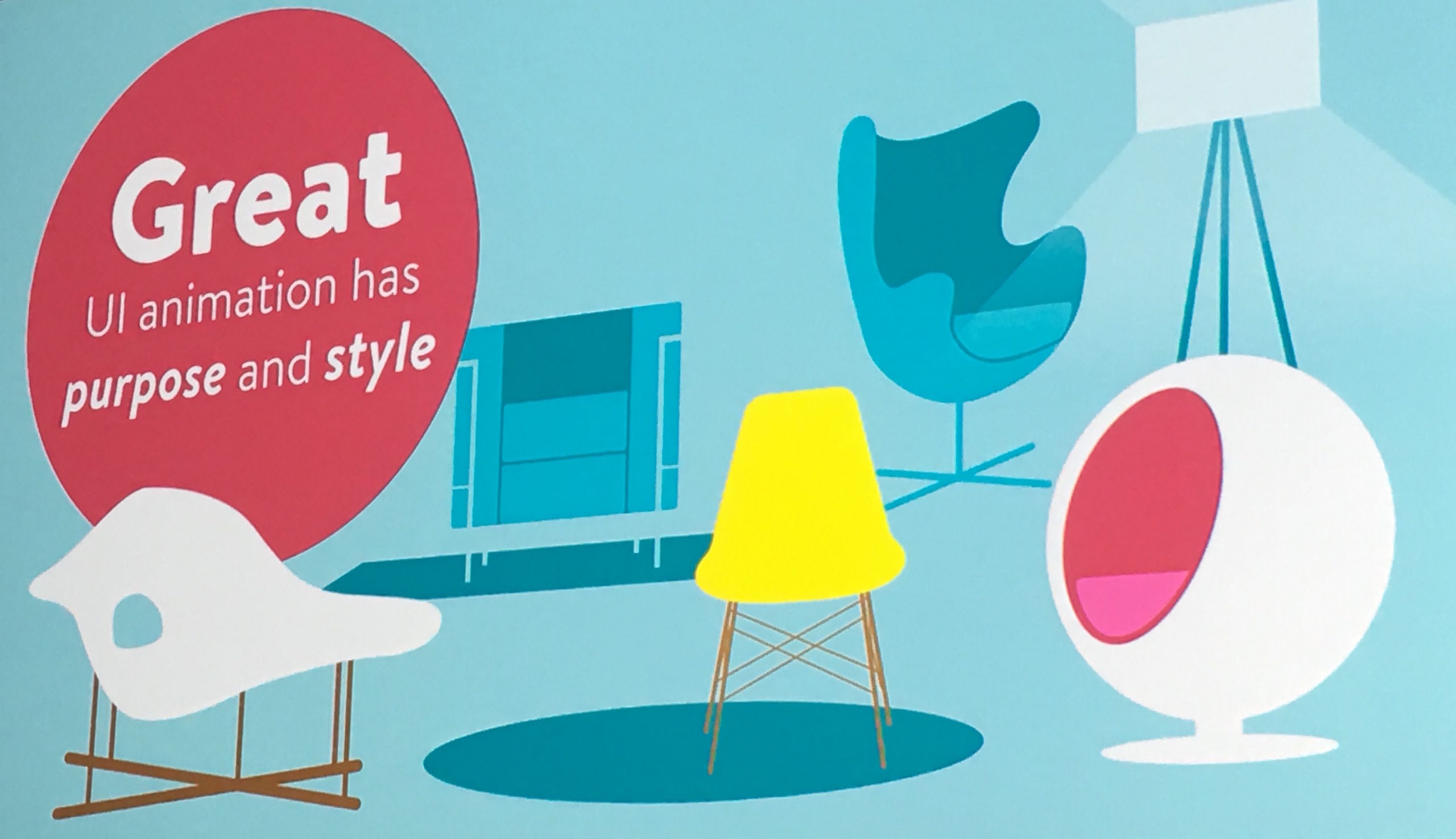
All of their animation has both purpose and style. That’s the nomination we need to create great user interface animation.
Motion design is kind of a thing we haven’t had to worry about, but there ARE principles we can pull from. As web designers, we are not the FIRST people to try and animate things!
There are classic principles of animation (12 principles of animation). These principles teach us how to communicate better with animation and gives us an expanded vocabulary to talk about what we’re animating.
These were written by DISNEY, in The Illusion of Life. They reveal their secrets on how they made little drawings look alive. There is a chapter called the 12 Principles of Animation. http://the12priniples.tumblr.com
The interesting thing about these are that they build upon each other.
_____________________________________
Animation Principle: Timing & Spacing
If you only have room for one principle, it should be timing… because timing is the key to animation. Timing is the duration / how long it takes something to move.
Along with timing is spacing, which fills in the gaps of timing. Just because it takes 1 second for something to move, things can change. By graphing the frames on the diagram of the movement (we’re looking at a bouncing ball animation currently), you can see the spacing of the ball.
– They make animated objects appear to obey the laws of physics.
– Establishes mood, emotion and reaction.
Timing = duration
Spacing = easing
CSS Easing Keywords: linear (you can cross this out because nothing in real life is linear so we don’t need to use it), ease, ease-in, ease-out, ease-in-out.
You can also use cubic-beziers instead of easing.
Everything is better with cubic-beziers!
cubic-bezier(0.42, 0, 0.58, 1); <— this is weird because we don’t talk about animation this way. http://cubic-bezier.com
Even if all you do is add the cubic-bezier into your animation, your animation will feel completely different. It can have so much more personality.
Animation Principle: Follow Through
This comes with our easing choice. This is the concept that not everything comes to a stop at once.
Example: A bulldog looks to the right and his cheeks keep flopping a bit after the rest of his head stops moving. Another example is the roadrunner when he runs up and stops in front of some bird seed and his body quickly shakes to catch up with him.
Do this by overshooting the target position.
Animation Principle: Secondary Action
Supplemental action, reinforces and adds dimension. An example would be how a character swings their arms while they’re walking. We watched her add a secondary animation to the h2, h3, and p tags within a modal that popped up to confirm a reservation and it added even more personality and meaning to it.
By using these 3 principles of animation we can make our animation more meaningful and better designed.
THE BIGGER PICTURE
We have to think about what all of these animations are doing together, how they relate. In essence you’re a choreographer.
Choreography
Designing all your UI animations to feel logical and related. For us it’s mostly the idea that you want your animations to have something in common, to feel like they’re coming from the same place, or in the same world.
Similar objects should move in similar ways.
Things that are there for similar purpose should animate the same way.
So if you have 3 thumbnails, they really should all move / slide into the screen the same way. However, sometimes you’ll see a thumbnail move in from the top, another from the bottom, and a third from the side, but they’re the same type of thing!
Entrance should inform the exit.
If a modal comes up from the bottom of the screen, it should exit the same way, to the bottom of the screen. If there’s no logic behind an exit, it can make it hard to understand that motion.
Match velocities (instead of durations) throughout the site/app.
You kind of have to go with your eye, because there’s not really a mathematical way to do this, but the objects should feel like they accelerate / move at the same speed. This is more of an art than a science.
Cohesiveness over consistency. Every animation doesn’t need to be IDENTICAL, but they should definitely feel like they’re from the same universe.
Podcast “Motion and Meaning” on Choreography ?
Look for real world things to exemplify in your animations. Example: IBM creates animations based on the behaviors / motions of the machines they used to make.
Express your brand with animation.
Pull from your brand values and express that as a motion! You can tell the story through all of your design decisions, including motion.
_____________________________
Some different animation techniques and feelings they create:
Follow through & anticipation: Energetic, friendly, bold
Squash and stretch: High energy and playful
Smaller movements: Calm and subtle
Opacity and blurs: Soft and stable. Using opacity and blurs and adding animation to those filters can even add depth. These animations can create a soft and stable feeling.
ANIMATION BELONGS IN YOUR STYLE GUIDE, mostly because is saves you from making those decisions over and over again. Just document the decisions you make the first time around!
- Document what you use animation for, which could include:
- Entrances and exits
- Give emphasis
- Give feedback
- Transitions between states
- Personality and brand
- Orientation
- Storytelling
- Document your building blocks (this is helpful for actual replications / building):
- Opacity
- Scale
- Colour
- Depth
- Position
- Rotation
Aim to build your own animation library that means something to your brand.
Where to find inspiration for great animation?
http://artofthetitle.com – film title design
http://capptivate.co – gallery site for animated interactions in mobile applications
http://uyi.io- interaction gallery
Her book: Designing Interface Animation
http://rifled.me/design-animate
The biggest thing is to be inspired by other mediums!
@vlh


0 Comments