
Eric’s intro: Ethan literally changed the face of web design. I remember when television commercials started touting their ‘new responsive web designs.’ I don’t know that anybody has ever used a word I created in a commercial… We’ve saved the best for last!
Ethan showed us a time-lapse video of a computer drawing every single maritime journey on a map starting in 1830.
“Where are we going?”
We’re still kind of catching up to mobile. Mobile is still massively popular. There are 8 billion mobile devices being used across the planet. And while tablets aren’t the most popular device, but there are still over 1 billion tablet users globally. We’re still trying to figure out ‘what’s next’ for us after the desktop? Is it smart watches, wearables or other screens we don’t know about today? We’re trying to anticipate and answer that question ahead of time.
Ethan has been moving further and further from pages as the central organizing structure to pattern-focused design practices.
This is a big shift for us as a design industry. Traditionally to create a new page we would start with a Photoshop document, define a grid, and fill a canvas with STUFF. But now we’re keenly aware that our design process has to change.
Trent Walton says “I trade the control I had in Photoshop for a new kind of control – using flexible grids, flexible images, and media queries… a network of content that can be rearranged at any screen size to convey a message.”
If you play around with The Toast’s new responsive site (http://the-toast.net), you’ll notice that some elements have far more break points than others (like the masthead has lots more breakpoints than let’s say a headline).
There are patterns that repeat on the site. One of them is called ‘the teaser’ that entices a reader to click further into an article. And, it has a number of permutations. One is just a headline. More often than not it’s accompanied by an image. Sometimes it may have a number associated with it to signify ranking. In the main section you’ll see lots more information like an excerpt. The presentation of these look different but they’re actually all the same patterns.
The most important piece of information you see in the teaser is the metadata, and then the headline is subordinated (although still dominant) underneath that metadata. In the old days, Ethan would have taken the four distinct elements on the page and put them in HTML in that order. Then he stopped himself and asked:
“What if someone doesn’t browse the web like I do?”
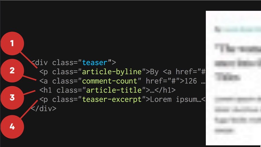
This question is very helpful for him. It’s a great way to step outside of his preference and biases. This is also a great reminder that not everyone is going to SEE the web the way that I do. The most important piece of information of this teaser pattern is the header, but in essence it would be buried in the actual code, below the byline and the comment count (if the code had been written in the order the information appeared in the desktop layout).
So, Ethan stepped back from the layout and prioritized the content. Reorganized, he changed the information to be: title, byline, excerpt, and comment count.
By making the title and byline children of a new container with class .teaser-hed, you can apply some simple flexbox properties on that content that could allow those elements to reverse order in certain layouts. So what about the comment count? He wanted to move the comment count from it’s original position at the bottom of the excerpt to the top right of the byline which is inside the flexbox.
So he write a little javascript query that tests if certain flexbox properties are supported in the browser being used, and if so, adds a ‘supports-flexbox’ class so then an even more refined layout can be created for those browsers.
This is a ‘conditionally enhanced layout.’
SHINY MAGICAL FUTURE
@supports will allow us to do feature queries directly in the CSS! This would be an alternate to a JavaScript solution (explained above). The one drawback is that feature queries are a flag for evergreen browsers at the moment. They’re not currently supported in IE or Opera Mini, or older versions of Android.
“Support” doesn’t mean “getting the same experience.”
TheGuardian.com is using flexbox as well as conditionally enhanced layouts. They have the image first followed by content in the markup, but then they use flex-direction: row-reverse; to display that content first on desktops.
There is a baseline foundational experience that is great, and then they
A well-crafted responsive design needs to be device-agnostic. Websites should be built to face the reality of the web’s inherent variability. – Trent Walton
Mobile, Tablet, and Desktop have become very unhelpful words, because the assumptions we typically made about them are no longer necessarily correct. Low bandwidth isn’t just a small screen experience we need to think about. Touch isn’t just the domain of the small screen anymore, either.
With the Toast redesign, even if a browser or device wasn’t as advanced as the ideal case scenario, they presented a design that was still beautiful, functional, and allowed them to read the content.
Design for the NON-IDEAL scenario.
Then, you can conditionally enhance the layout to make it better / more modern for the appropriate cases if certain conditions are met by the client.
Device Agnostic thinking means our designs are going to be more prepared for the web as an adverse medium. Plan for differently sized screens, failures of use, etc. Your designs are then going to be as resilient as possible and better equipped to deal with the dirty web (my term).
Building a responsive layout is no longer the hard part. The hard part is actually documenting and communicating our decisions – the how, why, and when about our responsive designs being adapted.
That’s why we’ve seen the meteoric rise of the Style Guide / Pattern Library to solve that problem. A stye guide is a central, shared repository for front-end patterns and code. This helps not only the technical members of your team but also the non-technical members and with on boarding new team members. It helps bridge “the collaboration gap” and allows designer to move into prototyping more quickly. It can also help facilitate in-browser design, review and testing.
Creating A Style Guide:
- Create a visual inventory of every pattern in your design
- Name and organize these patterns
- Translate that informatory into HTML and CSS (this needs to be a web based document)
Ideally you would automate the style guide creation over time. Tool: github.com/devbridge/Styleguide
Ethan Marcotte
@beep / @RWD
*I had to leave early because I had to catch a flight home to my 10 month old Nugget, sorry everyone!
AMAZING CONFERENCE AS ALWAYS!


0 Comments