
April 4 @ 3:15pm
An Event Apart Seattle 2018
This is his first time speaking at An Event Apart, so he’s starting with a big thank you to Jeffrey and Eric. It’s a huge honor to be speaking and he hopes to live up to the hype, but the topic definitely will.
This talk is about meaning. Words strung together are intended to convey meaning unless it’s poetry. Words strung together intended to have meaning are intrinsic to the web.
Using styles like fonts could be seen as essential or as an enhancement. Jason sees them as an enhancement that is essential to enhancing and clarifying meaning.
His too dogs, Tilly and Tristan, are fast and slow. He shows us this picture of his dogs, of one moving quickly and the other slowly, because multiple other speakers have addressed pace and speed as well.
In 1995 Jason wrote an article called ‘Nothing feels better’ about the feeling he gets from racing bikes. He did it for a decade because it felt good.
Without the capacity to will ourselves past what is typically possible in our bodies and minds, we would have no heroes. We need this ability.
Drawing and creating typography is about finding rhythm and structure, and then break that down to find beauty.
Type is never neutral. Even the act of trying to put it in the most neutral typeface as possible,
The most human typeface is that which has the human hand. The human handwriting influences how he reads that writing.
Type is how we ‘hear’ what we read. We’ve been perfecting this in print for centuries.
We can have good typefaces and good type settings on the web, but it comes with a cost. There is the tension. There is push and pull between design and development and the content itself is what causes us to find a compromise.
If we wanted to typeset one word with 3 different files, we’d get laughed out of the room.
You can’t typeset something in one perfect way. In design, we’re trying to code to get around this tension by creating style guides and design systems. And we need these! The good ones take into account typography and screen size. The BBC’s has guidelines based on type size, screen size, and usage.
Rich Rutter’s book Web Typography is a good one to read.
Let’s talk about the notion of ‘average,’ because that’s really what we’re talking about when we try to set a typeface that works for everything.
By designing something for the average person, it is literally designed for no one.
When we design a universal design system that is meant to work for all content, it is designed for none of it.
We’ve created a gilded prison for our words. We’ve created a new Crystal Goblet. We’ve ended up in a sea of sameness, diminished voice, optimized for anything and nothing at all.
Then came Variable Fonts! This is what you paid for, because this is going to answer a lot of interesting things. Variable fonts are many fonts crammed into one. So instead of having to install 64 different weights and variables, you get one file that contain all of the variable widths and heights etc encapsulated in a single file, that can also be variable along various axes:
Weight: Now instead of just regular and bold it can be anywhere between 1 and 999, and can be animated in between.
Width: Font stretch, a value
Slant: Not every typeface can do it, but some can
Italic: Also possible
These are not distortions by the browsers, but intentions by the type designer.
Optical Size: accentuates the contrast of the letters in bigger optical sizes, but makes them more sturdy at smaller sizes. Value: auto, on, or off
Grade: making something heavier without changing the physical space in which it sits. You can use this for a low light situation or readability issue.
Ascenders & Descenders: You can shorten these for certain situations
Mayhem: You can use all of the axes!
Inside the regular letter form, there are all of these points that allow the other shapes to be created!
It’s easy to implement. It’s supported in the browser, and soon it will be possible to say format(truetype-variations) so you can be really specific about which font you’re using. Right now stick with format(truetype).
Custom axes have to be uppercase when setting in the code or they won’t work.
Support for this is awesome. Start playing with this RIGHT NOW.
It’s right around the corner, it will be shipping before you can finish your project.
PSA: You can get involved and help with the spec!
W3C Github CSS Fonts Level 3
W3C Github CSS Fonts Level 4
You can go there and see everything and play and comment.
Jason also has a bunch of variable font examples on his Codepen
So what does all this mean? Let’s look at some existing websites and see what a difference this could make. What we’re talking about is to make a better now. We need to load fewer fonts, get better performance, do something to offset the heavy file size of our fonts.
EPSN: They are currently loading 4 different weights of Benton Sans which is 200kb. They could cut that in half or better and get better performance! Think about that: 3 fewer requests and 50% savings in the download, and they get much greater range in how they design for the screen!
Even if we don’t do anything more than just replace the fonts we’re using right now with variable fonts, we can have our cake and eat it quickly! This is a pretty bright future and worth looking forward to.
But that’s just the basics, not even why we should care!
And we’re the people he wants to talk to about that because we’re the ones that need to convince everyone to do this.
Typography for reading:
Typically we just scale font up and down along with the screen size and that’s it. But there are other things we can do and should do.
CSS Locks – the idea of scaling type with a low-end and high-end ‘lock’ and then scaling everything in between.
Optical sizing – the history is pretty interesting. He showed us a specimen sheet showing in print how a typeface differs in its design dependent on what size it is. The grade is heavier for example (less contrast between heavy and thin parts of the letters) for the smaller sizes.
This is something that was normal in metal type physically, because the letters were actually cut differently for different sizes. We lost this is the 60’s and 70’s when we moved away from metal type.
One thing we see on a mobile screen is the line length is a little too short to be comfortable. If we could make our characters a little more narrow, we could get 50-60 words per line instead of around 30 words per line (which just isn’t enough for us to complete a thought.
Reversed (dark background with light text) is good in a low-light setting but the text gets a little bit spindly, so if we can increase the grade just a little bit it can improve the readability a lot.
And because this is CSS, we could expose this in a UI control and allow the user to control that themselves.
We can also use variable fonts to improve the UI. Instead of an active state and hover state for a button using color, you could use text!
Let’s talk about editorial design & art direction
We want to bring art direction and editorial design into the web not just with layout but also with the text on the screen.
Text is just words. When you typeset it, you have a little bit of inferred authority. The Wall Street Journal printed newspaper has 4 very distinct heading levels on the paper, versus maybe 2 different heading levels on their website. We have this inferred authority that comes with seeing the name of the paper. You just get a sense of the authority that comes with that. When you start presenting all of your content in a similar way, you start losing that authority.
If you decontextualize the news (like Facebook does), you eliminate or impede the ability for people to find those verifications, to understand the context in which they read those headlines.
As we prepare to send our content different places, let’s think about how we can send it with its voice. If there is content going everywhere let’s take advantage of these technologies to preserve its voice (like news articles that can be scraped and displayed elsewhere throughout the web).
There is no one perfectly neutral typography. There is not one design system that can handle every single possible content type we can throw at it. And there is no one form of content that can present any voice.
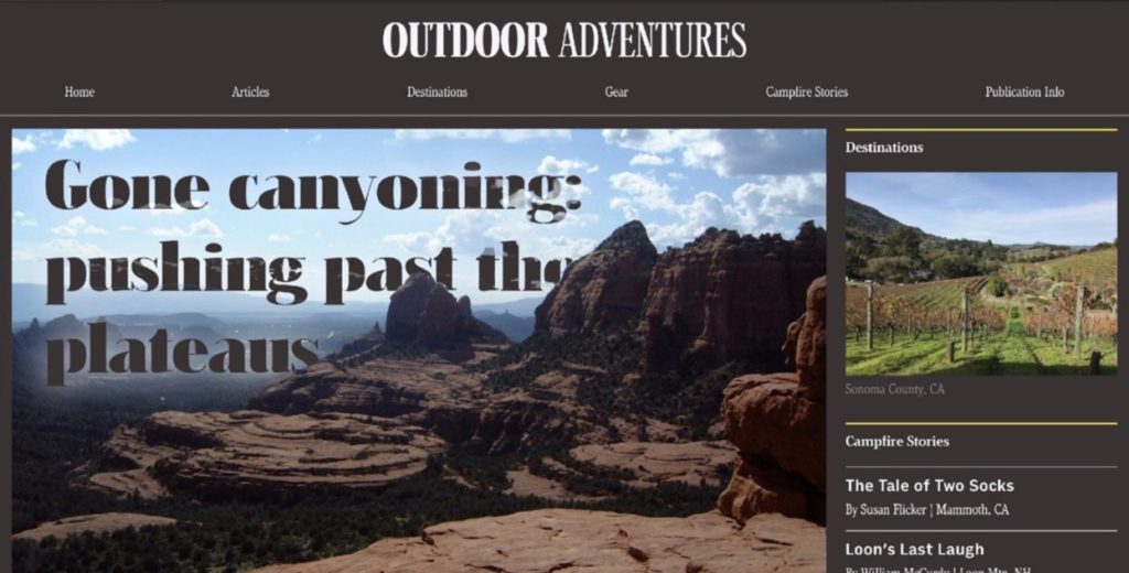
Jason showed this gorgeous example of art direction with a headline that looks like the letters are partially cut out and the image behind it sort of shows through some, and then that part of the image (the mountains) actually covered other letters. It was an example of elevating the way we can present content.
Type on screen is intrinsically of the web. That’s what it’s been for since its inception. But we need to remember that there is no one form of typography that fits everything
Good typography is intentional.
Really great typography is meaning.
@jpamental


0 Comments