
July 31, 2019 | Day 3, Session 3
@aarongustafson
noti.st/AaronGustafson
Some of us may be wondering what the heck is a PWA?
Progressive Web App
What the heck is that?
There are a lot of very smart people out there that question what exactly this is and what it means? Even the person who helped to coin the term… lol
When it comes down to it, and this is something that Francis B who did coin the term said, “Progressive Web App is really a marketing term.”
This is not necessarily for us as developers but a way for us to have a hared conversation for what the way of the web looks like.
What trips people up is the focus on ‘Web App.’ What’s important to realize is that a PWA can really be any kind of project you’re building on the web, it doesn’t have to be something you consider an APP.
It’s really just a progressive webSITE.
A lot of folks who have heard about PWA’s say ‘oh yeah, that’s a Google thing!
The reality is that every major browser to some extent is supporting the technologies that underpin PWAs.
Some notable exceptions in PWA’s support is iOS safari doesn’t support push notifications yet but that’s sort of a minor thing.
What is a PWA from a technical standpoint?
- HTTPS: It starts with having a site that is secure. You have to have an SSL, you have to be running https://
- Web App Manifest: You’ll need a web-app manifest (basically a big json file that has meta information about the site in it). You can have different icon sizes, definite your start url, your preferred orientation if you have one, colors, this is where all of the meta, app related and presentation information goes.
- Service Worker
Why consider a PWA?
Should we believe the hype about them?
Maybe… he feels like PWAs actually have some value worth recognizing.
Starbucks saw a 2x increase in daily active users. If you use their site and you sign in you’re using their PWA. They have high PWA usage on desktop – 40% of their PWA order-aheads were on desktop.
Tinder was able to take the core experience of their native app from 30MB to 2.8MB in their PWA. That is INSANE! That’s a huge savings which is important to people who are on limited devices, who don’t have a lot of storage space, and don’t want to spend a lot of bandwidth on downloading your experience.
West Elm saw an increase in time on site and revenue for their PWA.
There are a ton of examples of success stories out there.
What is a Service Worker?
A Service Worker is a special kind of web worker. They run in a separate thread from the main JS that loads in your page, so it doesn’t cause refreshes or janky scrolling or anything like that. Service Workers are wholly concerned with network-independence at this point.
He thinks about it as his own personal man-in-the-middle.
You register a service worker by checking if the browser supports it, and then you can register it. The path is super important. You want the service worker file to exist in the root folder you want it to work on. Or if you have a separate folder for your app it can go in there…
In terms of how this ends up working, there’s this whole lifecycle to a service worker. When a browser encounters a page that registers a service worker it kicks off the INSTALL process. You can use this as an opportunity to cache resources. Then it goes through an ACTIVATION event which is a good time to clean up old cache and load up new assets. Then it’s READY to run but then it doesn’t do anything until the next page is loaded.
So its ready but either a browser has to refresh or you have to move to another page, or there is an ability to take over the dustin page as well but it’s not the default setup. Then your service worker is in play.
In a traditional networking space you’d have a browser requesting assets and the internet responding. With the service worker acting as a man in the middle it has access to a cache in the browser. When you make a request it could look to see if it has that page or resource cached and if it does respond with that and not reach out to the server at all.
Caching is key to improving importance and improving offline experience which are the hallmarks of PWAs.
But if we step back what we’re talking about is building experiences that are good experiences. So we have to start with a GOOD web experience and then enhance that experience.
Progressive Enhancement is the core idea behind PWAs. We’re starting with something that works universally and then enhancing it.
Hallmarks of a great web experience:
- available universally no matter what the network or device is
- should be universally accessible (no barriers to access content or to accomplish key tasks within the interface)
Step 1: Focus on What Matters within your Site or Application
Forbes screenshot from 2007 showing a tiny tiny portion of a page which is what someone went to the page to read. It is NOT focused.
We need focus on what key tasks someone needs to accomplish when they come to our page. Whether it’s checking their bank balance or see what’ happening on social media or read content. That’s the entire point of our job as designers!
This gels nicely with Luke W’s mobile first idea.
Mobile first isn’t just about mobile, it’s talking about being focused and being able to provide a nice focused experience regardless of where that experience is being rendered.
WHY IS OUR USER HERE? IS THERE ANYTHING ON THE SCREEN THAT’S DISTRACTING THEM FROM DOING WHAT IT IS THEY CAME HERE TO DO?
We need to remember that text is the first interface.
When we think about text we have to ask if the copy is written clearly? Does it use language that our users will understand? Is the copywriting voice appropriate to our org and does it strike the right tone?
Languages can cause friction or foster delight. How we talk to our users matters because it makes them care or not in what we’re doing.
This is often what developers struggle with.
Book: Nicely Said
Resource from Mailchimp: Voice & Tone
His first experience on the web was via a text-based browser and he couldn’t access any websites he tried to! We have to think about what those experience are like.
Then we need to ask if there’s anything we need to do that would help our users be more successful?
What sort of affordances can we create to help users be successful because that’s what we’re supposed to be doing.
Step 2: Use makeup that supports the core experience of text
The words we choose absolutely matter but so does the markup we use to wrap it in.
He gave an example of the markup of a blog post that is just all wrapped in <div>s!
If something is self-contained content that can stand on its own there is an element for that! it’s <article>
There’s a markup for titles, <h1> through <h6>s
There is a great construct for key-value pairs like markup. It’s <dl>s and <dt>s which is super useful for meta data.
You can also wrap the date/time element in the <\time>. You can even declare machine readable times in there.
The content of the blog is wrapped in a div but there’s no meaning to that. We can supply meaning with meaningful elements like <p> tags. This is helpful for voice assisting technology to give a break between paragraphs.
Why should you care about markup?
It actually DOESN’T look the same if you do all of this with CSS – what if something happens to your CSS so it doesn’t load? With semantic markup and default styles you have something that is much more usable for your readers.
Poor semantics is an exclusionary design choice we make that causes a mismatch between what we as sighted folks experience and what those who need assistive technology experience.
We create accessibility issues. We’re the designers and if we build only for other people like us we exclude all those who aren’t like us.
If we use good semantics it helps us build consideration for people who aren’t like us from the beginning because we’re communicating in multiple ways. Because we’re relying on standards, that means they can be used by a broader audience.
Interaction with different input types comes along for free which is an added bonus. We don’t have to work as hard if we can take advantage for what the browser has in it.
And we can actually do MORE with semantic markup! We could ask a smart-reader to read us the top 3 headlines on the New York Times, it could go to the NYT and look for the first 3 <article> elements and read the first heading tags! That’s pretty powerful!
Conversational Semantics by Aaron on ALA
Developing Dependency Awareness
When we use good markup we do reduce dependencies. We can take advantage of things browsers give us for free.
Let’s say you’re trying to create a button on your site – you could mark that up with
<input type=“submit”>
or
<button type=“submit”>
or
<a class=“button” href=“##”>
or if you’re Google you might say
<div class”button”>
That’s 4 ways you could potentially make your button. They may seem to be equivalent because you can make them look the same but the reality is that they’re not equal.
The first 2 methods are WAY better.
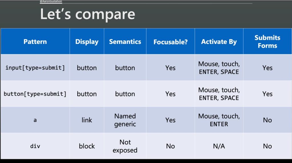
With the anchor and the div you have to do a lot more work. Add CSS to make it look like a button, add aria to expose it as a button, add html to make it focusable, add JS to make it something that is activate-able by mouse/touch and keyboard, and add extra JS to submit the form.
In adding more dependencies we create more potential for fragility.
What if your JS doesn’t load and now somebody can’t buy a widget no matter what they try? You’ve failed!
So instead we should ask how can we create an experience that works universally and then improve it where there is capability to do so?
Ex: Enhancing UX with markup.
<input type=“email” name=“email” id=“email” required aria-required=“true”>
Experience deltas:
- support for email input type?
- validation algorithm implemented to check if the email is valid?
- if somebody is in a virtual email context perhaps someone gets a special keyboard to help with email
- support for HTML validation for a required field?
- aria-required=“true”
You have a basic text input that works universally, then required notification to the users and then email validation and maybe a dedicated keyboard. The user will always have a usable experience but they may get a more awesome experience depending.
Then we start to think of user experience as a continuum that scales with capabilities.
Step 3: Design in support of the core experience
We need to think of how what we’re designing is important to the user experience.
Jeff Veen “I’ve been amazed at how often those outside the discipline of design assume that what designers do is decoration – good design isn’t. Good design is problem solving” – paraphrased
Graphic design offers a bunch of tools for illuminating content and providing meaning and structure.
- Alignment helps our eyes move more efficiently
- Contrast draws our eyes to more important information
- How we use elements and size them relative to one another helps a design feel more natural (proportion)
- Proximity helps us group related content more consistently
- A consistent rhythm can help a design feel more structured and improve readability
- Creating visual unity with similar visual colors can help a design feel more cohesive.
On the web we have some other considerations we need to take into account. The web is not print or TV or whatever. We have ways to address some of these:
- screen size (responsive layouts and images)
- resolution (svgs, responsive images)
- brightness (tune contrast)
- color density (provide color choices and use media queries for dark and light mode)
- user preference (larger and smaller fonts especially if we use ems)
- network speed & quality (responsive images, system fonts, service worker)
- assistive technology (see below, more detailed notes)
User preference – font size
If we use ems for media queries, layout can switch to narrower view as text gets bigger so the view gets more like a mobile view if the text gets bigger because the layout is dependent on font size instead of pixels!
User preference – high contrast mode
We have the ability to detect if a user is in high contrast mode. It’s another thing we should be paying attention to.
User preference – Prefers reduced motion
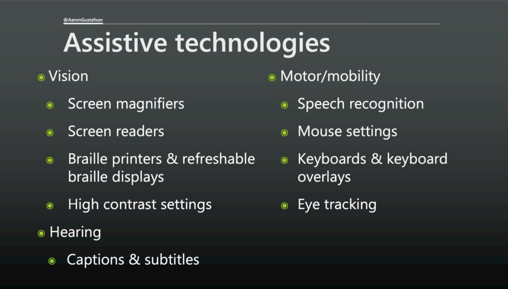
ASSISTIVE TECHNOLOGIES
The more you do to improve accessibility, the happier your users will be.
Pieces of advice on accessibility:
- Don’t rely only on color – perhaps by adding iconography to your color
- Make sure you have a good amount of contrast (aka.ms/color-contrast)
- Create connections between your content – if you reference something, anchor to it! Let somebody move directly to that thing.
- Provide space around interactive elements -think about people with fat fingers or people who aren’t really accurate when touching screens.
- Consider what our designs leave unsaid – like ‘view more’ or ‘read more’. It’s better if you can put in the actual content what’s going on, or you can add an aria-label like “You can finish reading ___name of article___”
How can we do this in CSS?
We can have multiple colors!
color: grey;
color: rgba( x, x, x, x);
We can have specific selectors to see if a browser has an element.
Be careful how you combine though, if you use a comma the whole rule will be ignored if a browser doesn’t understand one of those selectors.
h1:has(+p) {
color: green;
}
is a good example
**I missed the media query note**
@supports (display: grid) {
blah {
blah blah
}
}
When it comes to HTML & CSS browsers ignore what they don’t understand.
New specs smartly override conflicting syntax. If you apply flex box styles to something that is floated, the floats go away. If you apply grid to something that has flex box styles on it, the flex box styles go away.
The only time you need to use @support for this is if you need to change the grid-gap.
In terms of mobile first design, why does building this way this make sense?
If we make a desktop site first and then we smush it down to a phone, we have to basically undo those styles we wrote for desktop.
If we start mobile first we can start with the default of things tacking, and then only with a context of the media query for larger screens, you can pull them next to each other. You end up a lot less code for this approach.
You can also use mobile first to
- selectively delivery advanced styles
- isolate large css images in min-width media queries
- don’t hide content images using css, that’s an invisible tax on users
- use responsive images
- prefer system fonts
- font-display: optional;
These have huge benefits for PWAs as well!
We have to start at the CORE.
Screen real estate is a capability like any other so we should think about that as a continuum as we think about how we can improve an experience for our users.
Step 4: Improve the core experiences with JS
The way HTML and CSS that is not understood by the browser is ignored, that is not the case with JS. It can’t be.
JS is an application – it’s a programing language. If part of the programming language is not understood by the interpreter, bad things happen.
If your JS is necessary to achieve key tasks you’re going to suffer. Plus, if this is the case your analytics isn’t going to tell you either because most analytics runs on JS!!
You CAN use JS, but you have to do so responsively.
There’s a really cool feature called “webauthn” which allows websites to use device biometrics to let someone sign in (like Apple FaceID or Windows Hello).
Great example of a cool thing you can use that can enhance the user experience!
This is also when we start getting into PWA territory where we’re adding more native-experiences.
Wait, don’t PWA’s require JS?
Yes, but Service Workers were designed to be an enhancement to existing pages! So, your site will continue to work for users that don’t have Service Worker support, and those that do will get an enhanced and better offline experience.
We can and should be using JS responsibly.
We need to concentrate on thinking about our experiences as a continuum and try to enhance them based on the capabilities of our users without compromising the baseline experience.
We build a great experience by building what matters, using markup to support the core experience, using design to support that core experience, and using JS to support that core experience.
@aarongustafson


This PWA is very interesting. Thanks for sharing this article 🙂