
July 29, 2019 – Day 1, Session 6
@jensimmons and @rachelandrew are responsible in large part for the CSS grid support we have today – their teaching and analyzing and arguing is a large part of why we have what we have today in terms of CSS and grid on the web.
Jen is the creator of the experimental layout lab (get great ideas to blow your creative mind), she works at Mozilla, the creator of layout land (teaching everything you could possibly want to know about modern CSS layout), she is the creator of The Web Ahead, and has been called the Terry Gross of web design. In her freelance career her clients have included Cern, the W3C, Google, Drupal, etc.
youtube.com/layoutland you can find a playlist of some the things she’s talking about today to get further into it.
We’ve had a ton of CSS technologies throughout the time of the web, but out of all of them there are 4 main modes that your layouts can be in.
Flow & writingmode
CSS Grid
Flexbox
Multicolumn
She’s just going to say ‘it’s amazing!!’ it’s a little kitten unicorn and we should be excited!
Let’s just get to HOW because she assumes she wants to get into this new amazing exciting future.
labs.jensimmons.com – demos for 2019 – the last 3 are the ones she’s going to talk about today.
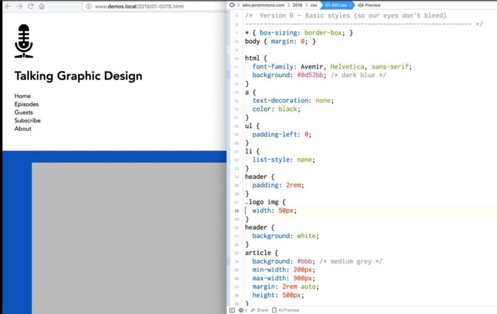
HEADER
Most websites have some sort of header at the top. We’re starting with the HTML – even if you’re creating a style system or some kind of component based system, at some point no matter how that page is built, it’s built in HTML, and there is one component document that is delivered to the user and it’s in HTML.
And you may need to go in and CHANGE the HTML if you’re not getting the result you want.
The first thing we have is an image (picture of a microphone) wrapped in an anchor link, then there’s the site name wrapped in a link, wrapped in an h1, and then there’s a nav element and inside that a ul with list items and inside those are links.
The whole thing is wrapped in a header element.
And then we can see the relationship between those elements – what’s a parent and what’s a direct child is pretty important.
Then when you view the page with no CSS, it looks pretty merp.

Why should we care about this? A large part of our audience may be using a reader mode and we can’t know it because it’s unmeasurable by GA.
Pocket is a cool app by Firefox that allows you to save articles and read them later OR you can listen to them!
it’s also very likely that using new technology we’ll be listening to web content so that readers can voice things like headers and links can
Semantic HTML is great for SEO too, we know this stuff!
Then you can apply some basic CSS and create in essence a ‘fall back’ layout. Very basic, but some CSS involved.
Floats suck.
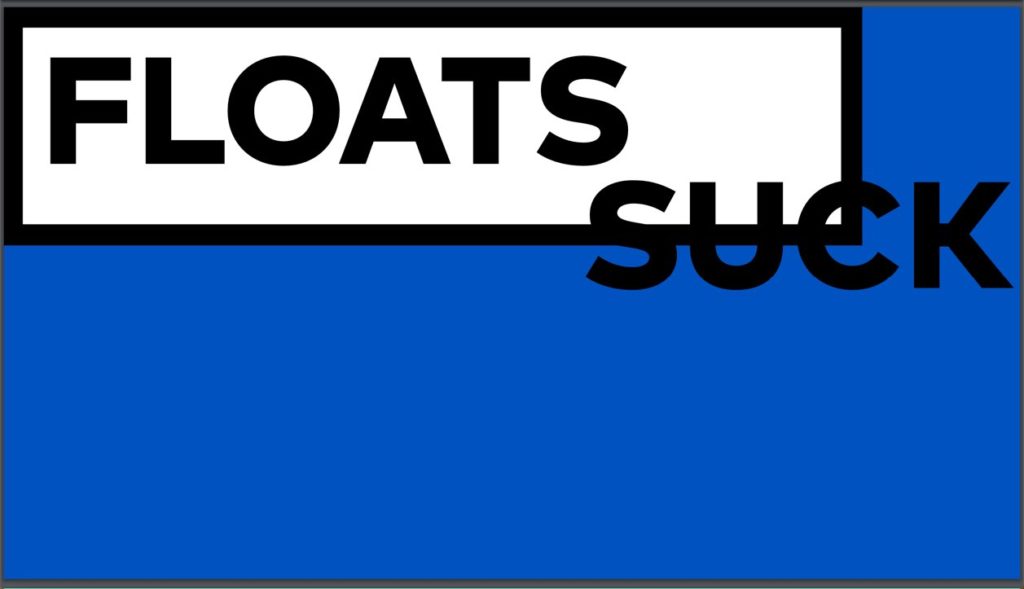
So, let’s use grid!
display: grid;
grid-template-columns: 1fr 1fr 1fr;
This makes 3 columns, they’re all the same size, they’re going to hold the content that is inside of them and if there’s more space they’re going to share the space among them equally.
But the way these elements are getting the space divided among them doesn’t feel quite right, so let’s use some crazy thinking and pick numbers for each column like 8fr 75fr 18fr…. But this is still pretty awkward because the column where the icon is is growing and shrinking even though the icon stays the same size… basically why would we have
With responsive web design we HAD to use percentages and things really HAD to grow and shrink.
With grid, flex box, all the tools in intrinsic web design, you can make the design be intrinsic to the content we have.
The big units of using fr units and percentages is that if you get down to below the size the content requires with fr’s nothing will get cut off, while percentages could result in cutoff content or overflow.
fr units is a way to say ‘please distribute extra space this way but don’t ever make it smaller than the content that’s inside of it.’
If you can hep it, don’t use percentages anymore, use grid.
So, what can we do instead for the logo for example? We can declare the width of the first column as max-content.
Let’s set width of max-content to the first and last columns and set the width of the middle column to auto. And we get a layout that actually works!
But let’s make it better! Let’s use flex box to make each list item in the nav into flex-items which means we want a flex-container right outside those on the unordered list.
Should I use Grid or Flexbox? YES.
You use them each on different parts of the website!
Well, we could have also used Grid for the nav. Check out the comparison. With Grid if the nav wraps the columns line up in both rows.
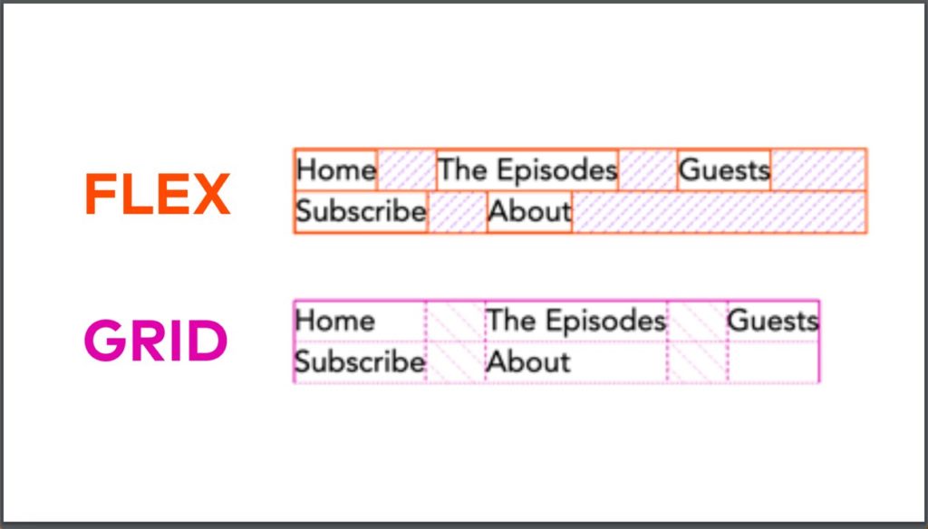
We’ve been busing flexbox because we’ve wished we had grid. But now we have grid so stop doing that 🙂
Little tweaks and details cloud be things like align-self: end;
and other little things to make this layout look nice.
We can get creative and change writing modes and make the menu vertical, and some other interesting things.
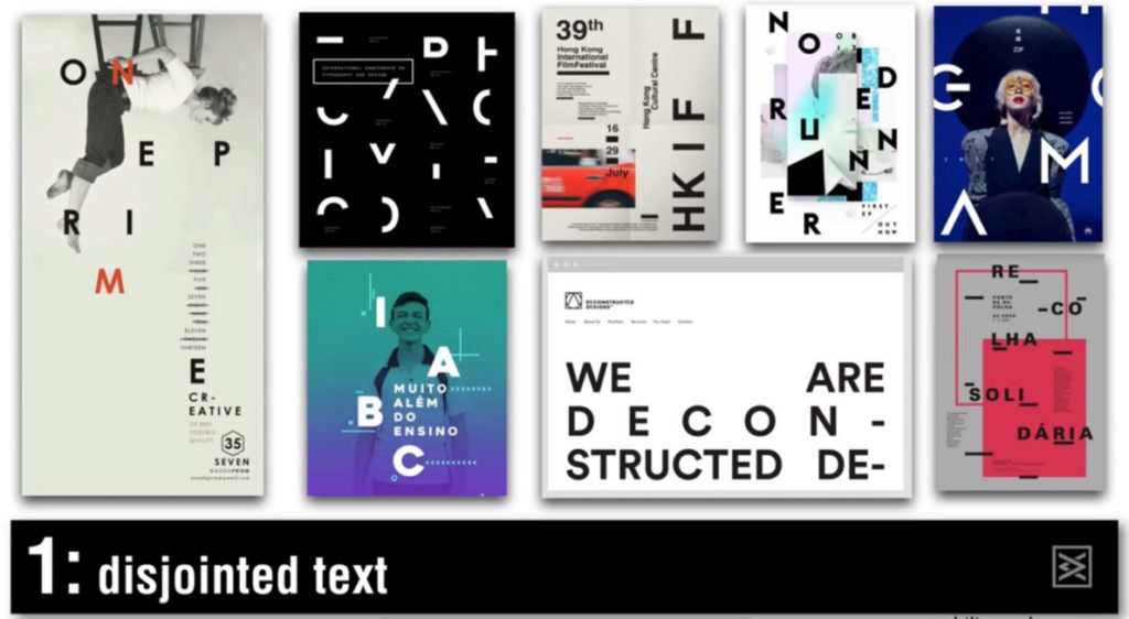
But let’s just forget bout what websites look like and look to other things like posters and weird spaced anywhere typography.
**demo that I’m just trying to absorb, sorry world**
BUT you should think about what your website does on various browsers that
So, you could use a feature query!! Basically say ‘here’s all the code and stuff for the website but if you know grid please do all of this.’
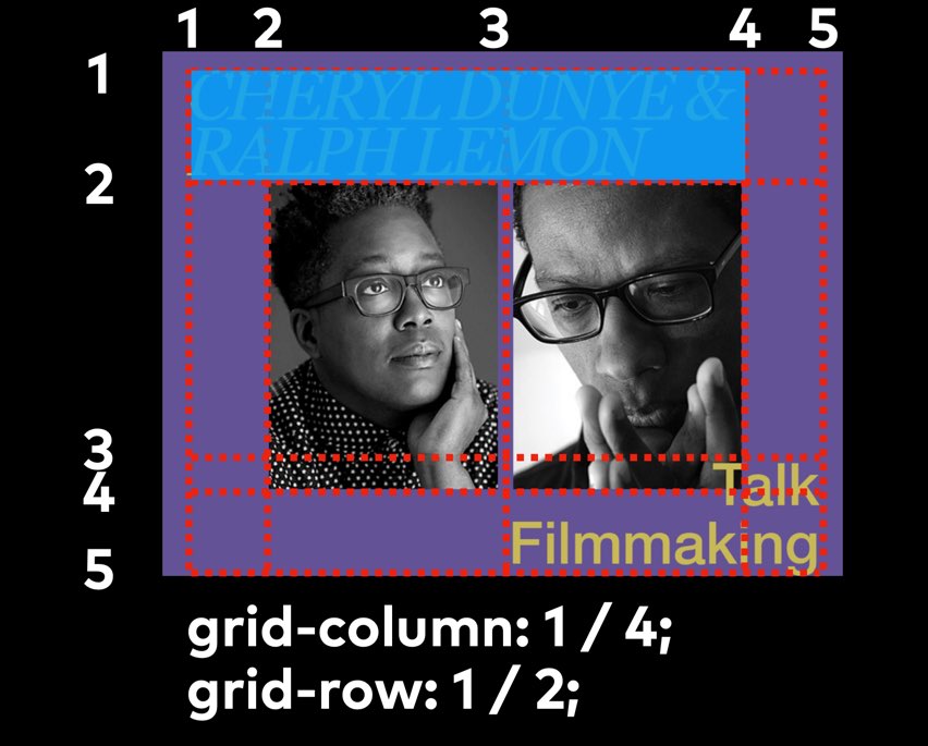
How to do text overlap in CSS grid?
Go into the Firefox grid inspector and try things. This is how she learns what she knows – she learns by just trying things!
We don’t know what’s actually possible yet. She wants to see us as an industry experiment in ways we haven’t in a long time.
She likes to look at design ideas from things outside of the web to keep her mind open and herself creative.
labs.jensimmons.com
layout.land
@jensimmons


0 Comments