
July 29, 2019 – Day 1, Session 5
Rachel who has written mountains of books has been working in the web almost as long as he has, is a member of the CSS working group, and is a member of the W3C working group, and flies more than any other human he knows. – EM
She is the co-founder of Perch CMS.
She’s been fortunate enough to stand on this stage and talk about CSS for over 3 years now. Over that time our understanding of CSS and layout has completely changed.
We’ve been using floats as our primary layout method for about 15 years, and that usage is now being resigned to history.
This is no less dramatic than most from tables to CSS. This move was really difficult who lived through it because we were asking people to limit their designs in many ways. The table layouts from early layouts were really complex – they were designed in graphic design interfaces and then pieced back together with really complex tables.
When we moved to CSS we had to simplify. Those complex designs weren’t possible to design with CSS alone.
In her opinion, this shift from tables to CSS design heralded the view of web as its own medium.
In some ways we downplayed the problems that came along with that. We weren’t really looking to see how we could improve the platform at that point, or trying to develop new CSS to solve problems, they were just working toward getting solid and stable browser support of the CSS that existed so they wouldn’t have to build 2 separate websites for 2 different browsers.
What we see as good web design is based in the technical limitations of CSS, and is informed by the early days.
But times HAVE changed.
She wants people to create beautiful things and practical things but she wants people to be empowered to contribute to solving problems we encounter as well.
“We can’t control the height of things.” – everyone ever
A few years ago getting the bottoms of boxes to line up with different amounts of content within them was impossible. So we’ve hacked around the problem like gradient fade out the backgrounds of the boxes, or avoiding background colors completely, setting fixed height for boxes and hoping there wasn’t going to be too much content put in, etc.
This is a technical limitation which is influencing our design and our content!
Our previous layout systems required us to set lengths for everything (widths) in percentages and to be very careful to not exceed 100% or some sort of bad thing would happen.
Flexbox is weird – the internet
But Flexbox isn’t the layout method you think it is. It’s not made for sizing things. It’s made for taking a bunch of different sized things and returning the most reasonably sized layout for those things. It solves the problem of having to put set widths on everything.
With Flexbox, CSS is really awesome. You CAN set widths on your flex items but
It takes control of sizing and gives you a sensible layout for your things.
Flexbox was never designed to be a grid!
Not everything requires a CSS hack. CSS may have solved your problem. It’s worth stepping back sometimes and seeing if your problem has already been solved in a different way.
** I love this sentiment, its what we do ALL DAY LONG **
CSS tries to avoid data loss. It’s a design pattern when developing CSS. They don’t want to do something that will result in some content vanishing.
Safe & Unsafe Alignment
Safe alignment means don’t use your alignment method if it’s unsafe or will result in data loss.
Safe alignment
I want center alignment, but if that alignment will result in data loss, don’t use it. So you use align: safe center;
Unsafe alignment
Force alignment you can use align: unsafe center; and you chose it.
If you’re happy for your box to get wider if the content in the box is too big, you set width: min-content;
So everything will wrap and become as small as it can without
width:max-content; is the opposite, where every opportunity to fit the content will be taken and you might not get any wrapping at all.
If you can’t allow the width of the box to grow but you don’t mind it to grow taller you could allow break-word.
CSS gives you TONS of choices! There’s a ton of choices to play around with.
But what if the text isn’t running left to right? THE WEB IS NOT LEFT TO RIGHT!
CSS assumed for many years that the web contains content from left to right and top to bottom.
The writing mode specification allows us to specify different writing modes and switch between them. This can be used for different languages but can also be used for design decisions.
Flex-box and Grid have an agnostic approach to writing mode.
All this contains is a way of mappings – a way of defining things in a flow mapping sort of way instead of the physical way we’re used to (top, right, bottom , left).
Instead of using width you can set inline-size which corresponds with writing-mode. So, if we set an inline-size of min-content that will work the way it’s intended/should whether our writing mode is horizontal or vertical.
CSS Logical Properties and Values
Support is improving – we will probably use these as default a few years in the future because they just make sense.
We need to consider the fact that there are multiple writing modes.
THERE IS NO FOLD
People know how to scroll! Also the web is responsive so which fold are you talking about? But, we DO know where the fold is – we know exactly where it! Plus we can also engineer our designs to reflect on the screen the user has. We have viewport units and they reflect a portion of the screen width or height. 100vw meaning 100% of the width of the viewport for example.
CSS Scroll Snap is another cool tool you can use as an enhancement – demo here: https://www.w3.org/TR/css-scroll-snap-1/
PAGED VS CONTINUOUS MEDIA
When we have screens of content that we’re paging between, we’re blurring the line between paged and continuous content.
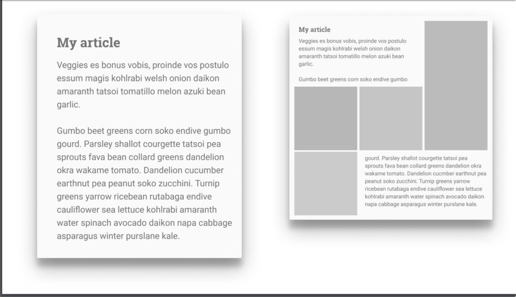
GRID & SUBGRID
It’s been the biggest problem solver on laying out the web ever. But it did raise some new problems. We discovered that one grid is not enough. We can nest grids. A grid item can become a grid. And each grid acts independently from each other.
So we can end up back at the same original problem we discussed = we never know how tall anything is on the web.
So we need to be able to create a grid whose children could refer to and count on. We need a SUB-grid.
Let’s say you have a <div>, and then a <ul> with multiple <li>s inside it and you wanted the <li>s to pay attention to grid decisions/layout.You can set
grid-template-rows: subgrid; – or –
grid-template-columns: subgrid;
You’re opting your track sizing into how it has been defined on the parent. Everything else stays the same and it acts like a grid itself.
With subgrid, you have a grid inside a grid, but the elements inside the sub-grid are using the tracks from the parent grid!
https://bugs.chromium.org/p/chromium/issues/detail?id=618969 – star this bug to show you want subgrid in Chrome!
https://gridbyexample.com/examples
The need for sub grid came to ahead because people started having issues getting things to line up that were nested inside the grid. You will hit problems and find TEMPORARY limitations. We just can’t do that YET!
We get the new stuff when we create it – when we find the use cases, write them up, point them out, etc.
She shared some of the problems and limitations she’s run into and her visions for how she’d like to see them solved. I just listened to this because some of it is a bit over my head and I wanted to focus and understand as best I could.
CSS Regions is something that came up a while ago and might help solve one of the problems she has encountered, but it’s not perfect.
She found that regions need somewhere for the content to go – you need to know exactly how much content you have so you have enough layout for content to go into without extra empty layouts if you don’t have enough.
She is wanting the ability we have with Paged Media on the web.
Having a final bucket for extra content just is not enough. In the real world, dumping content into a div somewhere isn’t what anyone wants.
So, Regions was faulted for several reasons.
The region spec pre-dated Grid. Now, in a world where we have grid, regions or something like it makes so much sense because we can build structures that hold content. So she thinks it would be helpful to revisit this idea and figure out how we could have a bunch of images we want to layout via grid and have text flow within / between them.
The minute we decide we have a finite page, we have decided how big something is in the block dimension. We’re going to cause overflow, and we’re giving ourselves the problem to manage it.
Web design really is just the constant battle with overflow!
A vision: Content thread and semantics fully separate from layout – without needing to simplify the design to get there.
Fragmentation CSS
You will run into it if you make paged media, or if you make multi-col.
You can use the break property to avoid breaking where you don’t want it. If you’ve ever tried to use these you’ll know that cross-browser support is terrible. So whether we solve regions with something close to the existing spec, overflow, or something she hasn’t thought of, we need better fragmentation support first. No one is going to support having a chunk of content in region 1, another action of content in region 2, and the heading for the second chunk being down at the bottom of the previous region.
No one is making up new CSS for a giggle – they’re making it to solve problems. So show them the problems!
Writing up the things you want to be able to do, write up a possible solution, and show the CSS working group! Don’t assume that because CSS doesn’t work the way you need NOW doesn’t mean it can’t or won’t work like that.
She can see so many possibilities with all the things they can do now with CSS. She thinks when we look back on 2018 and 2019
Let’s not allow this to define new technical limitations.


0 Comments