
By Rachel Andrew
CSS1 became a recommendation in Dec 1996. In Aug of that year, IE3 shipped which was the first browser to have CSS support at all.
The CSS1 specification is tiny but it contains the fundamentals of the language we use today.
The CSS1 spec assumes a simple box-model. It also includes the rudimentary explanation of what’s likely to be one of the first things you learned about when starting to use CSS: that there are BLOCK things, and there are INLINE things.
We don’t think about this a lot, but an underrated fact about the web is that if you mark up something on the web, you’ll get something readable. You mark your content with HTML, you pop it on the web and you’ve published a document. And this works because browsers have an inbuilt stylesheet. It also makes some things become block-level elements.
If it didn’t, our document would load looking like a big jumble of words and we’d have to try and go through and decide how much space various elements should take up.
Headings and paragraphs spread out and take up the width of the space. You can give them dimensions and you can push things away from them as such. The things around them always break onto a new line.
Inline elements can still have margins and padding, but in the block direction it won’t cause the other elements to get pushed away from them.
We can change between block and inline. This is an important feature of the web because it means we can pick the right element for the job, not having to choose it because of how it looks.
So we’ve taught CSS like this over the last 20 years:
* here is a block thing
* here is an inline thing
* this is the box model (it is very important and also kind of weird)
But recently she’s started thinking a bout how she teaches CSS differently, and it all starts with display.
The CSS display specification is the key to unlocking CSS layout. You have to understand display (level 3) because it puts the rest of layout into context.
It’s a level 3 spec. Much of the content is based on CSS 2.1. CSS 2 took the simple ideas in CSS 1 and started to refine them. We’ve even got a CSS level 2.2. A lot of specs at level 3 and beyond still refer to level 2 for key concepts. It’s only when more clarification is needed is a spec added to a level to replace level 2.
What does ‘block’ and ‘inline’ actually mean?
Paragraphs display one after the other in the block direction. They expand to take up all the space in the inline dimension.
The block dimension is the direction in which paragraphs layout in the writing mode of the document. The inline layout is the direction in which the paragraphs expand in the writing mode of the document. BLOCK and INLINE is tied to the writing mode of the document.
A block element will take up all the space in an inline direction and display one after another in the block direction.
These block level and inline level things make up the Normal Flow of the document. The ‘normal flow’ is what your layout will always try to return to. This makes your life much easier. If you have a well-structured document you can make adjustments to Normal Flow and it makes sense.
It’s pretty easy to think about block-level elements as a box. We can see it as a boxy thing is we give it a background color or a border. We can see it in dev tools and it maps to our understanding of the box model.
But everything is really creating boxes. Inline level things create inline boxes. Lines of text within our paragraph create a special kind of box called a line-box. It’s all boxes!
And any problem or confusion we have comes from misunderstanding the way these boxes behave and how they react to each other.
CSS display level 3 details how the boxes are generated. The spec says that for each element, CSS generates zero or more boxes as specified by that element’s display property.
The browser looks at the value of display for each element and creates a box or several boxes.
Something with a display:block gets a block-level box
Something with a display:inline gets an inline-level box
IF you make an element display:flex it creates a block-level box with flex children.
The flex container creates a flex formatting container for child content.
CSS specs uses lots of odd words that spec editor and developers understand so they don’t have to over explain a bunch of things. These words do have definitions that we can understand.
Formatting context describes how things behave. If you apply display:flex, items inside start to display in a flex formatting context.
If we say display:grid, we get a block-level box and the direct children become grid items participating in a grid formatting context. If the grid hasn’t been given a size it would expand in the inline direction. We could us fr units to distribute the space between them.
When the value of display is identified, it 1) applies how the box behaves within the layout (is it block or inline?), and it 2) decides how the children of that element will behave.
This is the power of refactoring the display spec.
In this refactor specification we can be more clear with our intentions by applying two values of display.
If we say display: block flex; rather than display:flex, it’s the same thing. We’re asking for a block level container of flex children.
Regular block layouts also have two values (display: block flow;).
(Screenshot of new display values)
It’s a bit early to start using these, but it’s worth talking about because they far better explain the mysteries of CSS layout.
Fairly recently, CSS gained a new value of display: flow-root. This solves a very common problem. If you’ve got a floated element inside another element (ex: picture of a cat floated to the left of a paragraph of text). In this example the block of text comes up behind the image but it’s not because the image is taller than the text.
One way to fix this in the past would be to use a clearfix hack or change overflow: auto; (this is a hack some people know about, if you change overflow to any value other than default it clears floats – it does this by creating a new block-formatting context). But it’s a weird thing to do, it can have some odd side effects occasionally, but also if another developer came to look at the code they don’t really know what you intended by changing the value of overflow.
So we have a new value of display: block flow-root;. What we’re saying here is create a new block formatting context, keep everything inside it, with no other side effects of doing that. It contains floats, it contains margins, and you can carry on doing float just as you did before.
We then have a matched value pair- we also have display: inline flow-root;
This seems new, but we already have a value of display that does this which is display: inline-block;. This has been around for years. Inline elements display like a word in a sentence within a line box and if you add padding around it it doesn’t push the other lines away.
Display: inline-block; also contains floats. This basically is creating an inline flow-root. So, that’s what display: inline flow-root; does. It just makes it more clear what’s going on.
Margin collapsing is something people run into trouble with all the time. If you create a formatting context you can contain your margins within the box.
By using display: flow-root; you can see that margins of elements are now contained within the box rather than being collapsed by the box.
With display:flex; you’re containing elements within it as well.
We know every element in our document gets a box. This creates a ‘box tree’ (boxes nested within boxes). But there are some things that don’t have an actual element that turns into a box.
For example if I have an element with three words in it, and the middle one is wrapped in a element, the elements no longer participate in an inline formatting context because the box around them is gone. The first and third words that aren’t wrapped in elements live in something called ‘anonymous boxes.’ Anonymous boxes are created to contain free ranging bits of text. It ensures everything is in a box.
In normal flow you don’t really think about it. It’s only when you’re in Flex or Grid that these anonymous boxes start acting like flex or grid elements.
So you now know that everything in the page is participating in some sort of participating content. Then you have some elements because of their elements of display become flex or grid containers.
This means some of the things we’re used to in CSS don’t work in the same way because they’re no longer part of this block formatting context.
If we’re in normal flow in block or inline layout. Floating and positioning take items out of flow. Setting an item to position:absolute; is probably the first thing you think about when talking about taking things out of flow. Once you do this, managing overflow is now your job.
Floating an element also takes on abnormal flow. This is pretty much the same as making an item position: absolute; except that any following text will wrap around it.
This behavior is specified for items only in normal flow. The specifications do explain to us what will happen.
If you apply display: grid; to floated elements, they stop doing floaty stuff and they behave like grid items. But we’ve created a sort of fall-back to floats.
However if you’d like to have floated behavior but allow those floated items to follow the lines of a grid, that’s not currently possible.
Absolutely positioning does work in grid and flex box.
This is all testable. One thing we need to ensure with spec editors is that our spec has tests.
Sometimes, you may ask for ‘no box.’ Here are the 2 values that don’t generate boxes at all (display:none; and display:contents; )
Display:none; has been around since the beginning. If you add this to an element, the box and all of its children are removed from the box-tree. If something is display:none; then screen readers won’t interact with it or announce it either.
All the other values of display only affect the visual layout.
Display:contents; removes the box but leaves the children. In terms of layout it’s like they were promoted to being direct children of their grandparent.
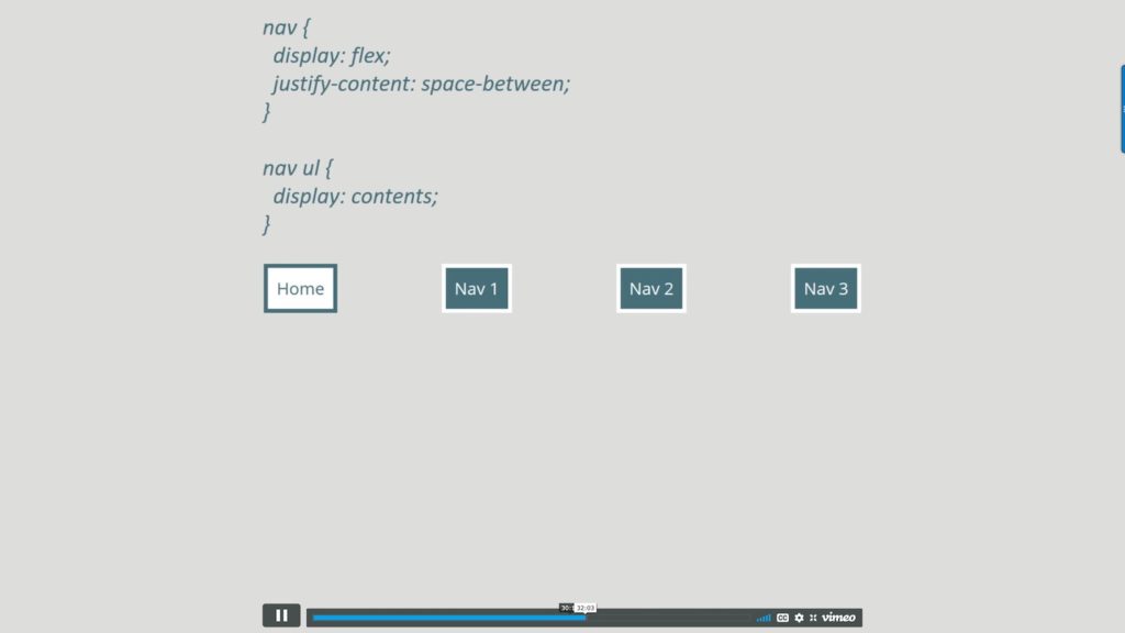
Using display:contents; will also remove the semantic context.
It’s best not to use display:contents; on an element that you need to preserve the semantics.
Exciting boxes!
Boxes generating boxes.
The content of your list items (the text) becomes the principal box, then we get this ‘list marker box’ around the bullet. If you put a background color behind your
The pseudo-element ::marker allows us to style the list marker independent of the list text!
You could use display:list-item; on something like a header for example to get at the ‘marker’ and style it, by let’s say making it an emoji!
IT’S ALL A VALUE OF DISPLAY! We should be using the value of display that makes the most sense for our layout.
Because the values of display don’t inherit they’ll only ever act on the principal box and its direct children. The grandchildren go back to normal flow.
Subgrid
This allows for the track definition to be inherited by a grid on a child.
If you use grid-template-columns: subgrid;, the tracks on the parent become the tracks on the child. We’re not inheriting values of display here, all we’re doing is inheriting the sizing.
So we first have to create a grid formatting context and then assuming the grid container of the component is a grid item itself, we can use the track so of the parent and move the components around the grid and it stays lined up.
To use subgrid, your item must already be part of a grid layout.
Z-index works on grid items.
{DEMO} – the featured image of this post is from the demo.
We start with a solid experience in the majority of browsers, enhancing for newer browsers that support newer features like subgrid, and then enhancing the experience for older browsers. The way can take this relaxed iterative approach to development in the browser is that you understand CSS.


0 Comments