
By Eric Meyer
The web was first conceived around 1989. That’s a little bit over 30 years ago now. It’s long enough that we’ve largely forgotten a lot of things about the web, what it can do, and how it’s SUPPOSED to work.
He’s had 3 web-related jobs:
He was Webmaster at Case Western Reserve University (he had that job when webmaster was a common title)
He was Standards Evangelist at Netscape
Since 2005 he’s been a co-founder at An Event Apart.
He marked up his first HTML document in 1993, and wrote his first CSS In 1996.
He’s written books about CSS and one into UX / design.
He’s sent and received a LOT of email.
He remembers when email was a plain text format.
Now you can view an email in plain text or in HTML. Very early HTML introduced a tag that marks text after it as plain text ( ). Anything before the tag is treated as HTML and anything after it is treated as Plain Text. This was meant as a parsing and indexing boost in the early stages of the web so browsers wouldn’t have to ‘guess’ what was supposed to be parsed as HTML.
The HTML specification of the time weren’t really clear about how or why you should use the tag just that you COULD do so.
Also, there’s not way to get back to HTML after you use the element opening tag (not even if you try to use a closing tag).
Support for the element goes until… TODAY. If you put this at the end of your document, the tags will also show up in the browser.
This was before tables!
TYPEWRITER, LISTING and XMP Are other elements that can be used to display plain text.
The FONT element’s origination goes back to Mosaic Communications Corporations Netscape Browser. The published an ‘extensions to HTML’ page showing how they were changing and adding to HTML. This page is still online actually.
Most of the way down this page there’s a whole section on FONT which defines a range of font settings from 1-7, the default value being 3. This applies both to the FONT element and the BASEFONT elements.
Remember, CSS doesn’t exist yet.
1 = 10px
2 = 13px
3 = 16px…
Etc.
CSS1 was published in 1997 and they also published a set of 7 font-sizing keywords, except here the default value is in the middle of the scale (4) rather than to one side which is a problem because authors are going to expect that the default font-sizing in CSS WON’T make all of their text bigger.
So then the CSS working group shifted the scale so that the default medium font-size matched font-size 3.
Browsers have these internal mechanisms that treat monospace Medium text larger than normal medium text.
This unexceptional ‘medium’ that is applied to TYPEWRITER that doesn’t have any special settings shows up bigger than the default text for LISTING and XMP. This isn’t the only time we see differences like this in the browser.
Consider the humble BLOCKQUOTE (debuts 1992):
There are default styles the browser applies.
You’ll find pixel margins on margin-block-start and margin-block-end, as well as margin (all) within the body. The body has an 8px margin… why not 0.5em?!
This is all because almost 30 years ago, that’s what Mosaic did. We don’t know exactly when that happened, just that at some point, somebody working at Mosaic decided that block quotes should be 40px indented on the sides, and that body text should have an 8px ‘gutter margin.’ And browsers are still doing that to this day.
25 Feb 1993 begins what we think of as ‘the web.’
The IMG tag was proposed. This embedded images on pages. Before this, images would be opened in separate windows! Images weren’t placed into documents. The IMG document would take an image element and literally put it into a document.
REVOLUTIONARY!
A discussion ensued, considering perhaps making this a more inclusive tag that could embed various things into the page including this thing called a PDF which he’d heard Adobe talk about.
This was proposed by Tim Burners-Lee… the guy that came up with the whole web thing in the first place.
This is why responsive images were so difficult to specify – it required having parameters around which image was going to be displayed at different times. That syntax became very complex.
IMG SRC=“” led to the beginning of images being introduced into layouts on the web.
Our friends at Netscape (thanks to a fair amount of alcohol) also brought us the majesty of ‘blinking text’ for links. One of the Netscape engineers who was in the discussion about blinking text (which was a joke) left the bar and went and created the BLINK tag… and was quite proud of it.
It was seen at that time of browser-wars to add something new to HTML that the competitor didn’t support. Then the competition would have to decide if that was a thing they wanted to support.
The people at Macintosh decided they weren’t going to support the BLINK tag but they WERE going to support text scrolling from side to side. (NOOOOOOOOO)
In 1993 for HTML 3.2, BLINK and MARQUEE… but Netscape kind of had a sneaky win here because you could still make text blink with text-decoration:blink; (but there isn’t a text-decoration:marquee; option).
In parsing CSS1, there’s some interesting language that says the browser must recognize the blink value of the text-decoration tag but they were not required to actually support it / enable the blinking text effect.
@support really should be @understands or @parases… Because Firefox and Chrome ‘support’ text-decoration:blink; but they don’t actually DO THE THING that’s telling them to do!
User agents are required to RECOGNIZE text-decoration:blink;, but they’re not required to actually BLINK.
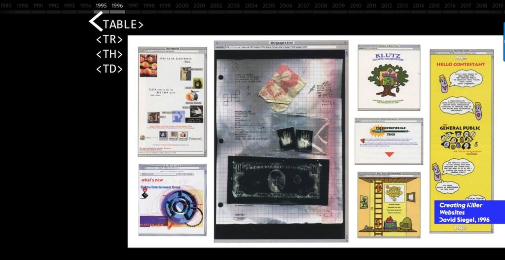 Look at all these layouts! They’re almost all in a design world unto themselves. It’s astonishing how diverse layouts were way back at the beginning of the web compared to how it is now (see joke about ‘which of these layouts are you currently using on your website?’)
You can use attributes to do more than assign a color to the background.
The classic SpaceJam website uses <BODY BGCOLOR=“” BACKGROUND=“”> to display a background image of stars repeated infinitely to fill the background of the page.
SpaceJam.com/archive/spacejam/movie/jam.htm
But this doesn’t make sense today… Using <BODY BGCOLOR or BACKGROUND should really only cover the BODY but it spreads to the entire HTML document!
CSS2 specifies to take the BODY BACKGROUND property and use it for the entire HTML element unless the HTML element has its own non-transparent background.
If you set an overflow on your BODY but you haven’t set an explicit overflow for HTML, then that overflow will get applied at the viewport level (because that’s what you would expect as an author), but there’s really no concept in CSS as ‘inheriting upwards.’ You’re only supposed to inherit downwards.
CSS itself created some weird outcomes. The W3C box model was that if you set a width to 200px, any padding or border would be added to that so the box would actually appear at like 220px for example.
But in IE if you set width = 200px, then any padding or border would squish the content down so that the visible box would be 200px wide but that content itself might be only 180px across.
By the time this incompatibility came up it was too late! There were thousands of pages that depended on the IE model.
CSS would literally have strangled to death on this incompatibility but then DOCTYPE switching was proposed. This became its own complicated system.
Then there were box model hacks that allowed for box-type switching using the voice-family property.
The twists and turns of web history extend into the way we write HTML.
All of the HTML code in this talk so far has been in uppercase. But HTML is case-insensitive!
xhtml is an HTML formulation, and it WAS case sensitive (so they had to pick!). They chose lowercase and they kept that through the next versions.
xhtml 2.0 sets itself apart from other versions. What if you accidentally flipped some closing tags? In xhtml 2.0, if you did this you’d just get an error message parsing the page.
Well this is why we DON’T use xhtml 2.0. By the time HTML5 came out, the industry’s lowercase preference became expected. Uppercase HTML is totally valid, but all the tools output lowercase HTML. If you accidentally flip 2 closing tags in HTML5, those closing tags show up as red in your source code, but the page still functions perfectly fine for the user.
HTML and BODY weren’t part of the first versions of HTML. These elements are actually optional. Browsers today will get confused and cranky if you skip them and just start your document with title, but you can do it! These elements are optional to preserve compatibility of the first webpages.
That fundamental design principle is why plain text content can still be seen on the web today, and why content placed in elements just created in the last few years would be visible in a website from 1994.
Compatibility is one of the greatest strengths of the web.
Because the most powerful core web technologies are designed to be compatible FORWARD AND BACKWARD IN TIME, even when it comes at the cost of adding new features.
This ability to make ‘soft errors’ and keep going, the heavy lifting browsers to do make sense of errors, is an intentional trait of HTML and CSS.
In CSS if you misspell “value”, the content will still load, just maybe not with the style you expected.
Doing everything you can to show the user the content on the page is FLEXIBLE.
The web prizes ubiquity over consistency. The web strives to meet you where you are. This is in a way the very definition of accessibility.
The whole idea that the very first webpages that were ever made can be viewed in a browser made just this morning is ASTONISHING.
Eric can’t think of another modern information technology that has that kind of robustness over time. And these principles should inform our work! When we’re creating new resources and tools, we should be thinking over those kinds of lines. Not, ‘will this work over the next quarter?’ but ‘will this work over the next quarter century?’
We’re moving into the fourth decade of the web.
We forget the value of adhering to these principles in the work we do. Building something that is fragile isn’t really in the spirit of the web. The spirit, the nature of the medium, calls for building things that are robust over a very long time scale. He can’t think of another technology from 1990 that is widely and robustly supported today.
Although these principles cause us to tear our hear out, they are the reason the web is on par with print in terms of reach and influence. They are the reason it’s spread so far and changed so much in the past 30 years. By sticking to those principles it will continue to serve you, and me, and everyone that uses the web into the next 30 years and beyond.
Meyerweb.com
@meyerweb


0 Comments