
by Margot Bloomstein
An Event Apart Online Together – Human Centered Design 2020
11:15am Central
How and why users should have slow experiences, not fast.
“I’ve always been a fan of anticipation. It’s not that the journey is better than the destination, but she thinks it helps her appreciate the destination more. Our users are like this too – they like more time to get where they’re going. The only get that luxury if we give them the time. The luxury of getting comfortable with an idea before we rush them through it. This only happens if we design ways to give them that time.”
When she was a kid, her parents took her on a trip to Disney World. This was in 1982. She was in the backseat of their Chevy from upstate New York to Florida – for 3 long days. She’s always appreciated those kinds of trips, they’re interesting. read the full story
She’s spent a month going across the US on a motorcycle, and she’s done the drive from Boston to Milwaukee plenty of times (16 hours).
Going down I-95 you see this incredible tackle amusement park right after you cross the border into South Carolina. The iconography and the language of casual racism, peeling paint… but she didn’t see that. She saw how they built anticipation. You’d see more than 50 billboards for South of the border. They were cheesy – there were bad puns, their typography was lazy,
She was 4 and ate it all up, she didn’t know any better. She remembered one that said ‘hey, kid in the backseat, keep screaming!’ They knew their audience.
But, they never stopped when they were driving – the puns were ineffective. They weren’t getting the right content at the right time to the drivers. So despite those 50 billboards, they never stopped. They didn’t need MORE content, they just needed the RIGHT content.
The thing about the right content is it drives confident decisions! There are so many forces adding stress and confusion to decisions. Smart brands drive trust by empowering people and making them more confident.
Eventually, they ended up at Disney World. One of the rides they visited was the Test Track. Many of the rides in Disney World are sponsored. This attraction was sponsored by Chevrolet. They didn’t put their sponsor dollars into the ride – they put more money into the pre-ride experience (aka when people are waiting in line). That’s where Chevy decided to put their money – how to make the line a better experience. They created an engaging pre-ride experience. They weren’t just waiting, they were DELIGHTING in a line. They were engaged, anticipating experiences, discovering things, and creating memories.
Slow content strategy offers users the opportunity to learn.
Chevy was giving people new information to add onto what they already knew. They were giving them new vocabulary, new information, so by the time you get into the ride you know what to expect. The people waiting in that line are learning and enjoying it as they go.
Slow content strategy offers our users the opportunity to learn, create memories, and effectively anticipate and seed their decisions with more knowledge.
We know that content, in that case, delighting in a line, affects both our experience and our perception of our experience.
Keri grew up in the shadow of Disney World and knows it well. Margot asked Keri about her experience with the rides and the lines that are longer and longer now.
You wait longer… but you’er engaged before you get there. You’re invested in the experience.” – Keri Maijala @clamhead
When people hav a frustrating experience, they rate is as slow. When we ask people what’s ‘slow,’ it’s the frustrating experiences. What’s fast? Delightful experiences.” – Jared Spool @jmspool
It doesn’t matter how long something actually takes, what matters is their perception of what’s happening.
Some questions this brings up: Do we find slow, deep experiences frustrating? Do we make better decisions if we can make snap decisions?
Amazon is a good testament to this. You can click ‘buy now’ and checkout in seconds. Amazon one-click shopping is efficient but it’s not always pleasant. You can order the wrong thing, send it to the address, etc. Amazon gives you lots of different ways to undo what you just did. This is frustrating –
Not all experiences should be slow.
If transactions are low value and insignificant we shouldn’t ‘get in the way,’ but there are situations where people NEED time.
In the real world we can see this every time we step into an IKEA showroom. The maps they provide are a bit of a nightmare. They encourage discovery and learning.
Jeffrey Zeldman spoke last year about how to allow users to have a slow experience through design, to help them slow down and focus.
The term CONTENT STRATEGY (definition from the 2009 Information Architecture Summit): Content strategy is planning for the creation, delivery, and governance of useful, usable, brand-appropriate content.
How do you slow down users?
- Editorial style and structures
- Discovery-oriented content types
- Longform content – visual & verbal
Editorial style and structures
Ex: Crutchfield
Crutchfield first educates their audience by offering them really long, garden path sentences in a conversational tone of voice. This mimics the experience you might have sitting down with a friend, talking with them over Zoom and discussing their new camera lens. What Crutchfield is doing here is creating a conversational, intimate experience, and giving people lots of different ways to engage with it (long-form copy, or in ways that aren’t pulling in more technical terminology but meeting their users where they are, teaching them through the experience of reading so they can get where they need to go). They’re developing vocabulary and a greater sense of knowledge.
Ex: Fidelity
Fidelity does this too. Where they need people to make quick decisions, they give people an opportunity to do that with short labels. After you make that first decision (ex: make a withdrawal from your IRA), that’s when you see a lot more copy because Fidelity realizes this is a big decision and requires information. They could give this same information with a pop-up, that said ‘hey are you sure you want to do this?’ but that might be a little condescending. So instead, they’re educating their audience. They’re putting up long-form copy here, and long-form content in full paragraphs that force you to stop, slow down.
Ex: Patagonia
They’re offering long-form sentences in product descriptions in meandering conversational sentences that force people to slow down and focus. They also offer free shipping both ways to easily send something back. This is great for users and their customer experience, but it’s bad for the environment. Patagonia is a double bottom line company that cares about their impact on the environment, so they want people to make informed decisions. They also do this in instructional copy in the shopping cart – they create a considered, thoughtful experience.
Discovery-oriented content types
When you add something to your shopping cart, they make sure that’s what you wanted to do – they popup the option to Save For Later.
Ex: Patagonia
“Our content strategy is pretty simple: we stay as close to our core market as possible. Patagonia’s always had a literary, storytelling component to the brand. It’s in line with what we say: buy less stuff and make sure what you buy lasts.” – Bill Boland, Global Creative Director, Patagonia
There’s a lot of internally consistency between their choice of content types and what they stand for in their mission, vision, and values.
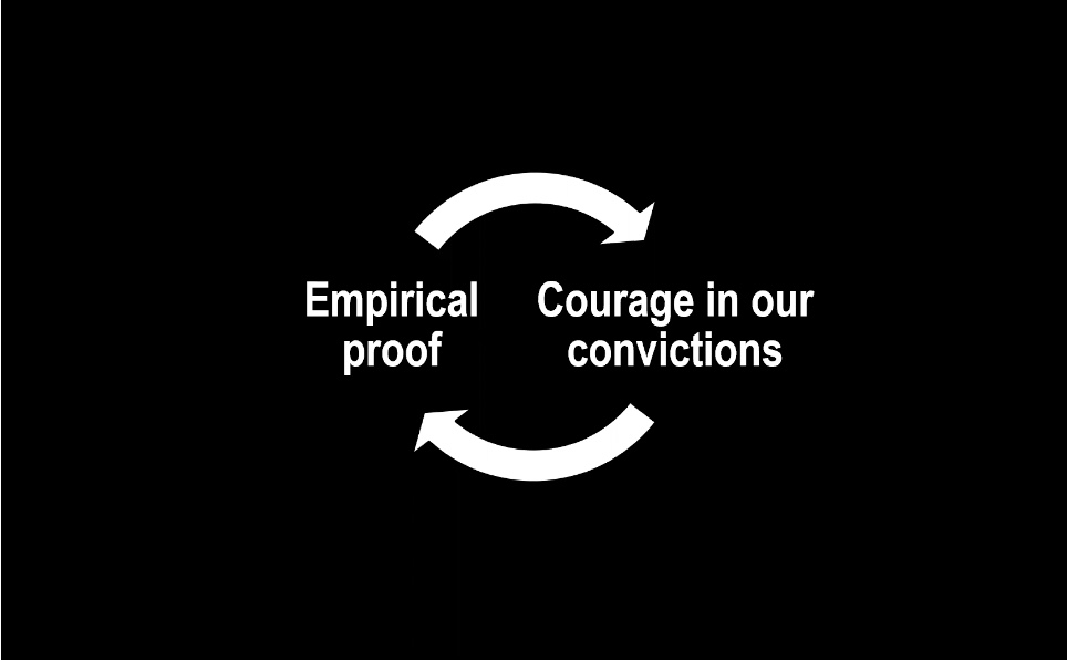
They give you the opportunity to ask, ‘is this still the thing I want? Yes, it is.’ This creates courage in our convictions.
If we can get in there with the right content to make sure they’re making the right decisions and feeling confident about the decisions hey make, it improves the trust-confidence that users have in the brands around them and themselves.
Every time we give our users the time and space to interact with content and then engaging informative content with which to interact, they’re able to revisit those decision and gain deeper ruts and grooves in confirming that’s what they want.
Ex: REI
REI does this a different way. They have a comparison table for products. If you buy a backpack for REI, and you go into the story you’ll find product information sheets that compare different options, have reviews from store employees, and you can interact with the products in different ways. You can pull a backpack down from the rack, put weighted sacks in it, to recreate the real experience you’ll have so you can feel confident about your purchase decision right there in the store. In the website they can’t simulate that but they still give you ways to weigh your options by giving you the opportunity to drag your consideration products into a comparison table.
Ex: IKEA
IKEA gives you a way online to ’swipe’ over a cabinet to see what’s inside it, just like you could within the store.
Longform content – visual & verbal
Ex: REI
In REI – if you get a backpack but you also want to hike with your dog so you want to get him a backpack as well.
You used to be able to bring your dog into a store and get them fitted. You can’t do this anymore due to insurance and liability, but you can still check out on the website ways to figure out what kinds of backpacks would
This is foundational content marketing: Information that helps support the purchase decision.
We can also be helping our users self-educate and grow confidence so when they do finally decide to make a purchase, they feel very confident in that decision.
Internal note: This is what we are working to do as well right now by becoming more active on Instagram, offering webinars, having long discovery calls with small business owners and answer 100 questions when needed, etc.
Ex: Crutchfield
If you visit their site and you’re pulling in information, amassing your own knowledge, it can take ea long time, and what they’ve found with these long pages of content is often when people read all the way to the bottom, what happens next is not that they’re ready to buy a product but that they’re ready to read more about that category. Sometimes it means they’re slowing down the purchase decision, but then when they make the purchase decision it’s that much more confident. It also means that they’re going BACK to Crutchfield to get information, they’re building trust in the brand. They know their audience! People that love to do research.
“We want everyone to have enough confidence in the information they see to make them feel like they can make a decision – and feel good about it from the moment they click Add to Cart until it arrives at their house. People who are not confident in what they’re getting either wont’buy or won’t be happy with what they get. So it’s really important for them to be the decision maker, not us.” – Julie Govan, Brand Manager, Crutchfield
Education drives empowerment, empowerment drives confidence, confidence drives trust. You could also call this Customer Loyalty.
When websites talking about government services or public health to empower and educate their audience, they find their audience is better able to engage with their government, take advantage of services and programs…
Make better user experiences that honor our users’ needs and help them to slow down. They become smarter and more confident in their ability to seek information, discern what’s truthful, and make decisions based on that.
Ex: America’s Test Kitchen
One of her favorite examples is what America’s Test Kitchen does meeting users where they are. Their long-form content both visually and verbal can be detailed imagery, long paragraphs of text… that level of details is what empowers their audience.
Patagonia has an Environmental section of their blog where they make sure you can just focus on the content, they don’t clutter it up with product recommendations.
But does this work?
Does giving people time to sit with content actually give them confidence, build brand trust, etc?
In the last recession, the Outdoor Industry Association said the outdoor recreation economy grew 5% in a time many other industries were contracting. In that same period, REI averaged 11% year over year growth. This wasn’t JUST because of content but it certainly played a roll in that.
Users deserve respect and dignity. Can we offer our users attention, respect, and time?
The places that we build online can be beacons of hope in their own way of saying, ‘Ok, if you’re here, we’re going to respect your time. Since you’re here anyhow, let’s give you the content to help you slow down and make good choices.’
@mbloomstein
Q&A
Question: How does this come into play with a user who has, say, dyslexia? They might not want to read long paragraphs.
Answer: When we’re considering accessibility, there is opportunity in there to give people more options/control over the experience. For example, giving people the opportunity to bypass long-form descriptions (toggles/read more). If we give people the option to just read the high-point bullets or expand and read the long-form information we’re giving them control.


0 Comments