ART DIRECTION
The web industry doesn’t quite have a handle on it yet. But for a long time she didn’t really understand what it meant either… Art direction is about being in a conversation, telling a story.
What kind of decisions do we need to make for people to feel what we want them to feel. This is more what Art Direction is.
When the Apple Watch came out, the logo was NOT what anybody was used to in the tech world, but it was VERY intentional to fit into the FASHION world! Then, the structure they built to announce it was a TENT that is very similar to tents that are used for runway shows in the fashion world! They set themselves up for future partnerships with HERMES, or other brands like Cartier! It was INTENTIONAL. ALL OF IT. That is Art Direction!
Even the design of a writing application can give specific impressions, intentionally.
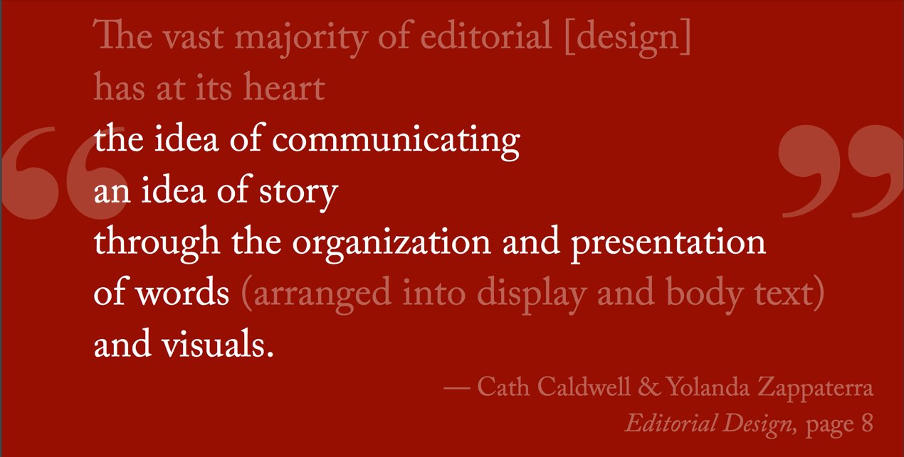
“The vast majority of editorial [design] has at its heart the idea of communicating an idea of story through the organization and presentation of words (arranged into display and body text) and visuals.” — Cath Caldwell & Yolanda Zappaterra Editorial Design, page 8
Use this in your websites to make your box sizing calculated the way it SHOULD be – if you say you want a box that is 400px wide, MAKE IT 400PX WIDE, not 400px plus padding plus whatever else the fuck the browser wants to add onto it.
html { box-sizing: border-box; } *, *:before, *:after { box-sizing:inherit; }
I don’t think layout should be a multiple choice questions. I think it should be an essay question. Ok, if it’s helpful for your team to have constraints, that’s fine, build a library, but that should be built OUT of your design decisions and your art direction.
Once Flexbox showed up, we were so used to using grid systems, we just used Flexbox to make a 12 column layout!
How do we come up with layouts of our own?! There is 100 years of graphic design knowledge and wisdom that we can tap into from the print industry!
- You can use negative space as a map, to tell your user what to do!
- Guide your user.
- Communicate using space.
- Create an Oasis. We are used to cramming pages full of stuff. People are very busy… but you can calm people down by using space to create an oasis.
There are some BIG PIECES and LITTLE PIECES of Art Direction. Little Pieces first:
INITIAL LETTERS
Use an Initial letter (drop cap). You can isolate a letter using the first-letter pseudo element. But the problem is once you isolate it what are you going to do with it?!
p::first-letter {

color: rgba(255,190,150,0.9);

font-weight: bold;

margin-right : 0.5em;

-webkit-initial-letter:4;

initial-letter: 4;

margin-top: 1em; //bug fix

}
The red text tells the browser to set the height of a letter to the equivalent of 4 lines.
FEATURE QUERIES
To use this even though it’s not supported everywhere, use @supports!
@supports (initial-letter: 4) or (-webkit-initial-letter: 4) {

p::first-letter {

color: rgba(255,190,150,0.9);

font-weight: bold;

margin-right : 0.5em;

-webkit-initial-letter:4;

initial-letter: 4; }

}
To use this:
@supports (property: value) {

// a bunch of css

}
___________________________________________
VIEWPORT UNITS
Get a header that is 100% the height of the VIEWPORT: height: 100vh; (also use display:flex; to center the content horizontally and vertically).
Any place you might use em, rem, %, or px, you can instead use:
vh: viewport height
vw: viewport width
vmin: smaller viewport number
vmax: larger viewport number
OBJECT FIT
A property you can apply to images that allows you to put a fixed size on an image and the image slides and crops to fit that space.
img { width: 50%; height: 400px; object-fit: cover; }
___________________________________________
CLIP PATH
You can chop an image or box of text or a div to get away from rectangles. You can cut things into circles or different polygon shapes.
CSS Shapes
If you cut an image that is not a square, how might you have the text float around that image?
You have to float things in order to get CSS Shapes to work.
img { clip-path: polygon(0% 0%, 100% 3%, 98% 99%, 3% 93%); }
CSS Shapes Editor is this SUPER COOL extension for Chrome that gives you an interactive way to get the polygon math needed for this. Link here
BIG PIECES
Flexbox
Our websites are so busy because everything is trying to cram itself up to the top of the page.
Flex box likes to think of the world as a long giant row of items (or one giant column), and if you ask it to, it will start wrapping those items. It will calculate what’s going on in the first row (or column), and then recalculate what’s going on in the second row, etc. She’s trying to do layouts without
Maybe sideways scroll is something we are ready to reintroduce into our websites… who knows. Apps use sideway scroll all the time.
Multicolumn layouts: it’s buggy but it could be useful for some thing.
CSS Grid
Grid is the right thing if you want to create a layout with equal sized elements in a grid that do NOT stretch to fill empty space. Flexbox will never work for this.
You also don’t have to fill the entire cell with content. The cell is a thing, and the content within it is a different thing. You also don’t have to have everything crammed up against the top, because again the cell is separate from the content so you can align content within the cells however you like.
In CSS Grid you can also do something like center a piece of content in the space of 4 cells.
And you can leave the top row empty, because grid has ROWS!
Also, grid is fine with you placing the content in a different order in the grid than it appears in HTML “because it’s cool like that.”
There are so many examples of different CSS properties and how to use them with CSS Grid that I didn’t document here. I need to get some learning on here.
So where are we with CSS Grid?
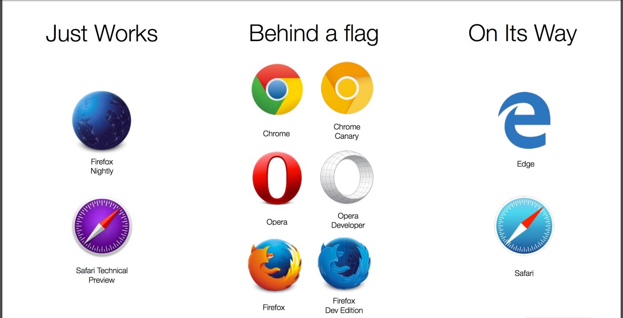
Firefox Nightly
PROCESS
For a while our process of layout design was ‘look at our choices and choose one.’
Instead, let’s start with Organizing our content. Then, Create an HTML file, and set source order. She does this with religious purity, and does not change it for layout purposes. Then sketch ideas for page layout (low fidelity on a napkin or paper or Sketch program). Design a custom grid appropriate for the content, separate from any tooling.
- Organize our content
- Create HTML file and source order
- Sketch ideas for page layout
- Design a custom grid
- Apply CSS. Write your own layout code from scratch (meaning not with Bootstrap, etc).
So how do we use these things when we still live in a world with IE? We think that these things either work or don’t work, and we can either use it or not. However that’s not the case. You can use a property and simply have it not work in certain browsers USING ONE CODE BASE! And that’s OKAYYY.
This is a time to play around. Spend a weekend playing with Grid or Flexbox! Play around with layouts with all this stuff.
She’s building a space for us to do this together (http://www.layout.land) coming soon. A place for us to address simple challenges and get design inspiration from each other.
Jen Simmons
labs.jensimmons.com
thewebahead.net
@jensimmons


0 Comments