
The values that make the web great as a medium are its adaptability, fluidity, accessibility. It can be accessed on every type of device and every type of browser. It naturally works this way, as long as we don’t break it.
This can be summed up by the idea of there being ‘only one web.’
“I need more than a responsive site, I need it to be adaptive.” – Everyone at Marriot. Except NOBODY KNOWS WHAT THAT MEANS!
We need to move ‘beyond responsive design’ and _______.
We’re going to talk about 3 different strategies about how we publish content to different places:
Responsive – fluid grids, flexible images, and media queries. It has a clear and consistent definition.
Adaptive – This means you are serving something different to the user according to some criteria that you can figure out. The most commonly used idea of adaptive is that an adaptive solution snaps into place at different device widths – it does not adjust fluidly, but has some fixed widths and the layout changes as more device width becomes available.
M-Dot – separate mobile website. Serving a completely different website to only mobile devices. These typically serve different or less content than the ‘real website’ and you need to manage 2 separate websites.
This idea of fixed width breakpoints for adaptive is Karen’s least favorite definition.
Adaptive means serving something different. Two questions:
Are we serving to the same URL?
Are we serving the same design?
Responsive design is client side, which means the whole page is delivered to the client and then the browser changes what is served based on the browser window.
Adaptive is server-side, meaning before the page is even delivered, the sever detects the attributes of the device and loads a version of the page that is optimized for its dimensions and native features.
Responsive design is Google’s recommended approach for designing mobile websites. However, they’re not going to penalize you for using a different approach.
Under what circumstances would you want the design to be different?
- You may want to serve a different page
- Serve a different feature
- Example: Beatport chose to serve just the media player adaptively on a mobile device (they served a completely different player)
Conditional loading is a client side technique that lets you decide how much information to load at different screen sizes. This is something where you serve only the minimal amount of information to the smallest screen and then serving more on larger screens. You aren’t delivering all of the information and then hiding that.
DISPLAY:NONE; IS NOT A CONTENT STRATEGY.
If the problem is literally related to the size of the screen, then you don’t NEED to get the server involved there! And if you can avoid getting the server involved, you should do that.
So when DO you need to get the server involved? WHEN YOU NEED TO SERVE DIFFERENT CONTENT.
Solution for device specific content without needing an M-Dot website.
COPE: Create once, Publish everywhere.
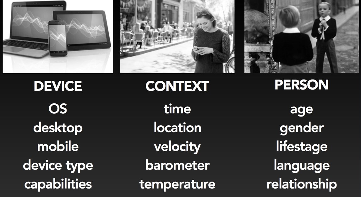
Targeting. This is a way to deliver content that has been targeted on some criteria.
The idea of having structured content that can be targeted according to what you know about the user or device is nothing new. MAIL MERGE!!!
So let’s talk about HOW you might want to target:
- Based on device TYPE
- Based on the Context of use – context to her means information that can be gleaned from the device sensors in order to tell you something about where the user is or what he/she may be doing. This could be the time, temperature of the device, velocity of the device, etc.
- Based on the Person / user (personalization)
When would you want to target something to the device itself versus the context of use?
DEVICE:
Let’s say I’m going to the AT&T site to get support for my phone. I want them to know what kind of phone I have! AT&T has a responsive site and is serving content adaptively. They may choose to prioritize iOS information for iOS devices, but they don’t actually hide content about other phone types in case you are looking for information for a friend, for example. This is about prioritizing the experience to help them get to the things you think they want more quickly.
Adaptive content could be used to tailor the verbs to describe what type of device the user is using. (ok awkward sentence) Example: On a desktop the verb would say ‘click’ and on a tablet the verb would be ‘tap’ and in a vehicle the verb would be ‘say select.’ Unfortunately there is no reliable way to detect input type in a device :/ So, rather than trying to detect input type, many people just give up and decide to present the same content to everyone.
You can’t use device type to predict what users will want. Device types don’t actually tell you anything about the context of use! Plus, data says that the behavior of people on desktops and mobile devices is not actually that different.
SOOOO Device Type isn’t all it’s cracked up to be in terms of targeting how to deliver adaptive content.
CONTEXT:
What if people want something different based on context of use? Context examples: time, location, velocity, barometer, temperature.
All we can know is the information we can actually pull from the device and make assumptions about the user’s context.
Her digital hearing aids have different ‘programs’ on them including Car! They automatically switch to the Car program when the iPhone paired to them is going faster than 10mph. However, this type of assumption is rather risky.
One of the easiest ways to do context based targeting is by location.
Example: You’re on a restaurant guide’s website, and they could present nearby restaurant information based on your location at the time you visit the site.
It is very easy to fall into the trap that location = mobile. Just because you want to use location based targeting does not necessarily mean the user is on a mobile device!
Another example on how location based targeting wasn’t enough is when Karen was in Israel and the first thing Google asked when she opened her computer is if she wanted to switch to the Hebrew interface. Well, based on the data they had about Karen over the past 15 years, there had never been as much as a hint that she would be interested in speaking or reading Hebrew. Sooooo Google would probably have been better off using the vast amount of data they have on her! So, location alone was not enough in this case to offer the right content.
Time of day – this does not ALSO need to be a device specific strategy. You can deliver a time of day strategy to all devices, and use it as part of your overall strategy.
Readers don’t want YOU to decide what information they get on which device.
By far, “access to information any way I want,” is users’ most important criteria when rating mobile brand experience. Also important is a seamless experience across all devices they use.
Don’t use device as a proxy for context. Don’t make assumptions on what a user wants based on device type. It will always be the less appropriate method.
If you want to serve content adaptively, you’re better off using location, time of day, or other data you can gleam from the device that will be more accurate (probably) than making assumptions based on device. But still, be cautious.
MAIN TAKEAWAY:
Most of the time, you’re better off serving the same information to everyone in every scenario in every device. The truth is 95% of the time you don’t need to sit around in meeting room deciding if users want something different on a different device or in a different place or whatever.
Get a really good solid, lightening fast responsive design working. Responsive is going to force you to prioritize content the way you should. START HERE. Then worry about if you should even try to customize the experience.
Adaptive solutions aren’t magic. They’re complex and costly. Getting the server involved, figuring out how to serve different content and design solutions – these are complex! You’re signing yourself up for a whole different set of problems… if you can solve your problem with responsive design, it will be easier to maintain than an adaptive design. Have REAL data for WHY you need to serve something differently / adaptively, and then you can solve for that specific use case.
Adaptive + responsive solutions work together – they’re not competitors.


Woah! I’m really enjoying the template/theme of this blog.
It’s simple, yet effective. A lot of times it’s tough to get
that “perfect balance” between user friendlinrss aand appearance.
I must say that you’ve done a very good job with this. In addition, the blog loads very fast for me on Firefox.
Excellent Blog!