We will be asking a few questions:
- Has design changed irrevocable from how we knew it?
- Has the fun gone out of it?
This is a tough time to be a web designer. We have cell phones and smart watches and all of our content and code and CMS systems have to accommodate that! A little piece of your content might be pulled out and shown on a watch… We’ve never had to do this! Wait, but we have (shows picture of a Palm Pilot).
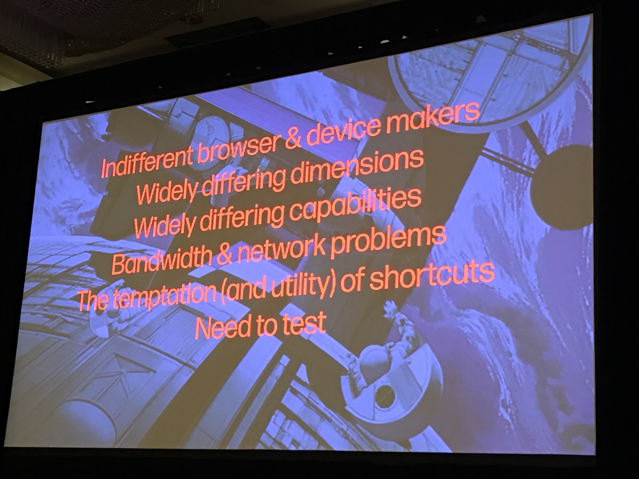
When he started designing for web, he had to use Netscape 1.1 “or go home.” So, he’s very old… but that was before web standards! It had universal access for everyone. He had to do design that worked on all browsers and multiple devices, etc.
When we started designing websites, there actually wasn’t a standard size for a desktop screen size, and there wasn’t even always a mouse! Jeffrey had to design websites for computers without a mouse! We’ve all had to deal with this at some point (unless you’re a backend engineer and this is someone else’s problem, but you have your own problems).
This whole emphases on Speed now… I just finished making this huge responsive site with this 12MB video in the background and there’s these giant pictures… but people are complaining it’s slow and “BLARGGH I’m a designer I should be able to put a 12MB video on the site if I want to!” Actually, we really have to worry about performance, but that’s not a new thing!
I remember having a 14.4 modem, and I remember being excited when I got a 28.8 modem… and then when the 56 modem came out he though “I’m not going to fall for that, I’m going to design FOR THE PEOPLE”… but now he has 7 redundant networks and doesn’t exactly design on the same environment that his viewers see his designs on, so he has to continually remind himself of that (by the way if you want to check ‘how the people’ view your site, go to a hotel and use the complimentary wifi to see it).
If you’re the person that doesn’t like learning new stuff, go get really good at HTML mail, and be the person in your company that does that. No one will ever stop doing HTML mail, no one will want your job, and it will never get better. So if you really hate where web design is going, do HTML mail. Bahahaha
Resource: 24Ways.org (It comes out near the holidays – it’s referred to as the Advent Calendar for Web Developers)
– The frameworks we use now introduce a bunch of nonromantic junk anyway. If you’re doing that, it’s not that different than the table layouts of old. It’s still mixing layout and content, and it’s still reducing the value of content, and limiting the ability of Search Engines to understand it.
Back when CSS came out, it didn’t work everywhere, and Jeffrey and his friends would say ‘well if we all use it and tell the browser companies what isn’t working, then it will get better!’ and they’d say ‘listen we have real clients, and we can build a site with a table layout in 2 minutes and it works everywhere.’ Ok, good point…
‘We’ve standardized on Flash’ was also a thing!
And so now, these arguments are all coming back, saying ‘JavaScript is so powerful and everybody’s got a modern browser or device, so let’s use JavaScript for everything, why do we need CSS?’ There are people that call themselves Full Stack developers, and for them grabbing a framework and doing a bunch of stuff seems like a virtue, so we have this argument asking if CSS is really necessary. ‘It’s too hard, it’s complicated, it’s baffling.’
Then people worry about Bloat… Dreamweaver was amazing – it was a Photoshop-type visual development space for webpages. It was great, but it was bloated. There are lots of things Dreamweaver needed to do in order to spit out semantic code.
Bootstrap is the same thing! It’s a great tool but Jeffrey doesn’t think it’s the right tool for production level code ready for the web. We can prototype like crazy with tools like Bootstrap, but if we want lean, semantic code we need to write out own.
What we’ve learned – nothing is new.
DESIGNING WITH WEB STANDARDS: Jeffrey’s book – let’s review what it said then and compare it to now.
- 99.9% of Websites Are Obsolete
- That’s because they weren’t going to last.
- Change Obsolete to Problematic – because they provide difficulties to various people. Like if JS doesn’t load, does the site still work? One of the things they do at their studio when they design a website is they turn off the stylesheet and see if the navigation works, turn off the JavaScript and see if the site still works. This is WAY BEFORE they even do accessibility work.
- Browser sniffing is still a thing. It still happens, but instead of sniffing for a browser’s name, version, or platform, we now are sniffing for capabilities.
- Forward Compatibility Ingredients (do these these and your shit will keep working)
- Full separation structure from presentation and behavior
- Valid CSS used for layout. Tables used only for their true and original purpose: the presentation of tabular data such as that found in spreadsheets, address books, stock quotes, event listings, and so on
- Valid XHTML 1.0 Strict or Transitional (or HTML 4.01 or 5) used for markup
- Emphasis on structure. No presentational hacks in markup (Strict) or as few as possible presentation hacks in markup (Transitional)
- Structural labeling/ abstraction of design elements – “Menu” rather than “Green Box”
- DOM-based scripting for behavior: if you need to fork your code, then sniff for object support, not browser version
- Accessibility attributes and testing
Read: Adaptive Web Design – by Aaron Gustafson (it’s about progressive enhancement)
Anytime you say “I want to use progressive enhancement but I have to do this super advanced thing using super advanced features”, this book walks you through exactly how to do what you need while using progressive enhancement.
People are going to fight what you want to do if you like progressive enhancement. Someone will say “We’ve standardized on IE6 (or Bootstrap, or whatever) so we don’t need to worry about it.” What do you say to that? “Terrific. Bootstrap is a great way to prototype, let’s get someone up quick, get it in front of people, and iterate iterate iterate. Then, when we’re ready let’s write the code ourselves and make sure the site works without the stylesheet rendering, without JS rendering, etc.”
Someone said to Jeffrey once: “The web isn’t part of our strategy. We’re an app-focused play.” And he punched him (was that a joke or is that for real??? Awesome!). If an app doesn’t connect to the web it’s dead. All apps need to connect to the web eventually. A great example is Instagram – at first, if Sally tweeted a link to a picture she posted on Instagram, and you clicked it, you were taken to a page that said “Hi we’re Instagram, we’re awesome, download our app!” So you’d say ‘ok… sure’ but then you’d get a ‘login’ screen and then even after you’ve done everything they asked of you, you are left nowhere, and you still can’t see the picture Sally shared! Instagram figured out this was a problem and they finally ‘did something about the web’ at which point Facebook bought then for 1 billion dollars.
Your brand happens between devices. Today, people don’t sit at a desktop and go to your homepage and drill down through your architecture. You don’t get to tell people what device to use to access your shit, or what page to start on, or how to navigate it. Jeffrey joked about how your visitor could be a mom with a kid in one hand (me: trying to keep him from playing with the keyboard and undoing all your recent work) and she reaches for a phone and is using one hand to navigate your site. THAT’S MEEEEEEEEEE. THAT’S MY LIIIIIIIFE.
GIZMODO says “No One Wants to Download Your App When They Go to Your Website”. This is so true.
‘We have a desktop version and a mobile version’ – this is still a thing apparently. This is frustrating.
Never underestimate the power of HTML. It is the cockroach that will survive our nuclear winter. It’s forward compatible by design.
Don’t design the cathedral, design the doorknob. Once you have a doorknob, design the door, once you have the door design the doorway… etc. Eventually you have a Cathedral! It will be utilitarian, if not beautiful.
Ethan Marcotte asked himself ‘if I couldn’t see would I change how this was laid out?’ and the answer was yes. Flex box allowed him to reorder things in the markup but present them differently on the screen.
Use Flexbox to further separate content from presentation.
HTML5 is custom made for ‘atomic design’ because it’s got tags for Section and Article. It’s perfect for a publishing world like this.
There’s this concept that ‘IDs are bad’, but that’s not necessarily true. Jeffrey thinks we need’ Front-End Directors, like we have Creative Directors..
POINT: In spite of having new platforms and new tools, and new challenges, the song remains the same. We’re still dong what we’ve always done.
MOBILE IS TODAY’S FIRST SCREEN SO DESIGN RESPONSIBLY FOCUSING ON CONTENT AND STRUCTURE FIRST.
REMOVE DISTRACTIONS. LET PEOPLE INTERACT AS DIRECTLY AS POSSIBLE WITH CONTENT.
90% OF DESIGN IS TYPOGRAPHY, AND THE REST IS WHITE SPACE.
DESIGN YOUR SYSTEMS TO SERVE YORU CONTENT, NOT THE OTHER WAY AROUND. (Don’t let your CMS determine what you can do with your content and you have to work around that. You want to figure out user experience and then build rules to fit that experience).
STYLE IS THE SERVANT OF BRAND AND CONTENT. STYLE WITHOUT PURPOSE IS NOISE.
REMOVE EACH DETAIL FROM YOUR DESIGN UNTIL IT BREAKS (Design 101). Do I really need that rule? Or Shadow? Let me see if it still works. The fewer design elements we have, the cleaner our design and the better it can communicate.
NOBODY WAITS. SPEED IS TO TODAY’S DESIGN WHAT ORNAMENT WAS TO YESTERDAY’S.
DON’T DESIGN TO PROVE YOU’RE CLEVER. DESIGN TO MAKE THE USER THINK SHE IS.


0 Comments