She started as a designer at eBay, and was the person we now all hate – the person who was devaluing our industry. She looks back on those days and hates herself…
Her company, You Know Who is now focused on helping celebrities and big brands with their social media presences.
About a year ago she started a hair salon, blushbar, and was interested in what the intersection of design principles and a hair salon would be like. She is also now producing lashes and hair extensions, in a way that hasn’t been done before.
A redesign used to be a big thing… a company would announce it and everyone would visit it and crash it and it would be a big deal for about a week.
In Seattle An Event Apart 2010, the book Responsive Web Design came out and it was arguably one of the fastest spreading concepts in our industry… but we worried so much about making our code responsive that Sarah thinks we left the designs themselves behind.
We had too much on our metaphorical web designer plate, and we just looked at the code for a while (and ignored design).
Every company is a media company.
We’ve become responsible for everything! We’re meant to know so many things! The amount of knowledge we now have to have is extraordinary, and we learn so quickly we’re not necessarily patting ourselves on the back as we go… There’s a heck of a lot of companies that go in house for things, and as an in house developer you’re meant to know
@JONGOLD’s tweet is awful but true
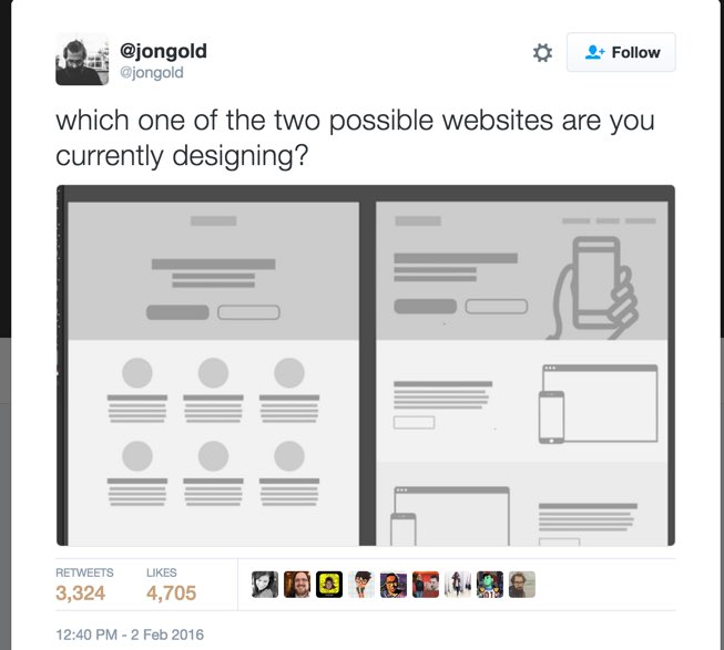
Websites have become complacent. We’ve become boring and predictable in what we do. It’s not surprising that we look the same when we go to the same websites for our inspiration.
We keep waiting for permission :/ Back in the early days, the web was broken anyway, and we didn’t ask for permission to do anything. We tend to look to the big payers to make things ok…
If she could hug a website, she would hug STRIPE’s website. The web is not imploding because they’re using a button that looks like a button!
We’ve been looking at color trends and typography trends from big players like Apple. There’s absolutely zero logic in trying to apply someone else’s branding to our own.
Looking like Apple has become so trendy that there’s a race on creating a purchasable design pack that people can use! We don’t see this as any form of artistic plagiarism which is crazy! If we’re going to go to sites for downloadable elements or artistic things, you should see a red flag. You’re heading into the realms of trend.
Branding is the product of deliberate conception.
Branding is not a pattern library or a mood board. She loves pattern libraries but they have a time and a place.
Our language has become very complex, too.
If you go to Pinterest and search for branding you get some beautiful layouts showing colors and treatments and the name of the font, but they don’t help, because they don’t answer the question of how the phone will be answered, how the tone of voice will sounds, etc.
So how do we stand out in the homogenized space that is the web?
RESEARCH
There is a problem with research in general. We are basing a lot on gut feeling. The design research that is worth doing is accessibility research. The analogy of design research is like jury duty – it only takes one vocal person to throw the whole process off.
Creating a tension in your brand is fairly new, it’s becoming a bit of a trend especially in the advertising world. It’s looking at the tension between two things that haven’t traditionally sat next to each other. Ex: Hamilton, the rapping musical about America’s founding fathers. It’s doing well!
The Facebook Audience Insights Panel is a great place in her opinion to go for market research.
She also likes working with a copywriter when creating a brief for a company. She likes their skill set but also having a bit of distance between herself and the client too when doing this.
What makes up a brand?
“I love that breaking down each part of a company brand opens up a larger discussion of the branding and design.”
Logo Mark – people typically think a logo is a brand, and that redesigning a logo means redesigning a brand. It’s an identifier but not your brand. “An icon should be neutral enough to be able to withstand all kind of cultural or generational shifts” Sean Adams. Also, you should be able to draw a good icon in the sand with your toe. (no source)
Airbnb’s recent redesign is very interesting – they’re actually trying to own a symbol and they want it to be as identifiable as the wifi symbol, and it’s supposed to mean that you’re at a welcoming place.
Typefaces – There’s a concept that a company should actually build up their typeface equity as opposed to changing frequently and going back to trend. Serif type creates drag and forces the eye to slow down, and that sans-serif read smoother. A Book Apart has great typeface equity. We know immediately that when we see a cover with that title and author typography that we are looking at A Book Apart. Spotify and Airbnb are using Circular Sans Pro and are building equity there. Fonts in Use is a great website to go to train your design eye a bit on pairings.
Color Palette – Pantone has just released a CMYK book for designers, and this is a really helpful tool for deciding how to pair color, if you like to actually hold something. We want to ‘own’ a color in our industry, like Tiffany blue, airbnb red (‘Rauch’?). We see color pairings happening all the time and people trying to own those color pairings…
Tone of Voice – Voice & Tone is one of Mailchimp’s sub brands… people often think you have to work with a copywriter to determine the voice and tone of a brand. Sarah thinks it’s more efficient / better to let that come organically from a company and then you can use a copywriter to refine. Dollar Shave club has a casual tone of voice. Sarah can’t tell you how to define it, or what it should be, she can only tell you that you NEED to define tone of voice in your brand.
The Basic Social Ecosystem: Publishing Channels (website, blog, Facebook sometimes), Aspirationsal/Inspirational Channels (optional: Instagram, Tumblr, Pinterest, Snapchat – imagery really), Support Channels (if you don’t have one defined on social media, make one or your users will make it for you), and Followup Channels (content from your publishing channels gets repurposed here). We need to define these as a company or our users / customers will do it for us.
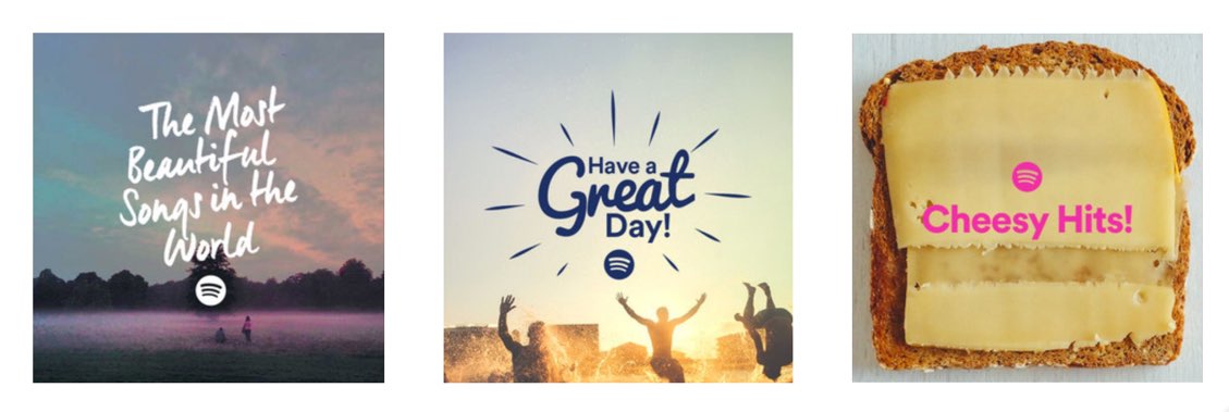
Art Direction – Something we don’t think about a lot with web design. It’s very unusual for a website to have illustrative elements to their brand… Vox stands out in this way – they never use stock photography, and they have illustrative elements even though news moves so quickly. They also do art-directed videos in their articles. This is something else that makes them stand out. Spotify also does very art directed media.
Airbnb actually made the decision to have professional photographers photograph the apartments / spaces, which was a big investment but they decided it was important and had more brand value than the cost.
SPOTIFY:
Company Values – TOMS shoes: we care more about their values than their shoes.
TELL YOUR STORY. The WHY is often where you find your story. Starbucks does a wonderful job of always telling their story and does so throughout the experience in their stores, online, etc.
Layout – Serial is another website that feels different.

Slogans – It’s a love hate thing… she hates them. She doesn’t hear many good ones… most of the things we hear don’t add anything to the brand’s value. For 90% of the companies she works with she finds they’re distractions to the main brand name. It’s a lazy way to communicate what the brand is or does which could be done better with some other method.
_______________________________________
frank body – Case Study
They disclose everything about their coffee scrub (ingredients) meaning the success of their company is 100% branding.
They created attention by using a male persona, called Frank. It’s a distinct tone of voice that they carry through everywhere – on their website, but also they reply to social media comments as Frank. It’s 3 women that are behind this persona.
‘We do a lot of our design work based on gut instinct, feelings or experiences with brands in the past.’ They’re open about the fact that they didn’t do a lot of design research or market research.
They chose a real great typeface called Pitch. Very old school. They chose a neutral color palette. They are quite ballsy in the way they present themselves. They had to change their HERO images actually because people who hadn’t encountered their brand before found them too shocking.. So they did AB testing and user research etc.
They art direct their Instagram account.
______________________________________
PERSONAL BRANDING
Authentic Story-Telling
Art Direction
Social Ecosystem
Personal brands tend to go down one route and do that really well, and don’t even have accounts on other sites.
Ex: Gary Vaynerchuck (@garyvee) – Twitter
Direct Marketers – their personal brands are polished, websites are great, etc. What they’re doing in terms of branding is genius, but their actual products may not be that great, and she kind of hates the people that say ‘here’s how to build a website in a morning.’ (Well fuck, I’m starting to offer that kind of a workshop… at least I’m offering it in person and in high value).
Consistency goes a long way with personal branding. Quantity over Quality applies to Personal Branding. Luke Wroblewski / @lukew has superhuman output, quantity AND quality.
________________________
summary:
FIND YOUR AUTHENTIC STORY in everything you do.
Look into the back history, wipe away old slogans and design constraints.
Before you choose anything, ask yourself WHY. Does it fit your brand? Does it fit what you’re trying to do? Are we just designing just based on trend or what Apple has said is fun this month?
What equity can you start to create from typography, colors or other brand elements? How can you own a color in your category of what you do?
HOW CAN YOU GET YOUR USERS TO CREATE YOUR CONTENT? Is there something you can look to where users can create that content for you like with ‘frank body’.
Create tension by playing with contradictions? Create a visual tension or tension within your brand that becomes interesting.
We need to design each part of the experience with your business – each touch point.


0 Comments