April 4 @ 4:30pm
An Event Apart Seattle 2018
CEO of Customer CareWords
Comes all the way from Dublin, Ireland!
He was a problem child. At Christmas what he wanted was an airport from his parents. Dream big… but he was always disappointed. He’s been in counseling ever since because they never gave him an airport.
A bit ago he was in Gatwick trying to get some free wi-fi, and he realized he had his own airport! The page title said “Your London Airport”!! Plus, he got wi-fi too! What a win!
The button said “Get Online Now!”… with an exclamation point!
He wonders if people who decide web language were actually in charge of the olympics or something… because Now rarely means ‘now’ on the web. It means ‘give me your name and all of your personal information and your firstborn then get what you want.’
He showed examples of what you have to go through to just get free wi-fi at different airports, and all the stupid stuff they show you and ask you:
Marketing design says if you get a cool dude smiling, what they’re looking at would be so compelling that you’ll click on it!
He definitely has a different name for signing up for free stuff, and it’s Miss Example Example.
A link is like a promise. Keep your promises.
If you break your promises, you lose credibility. If links were married they’d mostly be divorced…
Also stop asking stupid questions! Just let me do what I want to do!
And then there’s another image from the department of useless images – two dudes looking at something on a phone.
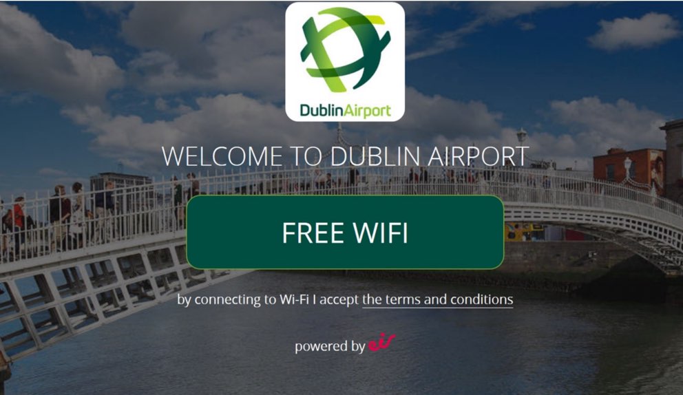
The Dublin Airport just has a button that says get online, and when you click it, you get online!! That’s the way!
Navigational Fidelity
Give people the sense of what distance they need to go to reach the end.
Navigational Momentum
You always want to keep someone moving forward.
When someone is on a page, trust that they want to be on that page. Trust that the person is in the place they want to be. And then it’s your job to keep them moving forward.
With amazon, when you choose musical instruments, the navigation changes and is reduced to only things related to that choice.
If you want to simplify, you must strip away everything that is not connected to the task at hand.
Also, be sure to establish clearly and immediately where they are.
Navigational Unity
Try to create your navigation structure in as unified a way as possible. There’s nothing worse than having a little bit of navigation in one place, a little bit somewhere else, and the rest somewhere else.
This happens by adding little fixes and clusters instead of fixing navigational issues or unclarity.
Tasks are much better than navigational labels. The core things that you offer, bring them together into a single navigational concept. It’s much better for the customer
Navigational Clarity
The labels, the words you use are extremely important. Icons are generally terrible as navigational labels. I mean, what do they even mean?!
If you’re going to have icons, at least have a clear word underneath to give them some sort of understanding.
When Microsoft Outlook was released, they had a bunch of icons but they weren’t used ever! Then they added labels and they started getting used.
Icons DO NOT HELP PEOPLE FIND STUFF. There are only a few universal icons that everyone understands so be very careful about using them.
Having the top tasks available in navigation is a huge huge way to increase engagement. Having top tasks hidden in a hamburger menu decreases engagement in a huge way, lots of data shown to support this.
Editor’s note: ….. and we have officially taken our main nav out of a hamburger menu… *looks around to see if anyone noticed*
Navigational Twins
There’s a problem with the battery of my iPhone. Some people might think “I’ll go to the Apple store home page and then to iPhone (because that’s the thing) and then try to find support for that thing,” some people will think “Oh this is a support issue so I’ll go to the Support page and then go find support for my iPhone there.”
We see these twins constantly repeating. They did a lot of analysis for OECD (Organization for Economic Co-operation and Development)
There tend to be 2 core journeys for every task.
Navigational Minimalism
The closer you get to the destination, the more you should minimize the navigation.
The higher up the structure, the more navigation you will present, because there are no top tasks in this scenario. For example on the Gov.uk homepage there are a ton of tasks. But then as you get to a specific benefit, you strip away all the navigation that is not connected with that task so everything is a forward momentum for that specific task. That is how you’ll maximize task completion – by stripping away all the links that don’t move that person toward executing the task.
You know what happens when you put tiny tasks on the navigation? More tiny tasks come flooding in. That’s not good design, but we do this all the time!
The less time people spend focusing on the navigation and making a click is better. It’s about the destination the navigation will bring you to. So if you’re looking at analytics, you don’t want to see a lot of time spent on the navigation!
We read on the web like we’re coming down an escalator or driving down the road. With too many options, we overload people and they don’t make a good choice.
Navigational Magnetism
You measure a link based on 2 characteristics.
1) Is it getting people to go where you wanted them to go, for the reason it exists?
2) Are people clicking it for stuff that it’s not meant for? Because it’s too vague?
You need to measure not just the positive magnetism, but also it’s dirty magnetism.
You don’t want your link to be a dirty magnet.
Grouping Tasks, how to classify different tasks:
What they found with research is that you can sort up to 35 things maximum into various groups. Sorting these into groups is critical.
Have people involved in the grouping! If you get 15 people to participate in research, you begin to get solid trends in patterns. Ideally you’d have more than 30 people participate, but 15 is good. People are great at grouping but they’re bad at naming them so don’t make them name the groups, just group items.
From all of this data you find, it’s your job to come up with an initial working structure as to how you think the navigation should work.
Handling ‘Orphan links’
You’ll see a lot of grouping, but then occasionally you’ll see an ‘orphan’ that isn’t grouped with other tasks. How do you deal with that orphan task? Well it depends on the importance of its importance. If it’s in the first 50% of the importance scale of the links, it is considered high demand and could stand on its own. If it has low demand it can live underneath something else but you need to know it will be hard to find.
These decisions are based in logic and evidence and rules. You’re much more likely to be listened to if you have evidence based on customer behavior backing up the decisions you’re making.
You can’t make your structure work for everything. Stuff that is low demand just can’t make it into an important place. You can hide them somewhere… life is hard for tiny tasks.
Naming your Groups
Then you can figure out what the overall importance of each GROUP of tasks has, and that helps you decide which order you put the grouped tasks in on the flow of the page (the most important will be top left for example).
Testing your Naming
Once you name your groups, you create a test, asking real people to execute tasks (based on instructions) and you measure the results against your hypotheses for each instruction. So, what do you expect that person to click based on your instruction, and do they actually click that?
You want to have 15-35 instructions in the test to see how the classification system is working with that range of instructions. If you have a small range of instructions you don’t get a true test.
You need to do at least 3 rounds of this. You do the first round, see what’s working and not working, make some changes, and do it again. Small changes can have big impact… changing the order of words can sometimes make a big difference.
Magnetism Score = Average positive impact – Negative impact
51% is actually a good score… it’s not possible to get 100% in this type of scoring.
You need to understand what a link is negatively impacting in the structure.
Overall Results:
What should you aim for? You should aim for at least 80%, but head towards 90% success score as you make changes and retest.
Design for forward momentum
Design for unity
Design for the journeys customers are on, which often involves twins (the object and the subject)
Design for minimalism (Have navigation take up as little space as is practical in each case)
Design for clarity (Be careful with images and icons. Words are always better, and the best words are tasks)
Design for fidelity (a link is a promise, keep your promise)
Design for magnetism – minimize dirty magnetism.
Design the navigation with the customer, not just for the customer.
UNITY
TWINS
MINIMALISM
CLARITY
FIDELITY
MAGNETISM
@gerrymcgovern


 5 page guide • 4 minute read
 5 page guide • 4 minute read

0 Comments