April 4 @ 10:15am
An Event Apart Seattle 2018
She’s one of the people that brought content to our industry as one of the things we should actually care about!
Writing for the web and screens everywhere – she hasn’t talked about this for a very long time… for 15 years or so. She started as a web copywriter in 1998/1999, and since the web was commercialized in 1995, that wasn’t very long after it had ‘become a thing.’
Putting this talk together gave her a tiny bit of PTSD from her time as a web writer. She’d usually get called in at the 11th hour of a project. The design and development would be done and they’d want her to just write the copy to shove in.
Then it would fall on ONE PERSON to catch her up to the 9 months of work that she’d missed, and stuff would be missed etc.
The other thing would happen is a company would ask her for a bid and then they’d be like ‘oh ok but we only have $4 left so Todd will write the copy.’
So she began to insert herself earlier and earlier into the project to avoid the problem, but it was a slow process so she’d come back at the 11th hour and ask for all the stuff but they still didn’t have it.
Content strategy guides the creation, delivery, and governance of useful, usable content.
Content design uses data and evidence to give the audience what they need, when they need it
Editorial component:
- Who is our target audience?
- What is our point of view?
- What brand and legal standards do we nee to comply with?
- What is our voice and tone?
Experience component:
- What are our users’ needs and preferences?
- What does our content ecosystem look like?
- What are our customers’ journeys?
- What formats will our content take?
- How will design pa>erns shape our content across screens?
- What metrics will we use to measure performance?
The foundation of content strategy supports the work that’s being done
Systems design is the process of defining the architecture, modules, and data for a system to satisfy specified requirements.
Structure component:
- How will we organize content for browse-and-find?
- What tags are most intuiAve for users?
- How will we categorize content for efficient management?
- How will we structure our content for future reuse?
- What are the requirements for personalizaAon, dynamic delivery, AI?
Process component:
- How will content move through its lifecycle?
- What tools will we use to create, deliver, and maintain content?
- How and when do we care for our exisAng content?
- Who gets to say “no”?
So what happens when we have the Editorial, Experience, Structure, and Process components but there’s nothing connecting them? Likewise, what happens if we’re missing the Editorial component?
So, if you’re missing a writer, or you don’t have a budget for one, YOU CAN DO THIS!!
We’re going to flex our writing muscles today!
We are going to consider these 5 things as we write:
- Inclusivity – this talks about and considers the people who will be reading your content
- Intent
- Meaning
- Context
- Constraints
Dagwood Bumstead is her persona.
When we make our user personas we make all kinds of assumptions about these ‘people.’
We need to practice INTENTIONAL INCLUSION instead of irresponsible assumptions.
Pay attention to:
- Gender
- Race
- Sexual identity
- Accessibility
How?
- Use non-specific pronouns (like “they”)
- Address the user directly as “you” or “your”
- Avoid gendered nouns wherever you can (“server” vs “waiter” or “waitress”)
- Use acceptable labels for race & ethnicity (get guidance from the members of those groups
- Acknowledge a range of sexual identities and orientations (Avoid exclusive labels and language)
Principles and Guidelines aren’t something you check against AFTER you write. THEY ARE WHAT YOU START WITH.
UNDERSTAND THE TOP TASKS
And then that there can be multiple intents for each task
Top Tasks are a huge driver for content strategy, because they are the things they need to do that our content can serve.
- Don’t use branded language or jargon
- Understand what someone wants to do or accomplish
- Avid product names or groups
- Eliminate overlap
- Avoid lofty concepts and goals (like a button that says ‘Get Inspired’)
- Be concise
Great example: USPS
There is a verb for most of these actions, they could have made it consistent very easily… They used terms like “Informed Delivery” and “Click-N-Ship” that are ‘branded terms’ and instead they could have described them so everyone would easily understand what they meant.
Consider STARTING WITH THE VERB
Let’s look at the site that makes us do things we wouldn’t usually do: Amazon.
When buying something, there are 6 verbs in a very very small space to check out. Well done. IT WOOOORKS.
Moo.com:
When starting to create business cards, they ask for Size, Corners, and a button.
There’s a verb: Choose a size
Then Corners isn’t consistent, it starts with ‘Square’
The button says ‘Start Making’ which she loves. That’s so much more exciting than ‘Next!’
Then the next screen asks you if you want to Use a Template, Design here online, or Upload a full design. They stuck with the verbs which is powerful, it inspires action (instead of just saying “Our Templates,” “Customer Design,” and “Full Design.”
As you’re designing and thinking about functions, think about what the words are going to do to crowd your experience.
She showed a few examples of sign in screens, some of which are simple and easy to use and others which shoved every single possible user action onto the tiny area (bad).
Let’s work to CONTROL OURSELVES.
If the Dashboard you’re able to provide to your user is small, don’t look to fill it with words. Adding filler content is bad. Don’t just fill up a page because you feel like you have to. Only provide the actions and information needed.
Hone in on substance. This is what will help us avoid ‘glamour copy.’
Where do we usually begin defining substance? Usually it’s within our wireframes. We’ve done branding, research, user personas, mapped out our sitemaps, and then we move on to wire framing. But where is the substance? What we have are beautiful boxes!
Or maybe we want to talk about patterns and requirements, but here we have things like “A bold statement about something related to the screen it’s one!”…
Tool to Use: a PAGE TABLE
It can help us bridge the gap between our design/page layout and the actual content that needs to be delivered.
This is a powerful tool that lets us all out the different elements of and objectives of the content itself that gets muddied when we’re only talking about pattern libraries and so on.
Here’s an example:
BAD EXAMPLE: A site that offers online courses / education for businesses. There’s a big statement up top about what they offer. But then RIGHT BELOW THAT THERE IS A ‘WHO WE ARE’ SECTION. Noooobody cares.
While it is tempting for us to start with all the things WE care about and the things WE can do… but we should be filtering our content through that second person lens and use YOU and YOUR! Stop talking about you! NOBODY CARES. BURY THIS IN YOUR WEBSITE.
They may go look into Who You Are if they decide they want to work with you, but first demonstrate your benefits.
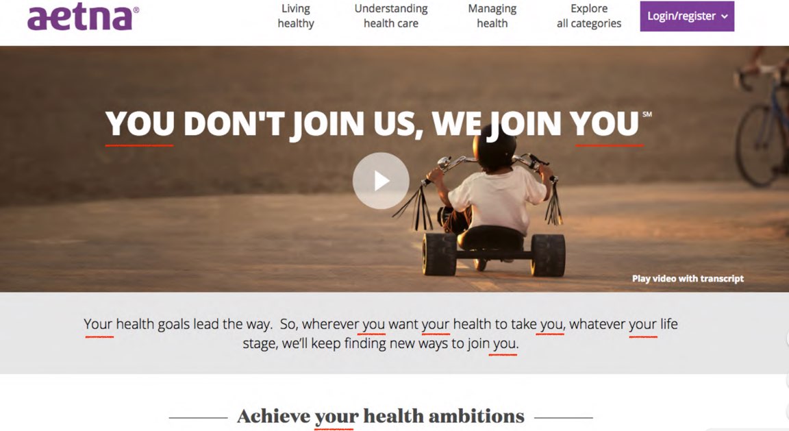
Look at aetna’s website for a GOOD example. Look at all the instances of ‘you’!
Get to the point.
It is easy to write 200 words. It is harder to write 25.
Read it out loud.
If you’re trying to ensure that what you’re writing is comprehensive and makes sense, just read it out loud.
Good example: Trek bikes has a quick summary of information but then below that they have a ‘Why we love it’ section with numbered list items that are concise! This is awesome!
USE THE FORMATTING TOOLS THAT YOU HAVE AT YOUR DISPOSAL TO MAKE THINGS READILY. PLEAAASE.
Use the enter button / line breaks. Use bullet points. Use bold! It can be the difference between making somebody want to cry or let them get on with their day.
Unsuckit.com helps you un-suck your terrible business jargon.
Don’t State the Obvious
Don’t ‘welcome people to your website.’
If you have room for copy it doesn’t mean you have to fill that space with copy.
Context
Where is the user in their journey?
Consider your Voice and Tone
The most important thing to consider is your voice and tone.
Your VOICE is who you are. It’s a reflection of your identity. It does not change. Generally speaking, you can sort of measure out where your voice falls within the brand personality spectrum: is it more professional, more high energy, more fun or serious, etc.
Your TONE is something that changes depending on context.
MailChimp does a great job having various tones for different situations.
- If someone just sent off a campaign they are congratulatory and funny.
- If someone is concerned about legal stuff, they are calm and clear and NOT funny.
- If someone had an error or failure message, they offer a solution and are straightforward, don’t use alarming words, and be serious.
This is one of the most important parts of this entire talk: Really understanding and respecting where people are in their process and using an important tone to interact with them.
One of her least favorite pages on the entire internet:
GET BACK IN THERE – a screen Delta presents after she’s stepped away ‘for too long’ and assumes SHE is the one that’s having a problem.
Their 404 error is LET’S TRY THAT AGAIN. That is super condescending!
Good ones:
Amazon (they show off the dogs of amazon)
MovieTickets says ‘I see dead pages’ (ha!)
Allianz has an entire movie of employees saying sorry for the 404!
If yo have someone that is ‘Captain Editor’, even if that’s not their full-time job, they can make a huge difference in terms of user experience.
We need your content to sound human, because WE NEED PEOPLE TO READ IT! Make yourself a human being to your legal team. You’ve got to find allies and partners and work together to try to get that content humanized.
Brand Requirements
Need to work within those. Make sure they’re detailed enough you can work with them.
Let’s stick with human grammar. Don’t use terms like ‘deprecated’ and use sentence case when it’s appropriate, make sure you don’t have misspelled words and
How to get started?
- Consider Substance
- Practice good hygiene – run your stuff through a spelling checker and have someone give it a once over before you publish
- Sketch with words – start fleshing out your design with ACTUAL, REAL WORDS (Editor’s note: We do this. We sketch out our homepages right away with real headlines and draft copy. It’s super helpful)
NOW YOU CAN DO IT!
@halvorson
Questions:
List items – do you use punctuation?
Answer: If the list is completing a sentence, have appropriate punctuation (within the bullets). If it’s just a list of things, there are no commas and you don’t capitalize. If you have list items of sentences, use capitalization and punctuation.
Do you write all the copy up front and THEN do the wireframe, or is there a dance?
Answer: There is definitely a dance. With the homepage, you’re probably not going to have a ton of body copy anyway, and you’re focused on top tasks and getting people to take action so yes it’s crucial to use real copy there. When you’re dealign with an internal page or an about page that has a lot more body copy, you don’t need all the copy written before the design but it is still important to keep in mind the goal / task desired for that page as you design.


0 Comments