
Sara Soueidan| Author, Codrops CSS Reference
An Event Apart Online Together – Fall Summit 2021
12:30pm Central
Intro: Sara Soueidan is an independent front-end web developer based in Lebanon who works with companies and agencies around the world, helping them build front-end foundations with a strong focus on some design, progressive enhancement, accessibility, and performance using the latest front end and design techniques.
She’s the author of the Codedrop CSS Reference and was awarded in O’Reilly web platform award for “exceptional leadership creativity and collaboration in the development of JavaScript, HTML, CSS, and the supporting web ecosystem.”
Sarah was sadly, unable to record a new talk, due to the dire situation in her home country, but please enjoy this encore performance from Sarah Soueidan.
_______
Hello everyone, my name is Sarah and I’m an independent design engineer. Over the last few years, I’ve made quite a few mistakes and learned quite a few things about building more accessible and inclusive interfaces and products. And in this talk, I want to share some of the most relevant and useful lessons that I’ve learned and share a bunch of tips and tricks with you where they can learn and start using them in your projects right away to make them a little more accessible. But before we dive straight into the meat of this talk, I want to share one of my favorite moments of inspiration with you that I had when I was still starting my journey as a developer of the web.
I entered the world of web development back in 2013. In 2014 the Adobe web platform team were developing a set of new CSS technologies and actively working on pushing them to the browser, that would enable designers and developers to create sophisticated storytelling experiences on the web. Some of those technologies include CSS shapes and exclusions, CSS regions, clipping, and masking Blend modes. Custom CSS filters, also known as CSS shaders and more.
To demonstrate the capabilities of these, then new and upcoming technologies and showcase how they can be used to enhance the user experience on the web, the web platform team wrote a series of articles and created a bunch of demos and applications leveraging these new CSS features. The team created wonderful demos using the technologies that they were working on, and they were all very creative and inspiring, like the demo that you’re seeing here, showcasing how CSS shapes and animations applied on scroll can enhance visual storytelling and create a creative and engaging experience in the browser.
But out of all the demos, one of the most without for me the most. That demo was a web application created in partnership with a food network called Cupcakes. Cupcakes was an iPad app, and the creative team at Adobe decided to bring this application to the web. In addition to using almost all of the CSS features that were in the works: masking, clipping, 3d animations, shapes, and regions, creating a visually pleasing experience. The application was optimized for the context in which it was going to be used. Cooking in the kitchen. The following is a clip from a longer video in which CJ Gammon a creative developer at Adobe demos the application and showcases all the new senses technologies used and in this particular part you’re going to watch now CCJ talks about the more practical features that they added to the application in order to make it more practical.
Watch video here
The application was built with the user in mind, and that’s what made it so feature-rich and so practical. Today, I still remember how incredibly inspired I was when I watched the video, I was fascinated by the possibilities of what could, what I could do and create using web technologies. But the idea that I’d have the ability to use tools we have at our disposal to design and build solutions that serve people and make their lives better. CJ could have created this application using cool modern CSS features without adding that voice and hand gesture support, but the experience wouldn’t have been as inclusive nor as practical. But by doing so we created a more inclusive experience, a more human experience, and above all, a more memorable experience. One so memorable that I still draw inspiration from it today, a little less than 10 years after its creation.
And by the way, navigating your web page using voice commands is actually more common than we think. Sometimes it’s even a necessity for some users. I’ll touch more on that later during the talk.
Unfortunately, today, thinking about people’s needs contexts, abilities, disabilities, and preferences and how we should be creating experiences that work for everyone, often sounds like a burden and creativity killer, but this application is living proof that this doesn’t have to be the case. Oftentimes constraint fuels creativity. I really like the way Microsoft expresses it on the Inclusive Design Reference. A great resource created by Microsoft to encourage and push inclusive design as an approach to creating experiences on the web. It says,
…expanding interactions to become more inclusive and seeing diversity differently: as a dynamic inspiration for creatives.
In order to design inclusive experiences, we need to get familiar with how our users’ use interfaces and consumer content, how users in different contexts and abilities navigate the world. The Cupcake app was an example of a context where the user would have some difficulty touching the screen with their dirty hands. People could be browsing the web and different contexts that affect their ability to navigate and user interfaces. Some people are born with permanent disabilities that fundamentally change the way they perceive the world and the web. Other people might be browsing the web with a temporary disability caused by an accident or a temporary health situation. And there are people who are limited by situational disabilities is like being in a noisy room or in a low lighting condition. Over 1 billion people live with some form of disability, each and every one of us could end up with one form of disability or another at any point. After all,
We’re all just temporarily abled. – Cindy Li
Building inclusive experiences with all the different user contexts and disabilities in mind might feel like a lot of work, and it often is. But as with everything, the more you do it the more efficient you get at doing it and the less of an effort it takes. In this talk, I want to share some tips that are small and fairly easy to implement but can have a big impact on the accessibility and inclusivity of your products. The good news is that you can cover a lot of ground and create far more resilient, inclusive, accessible experiences by starting with a solid foundation and the foundation of every accessible website is semantic HTML.
Semantic HTML is a universal language that all devices accessing the internet understand that there’s a language that you use to communicate your content to these various devices, including but not limited to browsers, reading apps, screen readers, smartwatches, smart refrigerators, cars, and more. (List of all HTML Elements)
HTML by nature is semantic or in other words, or is descriptive and provides meaning each HTML element describes the type of content that it presents. So using semantic HTML essentially means using the correct HTML elements for the correct purpose as much as possible. If you have a heading, use a heading element if you have a paragraph use a <p> tag. By using correct elements your document content will have comparable structure and meaning. A sighted user can get a clear structure of a page by quickly scanning it, they can get a clear idea of which content is the main content which content is complimentary heading, section blocks and whitespace and image sizes are used to indicate the importance. A sighted user can get it clear skeleton of the page just by looking at it. A visually impaired user cannot, they will often rely on screen reading software to convey content and content structure and meaning and screen readers rely on HTML semantics to create a navigation that the user can use to navigate more efficiently.
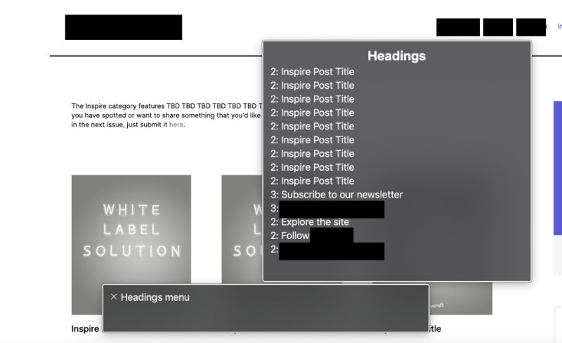
In this talk, I’m demoing how screenreader users specifically VoiceOver on Macro apps can navigate a web page using what is known as a Rotor. The Rotor is like power commands but for screen reader users. It increases their efficiency and facilitates the browsing the web. Inside the Rotor, there are several menus that the user can use to navigate, you have a headings menu that allows you to jump to a particular heading on the page. So the headings menu lists all of the headings and allows you to choose which one you want to jump to. In addition you have other menus, including the landmarks menu which lists all landmarks on the page, like banner, which is the header. You also have the navigation search menu, etc. There are also other menus, including the links menu which contains a list of all of the links on the page, and once again, you can choose to skip to them. There’s also the form controls menu which would contain all the form controls on the page so that the user can also navigate and jump to them.
Using the rotor and if the document is using semantic markup and proper sectioning elements such as header, main, footer, aside, the user can move from one area of the page to another without having to go through the content in each section. And it is very important for them to be able to do so. But the document structure and the rotor is defined by the document structure in your HTML. So if you don’t provide a heading into control and but alter the document hierarchy for screen readers will be affected if you don’t use a landmark it won’t show up on the rotor and the user won’t have the ability to jump to it.
Sounds pretty straightforward. html5 provides sectioning elements and we have headings with heading levels that can be used to define a document structure similar to the visual hierarchy sighted users and get us these elements, and you should be good to go. But things aren’t always as simple as they sound. What if the design spec says they don’t have a heading somewhere, and a sighted user is able to infer page structure from visual elements like spacing for example.
In the project I worked on last year I had a couple of interesting scenarios like these. First, the simplest scenario. I had a few page templates that simply didn’t have any headings associated with the main section of the page. A page listing a series of articles like this one, had a description on top for sighted users, and then the list of articles. The sighted users can tell what the articles are about and how they are related to each other using the description and the content and the header. I put the basic structure of the page, but when I navigate the page using the rotor. In this case I’m using VoiceOver on macroS I noticed two problems, the headings menu included a list of all the headings with no context, starting with a heading level two, skipping the heading level one. There is no clear correlation between these headings that they belong to a specific section or title because that title is missing, and navigating using the landmarks menu and this was in Chrome, I got all the main landmarks looking good, except for the main content area. VoiceOver on Chrome was using the first paragraph of text it found as a label to the main area which is of course very bad. Voice over will need to read the entire paragraph before it announces that this is the main section. Now the fix, in this case, was simple. In both navigations were broken because the main section was missing a heading, says that since the design doesn’t have a visible heading, I added the heading, that’s only exposed to string meters. And we’ll talk about hiding content accessible in the next section, but for now, suffice it to say that this class, the visually hidden class applies styles that hide this piece of text visually while making sure that it’s still accessible by string meters. Adding this heading fixes both the headings, and the landmarks menus and the rotor. Now adding a title to sections where one was missing a straightforward, but then there were also instances where it looked like there was no heading, but then the reality, there was one. Similar to the other templates but also slightly different, where the tag and category page templates. We had a header at the top, a paragraph at the beginning of the page, and then content in the sidebar, and the main area containing a list of articles or resources sharing the same tag or category. Looking at the design I visually divided the main elements on the page into three parts, based on how they would be laid up, so this is a visual representation of a semantic one, this is not code. Now because I was familiar with how screenreader users navigate the page, and because I’ve made a habit of always thinking about the content from a markup and semantics perspective, I knew that navigating the page with the rotor using landmarks and headings something weird was going to happen, and that is because of this little part here, and the heading inside of it. If a user is navigating using headings, this heading will show up on the headings list as “resources tagged with”
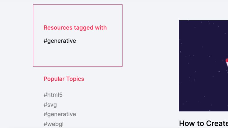
It’s incomplete. Resources tagged with what? Answering this question provides me with the first step to fix the problem at hand, a generator word as part of the heading, even if it is tagged to look like it’s not.
Now that I have the complete heading the next thought was, Okay, so what is this the heading for heading creates an expectation that content will follow it, but in this case, there was no content, not in the sidebar. This heading describes the content on the right, and the main section, it describes a list of articles. These articles on the right are all the resources tagged with generated. In other words this heading should not live in a sidebar, it should be part of the main section of the page. And since it is the main title of the page, it should be marked up as such, we think that it should be a level one heading, even if it is visually styled to look smaller, like an h2 or an h3.
With all that taken into consideration, I visually separated the heading from the sidebar and the resulting markup looks something like this.
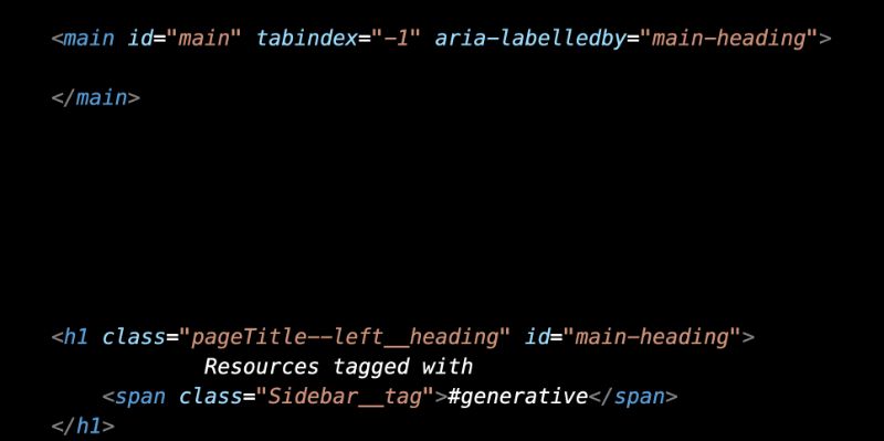
So somewhere in the code. If I remember correctly due to layout requirements, I placed the heading outside of the main element so I needed to let screen readers know that the heading exists elsewhere, by looking at using ARIA label by also ARIA labeled by fix the voiceover bug that I had in Chrome, where the first paragraph was used as a label for the main area. Now when I navigate the page using VoiceOver, the landmarks menu displays all my landmarks properly, and the screen reader associates that heading with the main landmark. And the headings menu displays the proper document structure and hierarchy that demonstrates the relationship between all the articles and the main area and categorizes them under the generative term.
Now, without thinking about the importance of document structure and taking that into account when writing the underlying code of the page, the markup would have been much different and much less accessible.
So the main takeaways from this section are
- Use HTML5 landmarks.
- Provide headings where needed and follow headings order on the page.
- Don’t skip headings. If a heading looks smaller, use the appropriate heading level in the HTML and make it smaller using CSS.
- If a heading is to be visually hidden, provide one for screen reader users.
A survey of screenreader users a few years ago showed that 80% of respondents will use regions to navigate, but they can only do so if you choose to use them instead of wrapping everything in that’s when you don’t use semantic HTML elements or take away your users ability to navigate your content, making it frustrating and inaccessible.
Headings and Landmarks
Now we mentioned earlier that the rotor contains different menus, one for headings landmarks and more. Among those menus is a links menu and a form controls menu. Knowing how it’s printed or user might navigate the page opens up the possibility to optimize our interfaces and improve their user experience even more common design and ecommerce websites is displaying a list of products on a page, each with its own Add to Cart button, allowing the user to quickly add items to their cart.
To demonstrate here is the Chillys bottles website showcasing a list of beautiful reusable bottles each bottle comes with its own Add to Cart button and the view link as you might expect takes you to the product details page if you want to learn more about each bottle. If you navigate this page using voice-over and use the form controls menu, you’ll get a list of all the form controls on the page, including the add to cart buttons. Quickly scanning these buttons you can tell that they provide very little value, as there is no way to tell which product each button corresponds to. How do I know which button I want to go to and press if I don’t know which product that corresponds to. I don’t want to be adding products to the card that I don’t want, right. So I bet you might have already guessed, one way we could improve the navigation, by adding screen reader-only text. So the solution would look something like this, you would add the product name and the middle of a button text so it says “add this particular bottle to cart”, the product name and the buttons, text string. So now when the form controls menu displays the list of buttons each button is clearly labeled to indicate which bottle, it is referring to.
This is a neat and very good solution for screen reader user navigating using Form Controls, but you do not want to do this, because even though it improves the experience for some screen reader users, it excludes users of other assistive technologies and makes these buttons inaccessible to them, and a pain to use. More specifically inserting visually hidden text in the middle of a visible string of text, or visible label on the button prevents the user’s browsing and navigating using voice commands from interacting with a button. A popular example of voice recognition software used to browse the web is Dragon Naturally Speaking, and the software that allows you to use your computer and browse the web using voice commands, such software is useful for a lot of people including but not limited to people with disabilities who can’t use their hands, for example, or power users who want to get things done faster because voice dictation is usually faster than typing. Now seeing it in action is the best way to get a general idea of how it’s used, and therefore how we can improve our interfaces. So to quickly demonstrate how it is used on the web, level X has created a video demo and gets users to fill out a form on a page. This video is a short clip from their video which you can find on YouTube. A quick aside here, when the narrator says go to sleep or wake up. He’s basically pausing a dragon and reactivating it by telling him to sleep and wake up,
As you can see, when a Dragon user wants to select a form control he speaks out the visual label of that control. This is one of many reasons why visual labels are important and user interfaces. So when we have a series of add to cart buttons, a Dragon user will speak the label of the button in order to interact with it. This is why adding text in the middle of the string makes it inaccessible, the content in the middle of the string would break the visible name. The user would be telling Dragon to interact with a button whose label is not what it visually appears to be. Now we still want to improve the experience for screenreader users though, but we can’t insert the product name into the buttons visible label. We cann’t fix the experience for a group of people and end up breaking it for another group challenges like these make you scratch your head and think of alternative solutions, and I like that.
As it turns out, there’s a middle ground here, we can still add the product name for the button improving the screen reader user experience without breaking the visible name of the button by appending it to the end of the button’s name instead of inserting it in the middle. So it looks something like this,
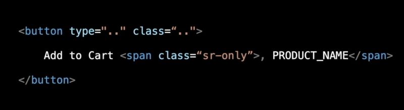
By appending the text to the end of the visible name, the visible name is left intact, and the rotor menu will show a list of “add-to-cart” buttons with the name of the products that they’re referring to. As for voice control users when they say, click Add to Cart Dragon is going to label the buttons that start with a cart. It’s going to label them with numbers like we saw with the checkbox and radio button examples in the video, and then the user can speak out the number of the buttons that they want to click the sports because the man’s work by saying the name of the input they want to interact with, as long as the name is not broken in the markup.
So a good rule of thumb is, whenever adding additional information to a visible label, it must come after what’s visually present.
Inclusively Hiding & Styling Checkboxes and Radio Buttons
Here is Sara’s blog for this next section
Accessible Icon Buttons
Here is Sara’s blog for the next section
Optimizing keyboard navigation using tabindex and ARIA
Here is Sara’s blog for this section
The above links are a shortcut to the full articles pages. In an effort to not create additional virtual waste, we are opting to simply add the links she has provided. You can find her beautifully illustrated Case Studies there.
People come in different colors, ages sizes, backgrounds, abilities and disabilities, and contexts, and this diversity is beautiful, motivating, and inspiring. As web designers and developers, we have the chance to create a world that is inclusive of everyone. We have the responsibility to build a web app that does not exclude anyone. As you saw throughout this talk, more often than not, it takes a little bit of dev effort to create more inclusive, accessible experiences. I hope this talk has inspired you to approach building interfaces with a more observing eye, and more creative and positive attitude, and a little curiosity to learn more about your users, and inspiration to vote for the people of the world wide web.
Thank you 💁
@SaraSoueidan | https://sarasoueidan.com


The agile approach generally works perfectly in development environments and it is easier to report as well.