
Eric Meyer | Author, “CSS: The Definitive Guide”
An Event Apart Online Together – Fall Summit 2021
2:30pm Central
Intro: Eric Meyer has been a burger flipper, college webmaster, one of the original CSS Samurai, a member of The Citizens, group of consultants, consultants, and trainers, and a standards evangelist at Netscape. Currently, he is a developer advocate and Igalia, and co-founder of an event apart with Jeffery Zeldman. Among other things, Eric and co-wrote Designed for Real-Life for A Book Apart and CSS: The Definitive Guide.
And Finally, he created the first official Web Platform Test suite and assisted in the creation of microformats. He lives with his family in Cleveland, Ohio, which is a much nicer city than you’ve probably heard. He enjoys a good meal whenever he can. And he finds referring to himself in the third person to be deeply uncomfortable. Please welcome Eric Meyer.
Hi there. I’m Eric Meyer. And today I’m going to be talking about CSS. And as it says here on the slide, Dsign In The Background, by which I mean, not design pushed into the background where we don’t see it anymore, or design de-emphasize necessarily, but using the backgrounds of elements to practice designed to do complicated and sophisticated design, or at least what I hope seems like sophisticated design for at least some of these examples. And in these examples, for most of them, I’m going to be using my own personal website meyerweb.com. In part because it’s the design that I know the best. Design is a lot of background, background, images of various kinds, background PNGs, background gradients, layering on top of each other in a given element in order to create certain effects. And some of those effects are quite varied. And in some ways out of this entire design the most complicated, but also, in some ways, the easiest to understand the backgrounds that I put on the body element itself.
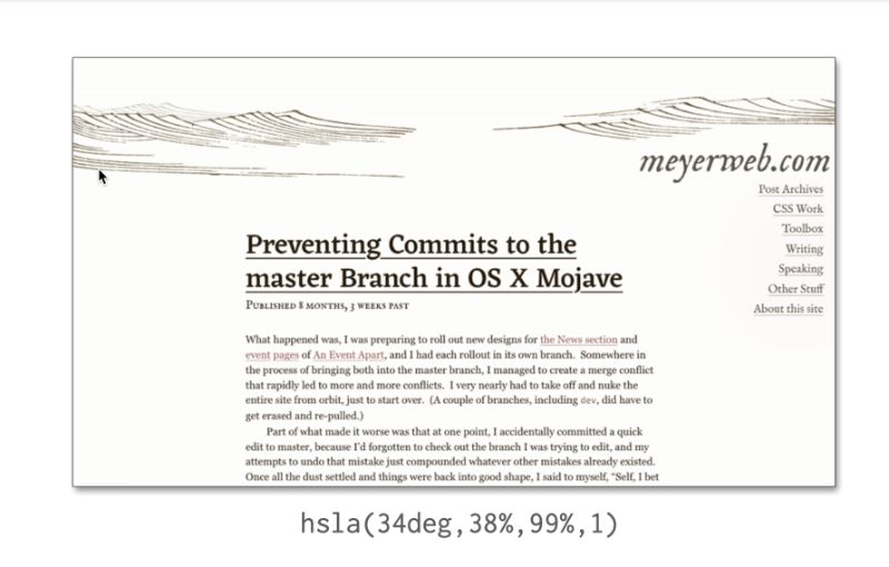
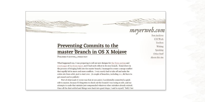 Here’s what that looks like. Now, if you concentrate on the page background itself, take that background away. Leave it with no background, well, I mean, the default white background that the browser puts out, because that’s the way my browser is configured. But other than that, other than sort of the canvas background, there’s no background on the body of this page at the moment. And the first step comes last. Or the last step comes first, the last layer comes first, a solid color. Because when you have multiple background layers, as many of you may know, the bottom layer, the last layer in your CSS is the only one that can be a solid color, you can have a solid color, background layers above that sort of bottom-most last layer, even if they’re translucent doesn’t matter. If you just want to specify a color, it’s got to be down here. So I have this, this HSL alpha value, I used alpha for whatever reason, even though I knew that I was going to have an alpha one. But you know, who knows, maybe at some point, it might decide to darken up rich in the color with that change the alpha.
 So I just use hsla. And then just above that, I have a title background image. And then just before that, next layer up, I have that exact same image also title, but with a different origin. So your combine, you get this repeated pattern that glows behind the navigation links over there on the right side, that’s actually a radial background on an element, I can have time to explore it in today’s talk. But if that element which leaves out there’s just a radial gradient that starts at a certain point near the center, not exactly on the center, and then it fades out from the page, the page’s background is the same color. It does that so that no matter what those links, scroll over because they’re fixed position. Whatever scrolls underneath, they’ll still be legible. Anyway, down here at the bottom of the page, I decided to have a visual transition for you guys. You know I have this, these two layers of repeated background image that have been offset in such a way that they it looks kind of organic, and if you study it closely, you can find that repeat sure, but it’s kind of organic feel to Whichever you would like. So down here, I wanted to have a visual transition.
So I have an upward pointing gradient, which starts above the visible portion of the footer and then fades out over almost 20. And then those values are 23 hour, although at first it was 23, and basically pointing straight up to planning zero degrees. So the gradients gonna start from the bottom. And I picked 23, because that’s basically the visual height of the footer, and then it fades out over almost 20m. I came to that interval from 23 to 42m. through experimentation, I didn’t, you know, sit down to say, Oh, I wanted to go from here to here. Basically, I threw in a couple of numbers, maybe 23 and 33, or 23 and 50. I don’t even remember when it started with. But then I opened it and open up the value and web inspector in Firefox in this case, and just started using the arrow keys to move those values up and down until I finally got to a,” Yeah, that looks right.” Because that’s a really quick way to sort of go through possibilities and say, “This is so good”. “Okay, this is good?” I just step it up using an arrow key? “Okay, it feels like I’ve got a little too far. Let me back at off one,” and still a little too much backing off again. that’s starting to feel about right, we back it up. One more. Okay, that was a little that was too far. The other way, I’ll go back up. This is where it’s gonna be. I could have experimented with decimals, but it just didn’t I just use full amps. Because, you know, I wasn’t, wasn’t trying to get things down to precise pixels. Like I’m not practicing pixel-perfect design here. Because, in part, because that’s just not kind of the way that I think about artistic design. And also, it’s the web, nothing’s pixel perfect. You can’t be there’s always going to be some situation where your exact pixel alignment gets thrown off, because you didn’t think of something or whatever. You will always have to remember that our rules are “suggestions,” right? We’re not absolutely directing exactly what it will look like in every single circumstance, it’s always a suggestion like his strong suggestion might be a suggestion that browsers 99.9% of the time follow, but still a suggestion.
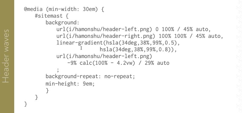
 Anyway, back to this back to the body, here. So again, I’ve got that if you look here, there’s that solid color at the bottom. And the next two levels up and I see layers are those waves. And above that, I have this gradient whose sole purpose is to provide a feed a transition into the footer area. And I did a similar approach for the masthead. But notice it’s not quite the same, right, the footer was pointing straight up at zero degrees. This is not pointing straight down at 180 degrees, just a little bit off, it’s 179 degrees, which again, I arrived at through experimentation. But like here it is at 180 degrees right and notice where it lands on the where it almost looks like a baseline in a way and how it sticks right along the bottom of the wave there. It wasn’t quite what I wanted, I wanted a little bit of overlap I knew that I didn’t want the straight 180 degree. I wanted tilted a little bit a bit tilted so that I got a little bit of overlap like this where you know it’s a more organic field that the waves intrude a little bit up to the wire web.com text but it’s still gonna be you know, very legible even if I didn’t take these waves and fade them out and the body background and stick weight along the bottom of that wave in the in the header. they overlap just a little bit. Again, there’s that organic feel. Yeah, I felt like 179 degrees by starting at 180 degrees and then 179? 178? Right, then I’ve clearly got too far. Let me back it up. 179 feels right to me. And again I could have got down into fractions I could have tried you know held down a modifier 179.8/179.9. I didn’t feel like going that far into it, but I could have anyway.
 So I have my header and my footer, their max scale. And I have my body background. But as you can see here, the text is a little difficult to read because of body background. So I need to fade it out. Some of those waves, put a gradient, which is too complicated to show the code here, right, you will see it in an upcoming slide where I summarize all of this. But it’s it’s complicated enough that I didn’t really have to put it below here. It’s also very subtle. So let me make it less subtle by lowering the likeness of all of the HSL colors that are being used. And there’s that radial gradient again, anyway, looking at this body background, which is now much darker, you can see if you look closely that it’s a radial gradient that goes from one side to the other, basically, from left to right. In the center of the design, it’s fully open. to either side of it, it’s not fully opaque, you can see those waves back here, right? Let’s see that wave pattern. And then on the edges of the screen, I went to gray. Because what I was looking for was this effect, were right in the middle, where that opaque color is now that I flipped it back up.
 There’s you can’t see the title, the waves behind the text, and then it’s sort of the what are normally going to be the gutters, as important that the whitespace to either side, you can see that, but that out on the edges of the page, it’s a little shaded, right, because I’m going for a parchment feeling like for parchment paper, something like I say organic where maybe to the sides, there’s a little bit of a vignette effect, or the pages are curling away a little bit, so the light values are gonna change. I did experiment with some more obvious attempts to make it look like there were changes in late value. And on one side, it was shaded on the other side, it was like a brighter color. And it started to feel like web 2.5 color, double pipe with a top-left spotlight shining on them so that they’re highlighted on one side and shaded on the other. That’s what they started to feel like wasn’t what I was going for at all. And the end of that I just said to myself, I just seen it on both sides to see how that works. And I liked the feel of it. So I went with it.
So there’s one last talk radio at the top of the sheet and the message a little more. This is how I started. This is actually an early color choice that I ended up liking quite a bit. Because again, I was going for that sort of yellow parchment look. But this just felt like too much. So I laid it up. And this is the result. At the top left and right corners, there’s actually a subtle, but I thought pleasing effect where that masthead shade and those two sheets along the side edges lay over each other. And they blend together the positive and give a nice effect, I thought more paper in life than like a computer.
So with all of that together, let’s review how this all works. So going through the layers again, First, there’s a solid color. And then there’s a two tiled image and more than two tiled layers in the same image at the top the bottom gradient on the top gradient. That means side-to-side radiant, last top shading. And that’s it. But if you want to see all that in 3d, then here’s how they stack up. And yes, both the slide and the previous slide are movies that are recorded of HTML and CSS animations, including this one, right? So you can see from top to bottom, that it goes through all the various gradients and titled waves, images, and then the solid color at the bottom. And here’s the code to do all of that.
 It might look complex, but honestly, most of the complexity here is the gradient syntax. If we took that out, it’s you know, background linear gradient at the top of the next linear-gradient, linear-gradient, linear-gradient, then two URL layers and then the color. Okay. And because I have these more complicated gradients, particularly the one that goes from side to side and masks out the images, we get, you know, this. The syntax can be daunting. Absolutely. This is why linear gradient generator sites exist on the web. I mean, I wrote these by hand but because I’ve spent so much time working by hand. I’ve just gotten used to it.
But if you look at this, this actually is pretty compact for a text description of images and yes, gradients and backgrounds are images every bit as much SVGs or PNGs. Just here they’re described using CSS syntax instead of an XML syntax SVGs are more binary for PNGs.
Now before we go any further, I want to make it clear, I did not create this artwork that I’ve been using. I got it from a public domain copy of this 1903, I believe operation Japanese artist, I will attempt to pronounce it apologize, but Hamonshu is three volumes of water studies. And some of them are quite exquisite. This is one of the pages inside.
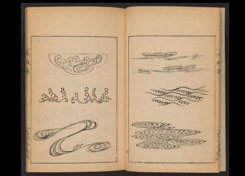 Here’s another where this artist just sketched water and sketched a light on water, which is what I believe the top right?
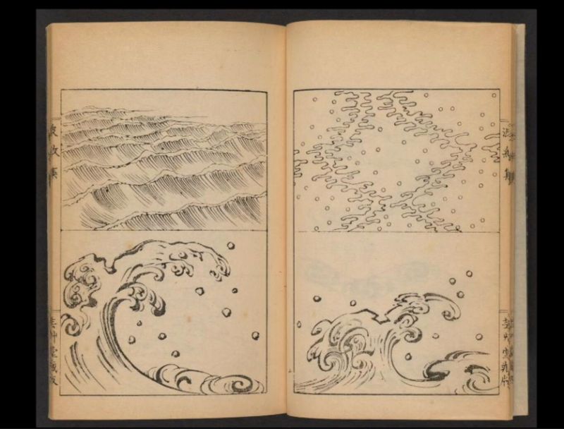 Image here is supposed to be showing is the way that light can reflect off the water. But you also have a series of waves and he has these smaller, tiny wave studies or, or even currents and eddies. And their legacy, there are three volumes of this, these are just the pictures I took from the first volume. But all three volumes were just really spoken to me and I just loved it.
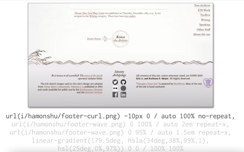
You can find it on the Internet Archive, it’s made possible through the Internet Archive and the Smithsonian. The scans are much higher in resolution than I’m showing here. I can really zoom in really close and get super high fidelity images, I even consider converting some of them to SVG. And at the end, I decided now let’s stick with what we have here. But who knows, maybe someday I’ll go back and convert some of them to SVG. And then have a little more control of them. But anyway, so let me move on. Let’s talk about the footer, which has some waves going across it, you might have noticed that earlier. And here’s what it looks like what we call it the element box of the footer, I’m using the Firefox inspector here, you can see that there’s an element box that has a certain pixel size, the pixel size doesn’t actually matter to me that much, because almost everything that I sized in this entire design was absorbed or something relative. But Firefox, as with most web inspectors will tell you, hey, here’s how many pixels This is rendering as right now, down to the sub pixel. Here’s the name of it. And here’s what the here’s the only box content, some margin. Cool. And here’s just the before pseudo-element that’s part of that footer. What I did here was just for this week part, I decided to create a before pseudo-element so that the footer itself could have our content. Rather than setting up like a really big beheading at the top, or whatever, I wanted to use a before element so that content, like the main content, has this radio, UNC makes sort of things darker as you go down through the footer. And then above that, I generated a box and I gave the box the size and I put some stuff on to it. So if we take it away, remove it. Here’s where we have her footer. It’s not terrible, right? because it’d be perfectly fine as it is. But you know what, I’m more. So I had a more. So at the bottom of this pseudo-element, once again, I added a subtle shade ingredient leaning down towards the footer body. And you might remember, I had a mask already on the body. It’s in this area. Well, I layered this sheet on top and it’s a really subtle effect. It’s very hard to convey through a slide like this, but it is there. And I did like the way that I felt and again, here was a situation where if you remember that, that cranium on the body was at zero degrees, so it’s pointing straight up, but this one, I’m shooting it downwards, and I turned it just half a degree. And yes again, found that through experimentation Just turn it a little bit so that there would be a little bit more seating to one side than the other. Why? Because it looked, it looked good. And it was, as I was playing around with the various looks, I thought, let me try this. Yeah, like that. I’m going to keep it anyway. So I took an image, just a single, like, simple image. I believe it’s three waves but before and then repeated it along the x axis, right? So rather than having this huge, like this huge, wide image trial and error, that’s where responsively that had the effect. So it’s also 29% of its height as part of scale to preserve its aspect ratio. Right.
So on the other side, I have a different image wave. But it’s pinned to the bottom right corner of the header. And it’s a 45%. Back to the left, but another copy of the same wave image I used before, but it’s bigger, it’s pinned into the bottom left corner was 45% or so is that possibility 10% of the work therapy, the weight, so viewport sizes where, where it feels like both waves can exist, they never come together, but they can move apart as they get bigger. They’re always scaled. I really like that effect. And it really helps with responsiveness. And then, between that smaller waves image on the left, which is the larger one, I threw out a transmissive cranium, right, right in the middle of the background stuff, which fades out that small wave makes it look like it’s further in the distance. I might have overdone it here. But maybe if I had more color, maybe if I made it a little more translucent. There might have been better, I’m not sure. But it’s the effect that I’ve landed on. And here’s that left wavy image with a black background. So you can see which parts of the image are opaque and which aren’t right, so I used some actual image capacity, just a little bit in the top left, maybe we should follow further. Regardless, this is how I was able to have the images layer on top of each other, and have the one in front and really block out the one behind it. So that it does not get this illusion of depth. And I think it works as a declaration. Again, sometimes I look at that way back, I wasn’t going for a foggy morning, I was just going for a little further away. So you know, maybe a little more translucent, but easy enough to do, I can literally go open up my site on a web browser and start messing with the opacity or 25 values that I really like. Anyway, there’s more to it than I show, although there’s much in it. I didn’t mention this, right, this is the basic background stuff that is applied to mobile sizes by style mostly. First, there’s a wave in on the left, and there’s just the one. And then here’s the layer background, this used to desktop sizes where when you get out for all of the images come in in a linear gradient that sort of sheets apart from each other, this is what you get. So backgrounds don’t have to be this complicated. Okay, just to be clear, and just the letter to you could create a more stylish separator.
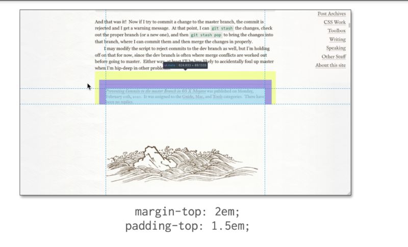
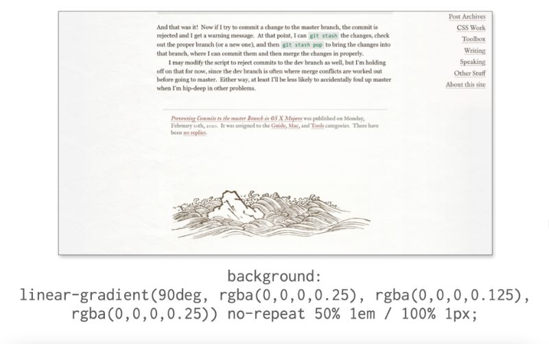
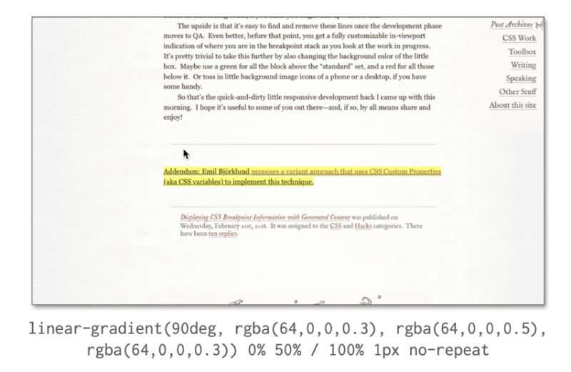
So here’s the separator that goes sort of between the above the body of each post, and then just above what I think it was the metadata where it talks about, you know when it was published and which categories it’s in and how many replies there have been, sadly, the replies to this one. But that’s how it goes sometimes. And here’s what that element looks like. There’s the content and then the padding and the margin. And this separator is in the padding. One and a half. That’s that here It isn’t one pixel tall is what it looks like. It goes 90 degrees and has this RGB a color and what’s RGBA here for who knows, woke up that morning in an RGBA moving as I went from point two five, opacity to one to five, back to point two, five. That’s it. That’s the whole separator. But it fades from dark to light and then back to dark. I could invert those. It goes from light to dark in the back to light, always layers on top of whatever’s in the background. So that there’s that sort of feeling of cohesion. It’s not just like, Oh, I drew a line here. It’s almost like here’s a line. That’s been heard of this page that, you know, it’s an impression baby to avoid and go for the full drop shadow effect.
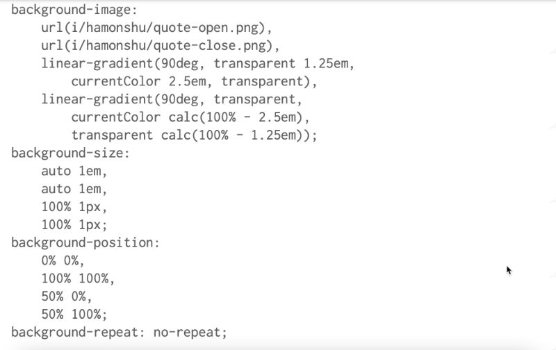
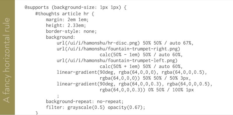 We can take that same sort of thing and get fancier, right? Let’s do a fancy rule, because they don’t have to be simple. It can’t be complex. That’s once based on an HR element, which I’ve shown here without any extra sales, okay? So rather than trying to drop this fancy separator on only specific elements, like I did with that metadata separator, here, it’s like anytime I want a horse on a roll in a blog post or whatever, I just drop it in HR, that’s it. Here I have a job with any with no author styles whatsoever. Remember an HR element. So you can size it, and margins and you can put anything else to relate it’s basically a box of zero height as a border around zero, then you’ve got an element box. So if I turn off the border, the rule visually goes away and leaves us with a blank background to play with. So I did a one-pixel gradient that fades towards the sides remember, better data want to actually go, it fades towards the center, and then becomes a beggar to get here. It’s more of concentric, less opaque on the sides. And then on top of that, I put a thicker gradient. The first one was one pixel tall, this one’s three pixels tall, but it fades out more quickly. The overall effect is a single line thicker, in the center, it gets thinner towards the edges, which are really dark. And then I added a couple of images similar to the way that I added the left and right waves in-person position to effectively to the center and then pushed away from each other using these calc constituents one is pushed to the left one is whenever the other one gets pushed to the right plus one. There you go. And then one more in the middle. I put in this little circular guy. Now all the chores are extra fancy. And you know, yeah, sometimes I look at these, I think was that extra one in the middle too much. But the thing is, if I ever decide it’s too much, it’s that you know how much you HR def does dumb kanji, I could just remove that layer. And it’d be fine, right. And again, I have a filter added here, which we didn’t talk about before, I added this filter to make it a little more washed out and faded. So it looks a little more like something from an old book. But this is, you know, three images, two linear gradients, I didn’t even set a background color. So it defaults to transparent, I could have put a transparent explicitly. And as I was formatting the slide, I realized that this code can be a bit simpler, just look at all those images. That includes the gradients, let’s say no-repeat, I can just take all of those out here and add a single line to cover all the repeats with a single property right. So I can leave them as the default, repeat in the background shorthand, but then at the background repeat, no-repeat, which basically means all of those, all those images should not be repeated.
 So good place to use a feature query. You’re the only browser that supports background sizes highly likely to support everything I have in here with the possible exception of the filter, which is super key to the rules appearance, and just it was a nice little dollop.
So I said okay, if you support backdrop size, one px grid, do all this stuff. So any browser that doesn’t just gets a standard horse on a roll. And that’s fine. And I might add a little bit of extra stuff where I say all the HR should have top-bottom margins before this supports and then add supports background-size kicks in, and then changes the margins in some way.
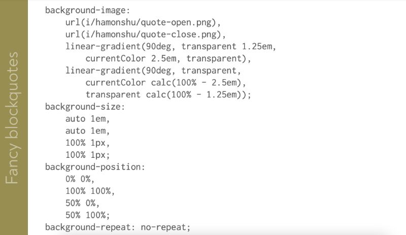
So I also use these techniques for Block Groups because I do have block quotes occasionally. So another way of combining images, great clients. That doesn’t take a super long time to explain that this point. There’s one image in the top left, which is the open quotes. There’s another one in the bottom right, just like close quotes, and then there’s radiant light across the top that feeds out. Here the invention for that food spectrum and you’re connected to that bottom. It’s faded out here to coated straight away from him. And that’s what the blackboards look like. Right? What I like about this is that if the images fail to load for some reason, the style still looks kind of interesting. I take it and this is the code This is it. I use the current color here. If you look at the linear gradients because I wanted the color of the gradient lines always to come from that text color blockquote. So if I have a blockquote that I decide to stop, dark red if for some reason, so really want it to stand out. The gradients will be red-hued, with quotes, images won’t be it is one drawback here. So I would have to be careful with that. But I might decide in this situation, Okay, this one I really want to stand out, I’ll either load new images, or I’ll just take away the images and I’ll rely on the previous meaning a different color along with the text that will help them stand out and you know, the reader probably won’t miss it that much. If there’s no quote evidence, a lot of ways to play with this for you would be super cool. If I could, like color, just those image Isn’t there are probably ways to do it but I didn’t go far enough to figure them out here. If anyone comes up with a way to do that, be super interested to know I suppose.
The whole thing you know, I can see pros and cons If anyone comes up with a way to style Just the images tend to be here. So Get in touch. Let me know anyway There’s also The ability to use math Skip we saw this a little bit before I’m going to use it again here. So I almost never Hi In my blog post Nearly Every post I’ve ever written in the last 20 years, sorry, 21 years, is just whatever it is the posted goes on the homepage or the archive page, whatever there was this one. So what the heck, I’ll make them fit. Get some pixel top ratings except they’re not actually really gradient stuff. They’re solid colors, but it’s a really easy way to make this sort of thing happen. Yeah, and you know, borders are also a thing where, but if I had done borders here that they would have followed them around on the sides. I didn’t want that to happen, I wanted them to only be able to top the bottom so when you’re agreeing to spend sounds, and then I added these images.
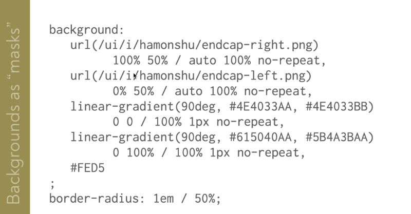
Okay, so let’s talk about these images. Let’s look at these more closely. Here are actually the two images it’s not just one image is two images that are split apart. With black background. You can see what I did with them. I actually did the basket on the sides. Remember, as he did with that wave. Imagine the header. So using the page background, I filled in opaque parts of those. Make the rest translucent, and then when I stick those in, as long as I’m careful, they fit in fit. They fit With the public itself sort of mask out what’s behind it but only just just just a little bit. It’s hard to see if you really closely you can see what I’m asking is happening but it’s hard to find that here, they are inverted. Right?
So I snuck these Images basically inside the browser Do you have the backgrounds. Using data border-radius. It all worked out. Here’s the code
What’s up To PNGs or to linear gradients of background color which used to stand out a little bit, but I didn’t want to. But just in terms of the background and how that works, so how moving away. This is not something I did. I’m gonna try I want to move away from My own site here.
Additional Backgrounds:
Here’s what for example, you may have seen this before. Not it’s a piece of artwork that is constructed. entirely of HTML and CSS. This is really mind-boggling part was not written by me.
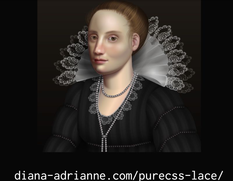
https://diana-adrianne.com/purecss-lace/
Really just stunning effort and artistry happening here. a surprising amount of it is created with border-radius and 3d transforms, but some of it is done with backgrounds. I want you to keep an eye on that. I strongly recommend you go to this dive into the CSS with your web inspector. Just see how these various bits are doing. It gets complicated but if you focus on one specific element because there is a lot of help as you figure out how it’s created. Huge learning experience. I learned while looking at some of this stuff.
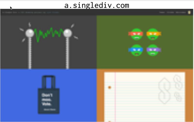
If you’d like to see much less complicated, still very inventive. Just to give you a background. So pretty much anytime you see single element artwork like this, like a single div itself with a lot of backgrounds because as I’ve shown You have effectively an infinite number of background images on a given element. And you could also generate before and after pseudo-elements to get more boxes. So every single one of these pieces are at a.singlediv.com. The Ninja Turtles for example.
 It’s not For us, it’s What This page goes on for a really long time Which I think addresses a question. I sometimes Which is How is the performance with backgrounds This is pretty good this little page Doesn’t really slam my laptop CP And my laptop is here. In early 2013 you want to be careful of bubble gum. So, the nice thing is, of course, you can simplifier remove backgrounds with media queries, but in a mobile context you do need to be careful because you never know how old a device is. You don’t know how many backgrounds, gradients, that sort of thing can be someone’s mobile device CPU will drain your battery as you saw with my design.
The header there are fewer budget is actually At least at one point that simplification of the whole page. Background there probably needs to be more It is one of the things that this talk is for My name is But anyway, this is where Firefox is full screen shot command 10th 1000 pixels in height which was about a quarter of the total page length, but it’s also good places Because I really like this licorice example. It’s a very clever pattern. An optical illusion.
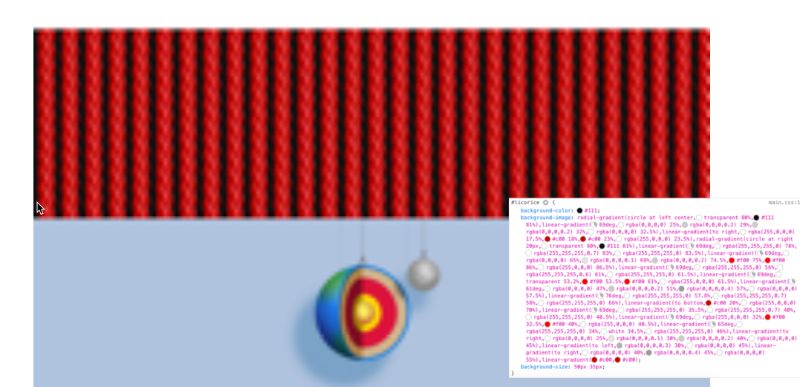
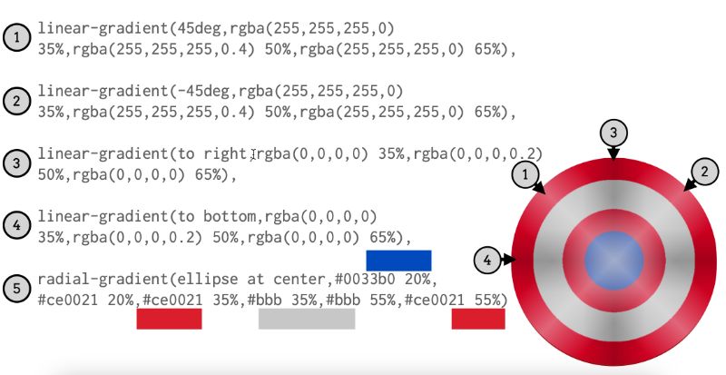
All in one. Here’s the CSS for that div. Don’t worry, I’m not gonna walk through step by step, okay? All I’m going to do is disable the background size. And that’s what happens when the licorice pattern is blown up to quote-unquote full size. Right and then Want to set it back to 50 by 35 pixels. It repeats in the usual CSS manner. I really love it. It looks like these liquor, sternum straps are all tilted or something It’s totally an optical illusion. Every single one of the constraints is perfectly vertical You can check the left and right go straight up. To look at just the element you See you Got to like this example from the bottom of blue made the star is generated Content before Sumo It’s literally just a star Drew and the shot The water below the shield is after pseudo-element So we take that way as well as the background fill color, we get just the sheer Which I think is built, textured, using just five background images. Here they are first you’ve got the highlights. You have the two others a radial gradient and creates the rest of the shield.
It’s simple, but it’s super effective. And there are so many more examples of the links page. I mean literally hundreds. These are very few of my favorites.
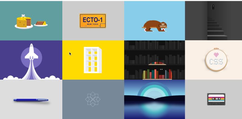
Some of them are even animated because background images can in fact be animated in terms of size position but Here’s something a little more appropriate for the upcoming spooky holiday. And here’s another one that’s appropriate for the holiday. We have coming up with the end of the year again Each of these is a single day of a bunch of backgrounds some of which reanimated So You know, I’ve talked about how Crowds keep us calm. Computers have layers. We don’t always have to be All right. You can just have one or two later. And that can be enough where you can have five layers like we saw with the Captain America shield. Are you going to have seven or eight or 50?
If you want background layers all coming together to create these various effects. What I like about them Sort of like I said at the top, okay, okay, integrated
Let’s talk real quick about them. Is that you’re doing opposite sign-on. Add a single element in a single element. You think the content or you don’t have to have 16 rapper dues Just to make this work, you just need the one
Even if the decorations don’t load, you still have a decent layout. And when they do load, they look really, really nice they can look really fantastic and there’s just So much further that these can be taken without necessarily having to be Super, super complicated In terms of how they’re put together, it just takes cleverness how you Combined things you know, as lifted with Captain America shield or you know with the spooky library, or whatever those are called. There’s just so much that can be done with backgrounds.
Thank you very much for your time and your attention.
Eric Meyer| Design in the Background
meyerweb.com
@meyerweb


0 Comments