
Rachel Andrew | Staff technical writer, Google
An Event Apart Online Together – Fall Summit 2021
12:30pm Central
Intro: Rachel Andrews has been working on the web, since 1996, and writing about the web for almost as long as she’s a front and backend web developer, speaker, and author or co-author of 22 books, including the new CSS layout, and she’s a regular contributor to a number of publications both on and offline.
Rachel is a member of the CSS working group, where she edits in the multi-column page flows and specifications. Rachel currently works at Google as a technical author, and she agreed to step in last minute when another speaker had to cancel. Please welcome Rachel Andrews.
For whatever reason, it’s become fashionable to announce to the world that you don’t understand CSS in a proud sort of way as if it demonstrates that your brain is far too busy with important things to bother itself and sort of trivial things as a language that controls how everything looks on the web. And I’m kind of tired of being a CSS apologist because at this point, Anyone who claims that CSS is some kind of wild unstructured language with no rules. It’s just not learned CSS.
And that’s not to say that learning CSS is always easy. I ever saw often people try to learn by cobbling together task-based snippets, rather than figuring out why and how things actually work. A bit of time spent understanding some core things about the language will save you a lot of time later on. So that’s what this talk is about. Unpacking some common points of confusion, and rather than showing you some copy and paste code, explaining why these things work, as they did.
And what I would say, is listen to the bits you think you already know CSS in particular, is where folks who’ve been doing web stuff for years carry the practices of web browser just passed into the work they’re doing now, things that made sense because of some bug and some browsers in 2005, and it still shows up in our code and I’m talking to myself as much as anybody else.
My favorite example of this was the chunk of code, known as the net scope resize fix.
function MM_reloadPage(init) { //reloads the window if Nav4 resized if (init==true) with (navigator) {if ((appName==”Netscape”)&&(parseIn t(appVersion)==4)) { document.MM_pgW=innerWidth; document.MM_pgH=innerHeight; onresize=MM_reloadPage; }} else if (innerWidth!=document.MM_pgW || innerHeight!=document.MM_pgH) location.reload() ; } MM_reloadPage(true);
The name came from Dreamweavers naming of the chunk of code, it basically reloaded your browser window on resize. The reason we had to do that was Nicky was CSS positioning, and the user was using Netscape before they resize their browser window. All the prepositions items would stack up top left and will require reload to put them back where they should be which is what the JavaScript was basically doing.
This is an easy to spot and fairly major example but we all do things because of some bug we remember from someone’s browser without ever checking seems to be an issue anymore. And if you couple that with the fact that CSS has evolved that certain things have been clarified, there can be a lot to learn and those things that you can think of as the basics of the language so it’s worth a periodic revisit.
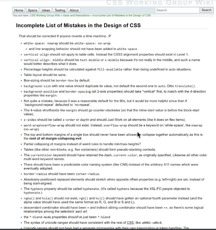
It’s true! Some things in CSS have weird names, strange casing, and odd rules.
I’m going to get two things out of the way at the start, yes there are some bits of CSS that have weird names, weird casing, and odd rules, almost all of those come down to one fact, we can’t break away. So sometimes when you ask why is this like that. The answer is because history. Here is a whole list of things that the CSS working group would like to change but can’t unless time travel is invented so you can always check here and see if that thing you think is weird, the CSS working group also thinks is weird. The other thing really is that naming things is just really really hard, especially when a lot of things in CSS, kind of relate to some other construct, perhaps in traditional graphic design, but not quite, because the web is different. Add to that the fact that web is international, and some things that might seem like a really good idea, is naming for English speakers, just don’t make any sense elsewhere. So sometimes you do have to learn what something’s called, even if you think it’s hard. And the web being international is a really good place to start.
Writing Modes: A writing-mode agnostic way of working.
In our unpacking of CSS, let’s think about inviting waves. So when Flexbox and grid landed in our browsers, they introduced a writing mode agnostic way of working. And what I mean by that is that everything that came before, related to the physical dimensions of the screen, so top, right, bottom and left. I was offering vertical X and Y. Suddenly people asked things about start and end. The block and inline dimensions line number which is related to writing mode, resulting a little bit strange and obscure and why couldn’t we just use top right, bottom left? But the thing is these concepts are really important in terms of our understanding of layout, and the way that the web is moving forwards, and caring about different lighting modes that might be possible to be used. So even if you never format documents in a writing mode, other than the horizontal top to bottom, which is for English, they’re going to be very useful content.
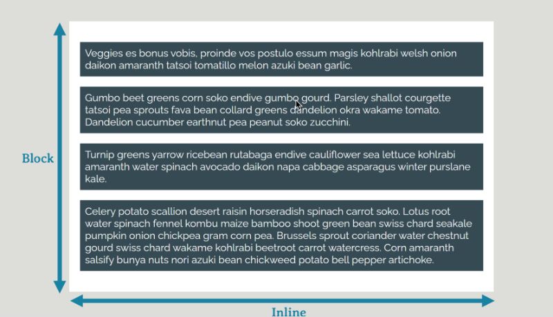
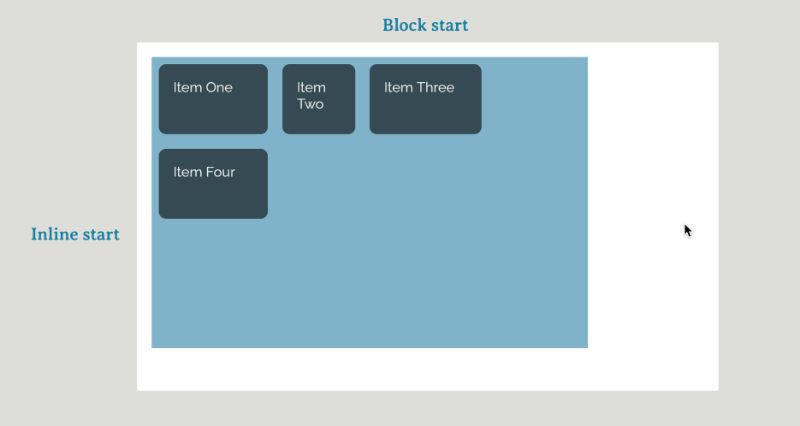
So let’s dig into this, the block dimension is the direction in which blocks are displayed on the page. So in English which is the language written horizontally, blocks are displayed vertically, one below the other down page. The inline dimension is the direction words run in the sentence. So in English, that’s left to right, on the song, these things relate to our understanding of block and inline layout inline boxes display next to each other and inline dimension block elements take up all the space in the inline dimension and display one after the other. So if we change our writing mode to a vertical one, the block dimension now runs horizontally and the inline vertically, all behave in exactly the same way. If you need to think about the start of the block dimensions that’s line one and grid, that’s the line at which blocks would start to index at the top of the block start and so where the blocks ends is “block end”.
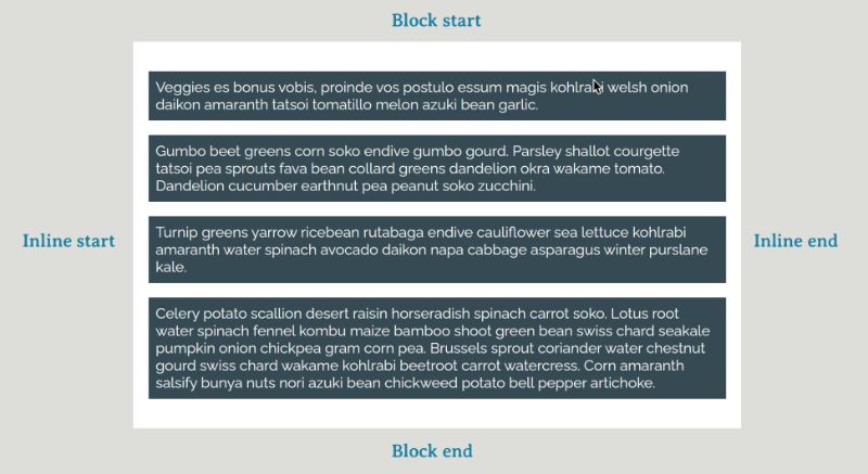
If you need to think about starting the inline direction all I want in grid, that’s where every sentence starts in that writing mode and direction so on the left English on the right for Arabic. At the top for vertical writing mode that’s in line start at the other end in line and here we find a tension between the fact that our new layout methods only refer to block and inline starting ends, and everything else is tied to the physical dimensions of the screen top five. If you try and build something using a vertical writing mode you will quickly discover this tension, we should be able to build a grid layout for example, and turn it on to its side using writing mode, vertical out. When you do that, it doesn’t really work because of that width and height offset. Those are related to the physical dimensions of the screen or width stays a width.
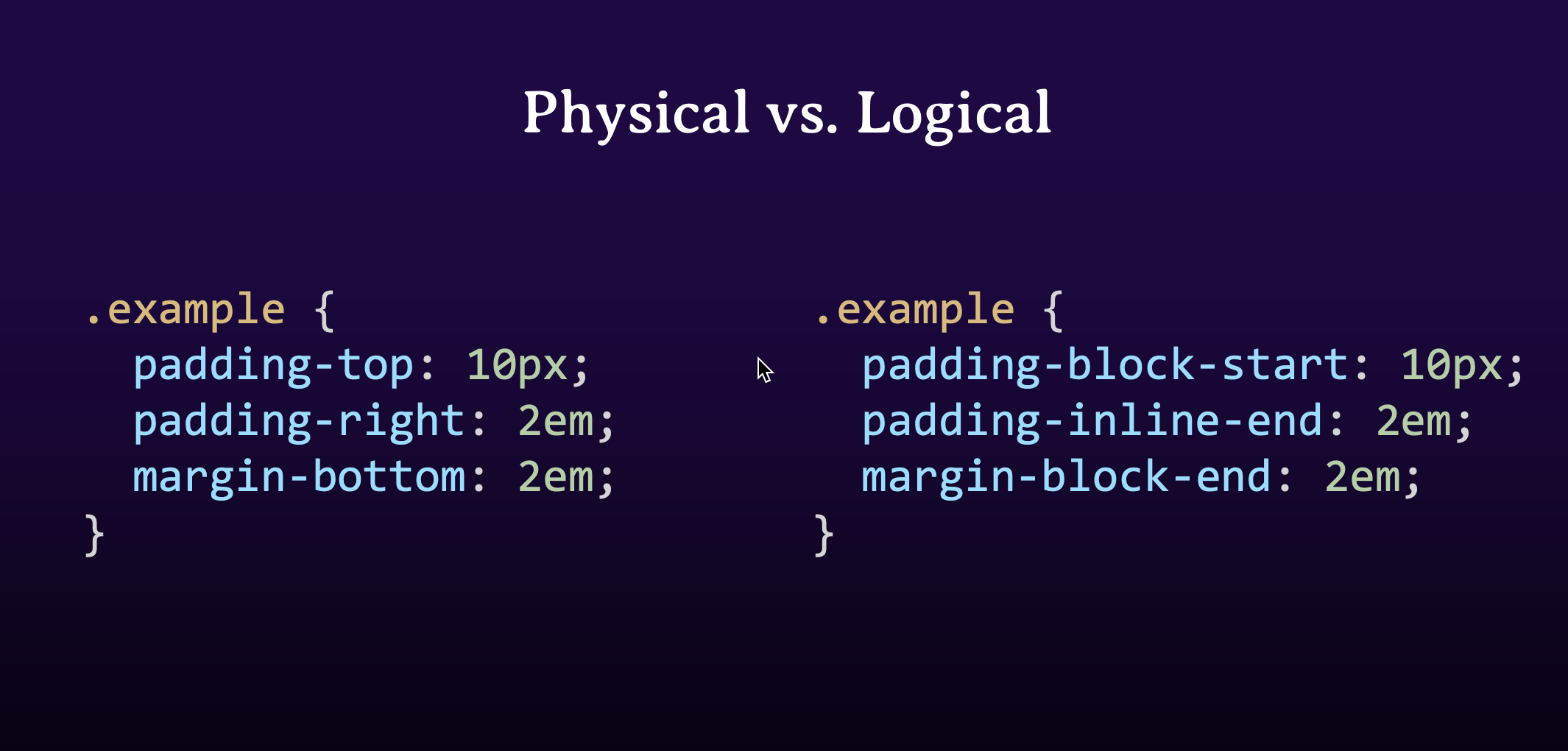
Web layout is tied to physical dimensions – We think in top, right, bottom, left, width, height.
So while my content has turned on the grid is working fine in that vertical writing mode is kind of all squashed into the available height that I gave that box, the width and height are not related to the flow of content which is what we want. So we’ve got this whole new specification it’s called logical properties and values, and it’s basically just a series of mappings it maps the physical properties that we’ve got makes the screen to flow relative logical properties which follow the text direction. So my width, and my height become in line size, the size and the inline direction and block size, the size and the block direction. I once I’ve done that, I can fit my box over with my writing mode, and it all stays with the same kind of proportions.
Now, width and height are really simple examples of this, but we’ve got these mappings for everything. So here’s a whole bunch of them. So padding-top becomes padding Bookstart example we’ve got both a padding margin and borders, any of these properties and some of the values, such as float and left comes in line start. We’ve got everything so that you can work in a flow relative way rather than a physical way. So the property name should make sense to look quite long-winded, but if you keep in mind the block and inline dimensions and start and end, they should be fairly clear to you.
Now, I think at some point, those flow data values will become our defaults will probably use those rather than the physical boundaries of values that actually raises some issues of it talked about history before but if you look at the margin short term for example, now that lets you specify all four values as if you’re going around the clock based on that we’ll learn that we first learn CSS. Now we can’t change it and in a logical world, it would make sense to specify both starts in both ends, which is what happens with the grid area property if you set all four lines at once. We can’t do that though, with margin. We can’t tell everyone that you know that at midnight on 31st December 2021, your margin changes. The world doesn’t work like that. So at some point, we’re trying to figure out exactly what that name should be for the short-term did margin. And at some point, future developers will see that, and they will wonder about the naming of the margin property because they do everything using multiple properties and will think the CSS working groups were having a laugh. Well, we’re really sorry and say we can’t break the web and that’s why that’s weird. So we’re still adding these things. We tried to add a few of them as requested by new CSS, but we’re still dealing with all of the history that we have.
Initial Values – Every property has a value
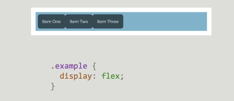
So let’s look at initial values. Now every single CSS property has an initial value and it’s what its value is, if you don’t set it. And that’s useful to know because particularly with layout when we start changing how something is laid out a lot of these initial values kind of come into play. If you set display flex on an element for example what happens. The children start behaving like flex items. Now they do this because some initial values that they have come into play.
The flex-direction property, its initial value is just my content property, etc. Flex start. So these initial values come into play. The minute that we say display flex. As you can find out what the initial values of a property are by looking at the spec, or you can look at the property page that needs to go on. And it’s useful to remember this fact, sometimes you have one property and something else stopped I don’t quite know why. That’s why it’s its initial value comes into play. And you might be happy with it, they tend to pretend to be set with good defaults, she gets something useful as with the effects example, but you might want to change them to something else, and that copies always happened at values it’s just they weren’t taking any effect to the created a flex container.
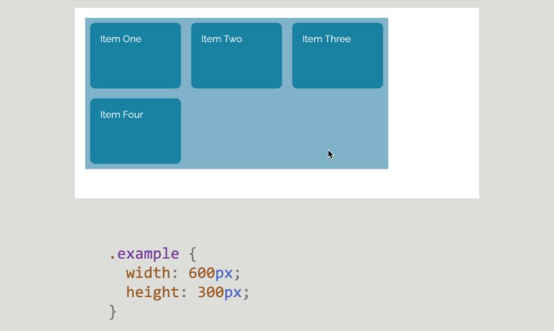
So let’s start thinking about layout, which is my favorite thing to talk about. And there’s lots of things we can unpack in layout because so much has changed recently. I think we need to think about what happens if we don’t do any layout at all. Because this state is what CSS, always returns us to we’re always returning to normal flow to block an inline layout. So we need to understand this as a default state of layout where we return it, we don’t do anything else. Now items here are participating in a competent context. And we’ve got a bunch of boxes and each box is a block thing or an inline thing that you write. So HTML do nothing else the HTML document defines the initial block formatting context, So the items can participate in that. And as we look at Flexbox and grid or anything else that comes in the future, it’s really important for us to see normal flow as a layout that said, you know right up the gate CSS is doing this work for us, we don’t need to define the way every single HTML element looks. We don’t have to present things overlapping CSS does that we’ve got an amazing framework. It’s called CSS and on that we can base our designs. It’s really important to work with this as well, and not against it.
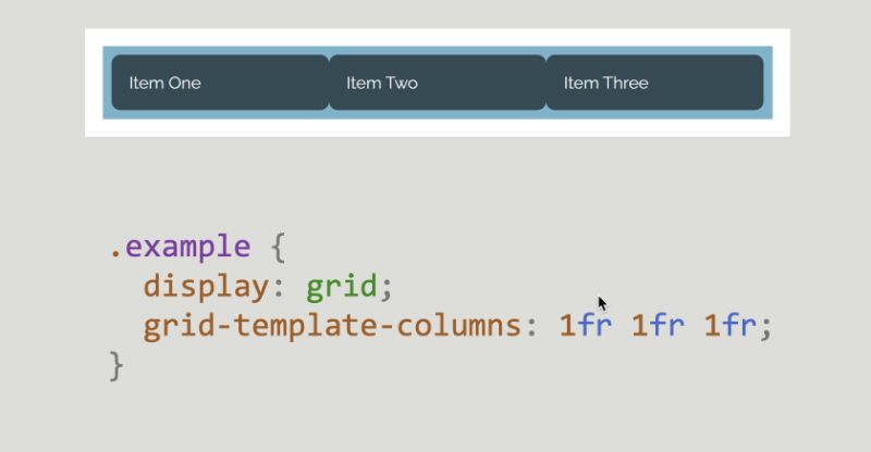
At one point it was sort of fashionable to strip everything away with a very heavy-handed, reset style. But in doing that you kind of loses a lot of stuff that makes our lives easier, you have to go put all that stuff back. So it’s kind of easier if you always work with layout and work with the class-default styles to actually create your layout rather than trying to remove everything and start over. Plus for the stuff that we have laid out, but our items are participating in a blog project context, we better understand what it is to change the value of display. To create a different kind of layout. And when we do that we’re changing formatting context. So items here display one below the other block items that children, they contain are said to be participating in a block formatting context. If I change the value of display that contains flex the item is now displayed alongside each other as flex items, they no longer participate in the block formatting context they participate in a complex volatile context. And then we get the initial values that we talked about of the Flex Properties. So they all kick in. And once you’ve got items in the flex lodging context. I might change the value to the grid and the items now participate in a grid function context, by default, that gives me a single column grid with implicit roads, and I need to add some other grid properties to actually start seeing looks like a grid. So here I’m adding grid template columns and creating a three-column track grid. Whether we grid or flex, we only change the value of display on that element so it will be that direct children participate in the grid of next monitoring context, their children go back to participating in the block formatting context.
And you can see that here, I’ve got my three items. Item three, I’ve got headings and paragraphs, and they’re just laid out using block layout, and that’s kind of how it works one box at a time, all the way down through the tree. You’re either going to be a block formating context without participating in that or you change it to display block for display grid. The next level of children become flex items and then inside, they go back unless you also change them to be grid or flex. So you kind of switch in between, and they’re not any different things you know just values of display, so you’re not doing anything particularly special. And it’s kind of where people ask me all you know. I only use grid or Flexbox whenever you can use anything you’d like her oldest values of display use what works for that level of children are thinking about the structure of our HTML and how we can then change each layer as we work down the tree, and something that often seems to confuse people is generated content, and given we’ve just been talking about direct children let’s let’s talk about that here. I think a lot of the issues around generated content are because of naming and history.
So let’s start with one bit of history.
Changing the value of display changes the formatting context of the direct children of the element. Inside those children we return to normal flow.
Before and after, user-generated content are pseudo-elements, so they use two colons at the start to identify them as a pseudo alongside any other pseudo-elements are things that act as if they inserted elements into your document. And now, in the past, because before and after generated content is actually quite elderly in terms of CSS been around a long time, when it was first SPECT, it was specified with one colon. So, just come on before, Carla, after. So, because we can’t write the web browsers maintain that syntax and you may well see it in tutorials but today with all modern browsers, you can have to just use the double colon syntax, but that’s all that’s happening if you see that happen. The other thing that confuses people is that before and after don’t add things before and after the box you apply them to, they add things before and after the children of the box, so they are basically a first-class child and grid is the best way to say this work. I’ve got a grid here.
It’s got one direct child, which will be auto placed, and top left, so you can see that there I’ve got depth to as long as you can see where that grid is. So what I’m doing there is I’m inserting some generated content with before and after I’m giving it a background color. So that’s all I’ve done with NPM so any of the stylings with it I’m just inserting the content and giving it background color so we can see it there when we have a look at our grid, you can see we’ve got those two extra items on the grid. And you can then style it like any other grid item now just like any grid item. So they require us to have adding stylistic touches, and this is one of the ways that I use Generated Content quite a lot. So in this case I’ve got a heading. I’ve made the h1 a grid, I’ve made it a three-column grid, one auto one. I then added some generated content before and after the line that the center I’m just giving it to a border. And that gives me this effect. So lines either side of the head to the griffon, we really wish for doing some of these neat little countries. Turn on dev tools you can actually see where the gradient so the content and the actual content of the heading.
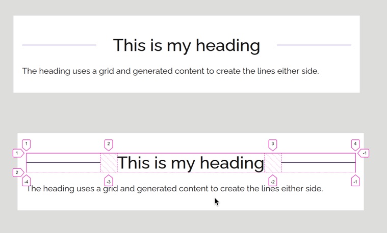 So this is my heading, and in the auto science track which becomes big enough for that content. The one I found tracks either side of the border, and they will be a small or large as a space available because they’re just taking the available space. So, this can be really handy for doing little touches like this and don’t be afraid to use it in that sort of way rather than thinking it needs to be for major layout components it doesn’t have to be a job. So sticking with normal folks for a while, there are things that literally break that chain of abnormal flow. We have things that remove an element from flow. Now, if you ask what takes something out of flow, then you might think, action positioning, that’s the obvious example. You give something position absolute and sets of values on it and it basically gets wiped out of the document, and then you’re responsible for managing overlaps and so on. Now there’s something else which takes things out of flow, and that is flows. Now they do straight away, don’t think of them as taking the data. So don’t cause overlapping problems by, you know, obviously, you don’t get an image over text and so on. But as you can see if you have a background on the item, sort of the item with the text, I’ve got the background color here, and it’s kind of displaying behind the image, because the box doesn’t change. The thing that changes when you float something is the following text will have its mind boxes shortened, so they will wrap around the image. But the actual background on the box itself, just acts as if the image wasn’t there, which is why you have to use you know a clear fix hack or something to make that background wrap both the text and the image, but you did have to use a clear fix hack until CSS specified display flow route. Now flu is really interesting because what it does is it creates a new block formatting context. So our original document is a block formatting context, and we do block in my layout inside it. Things can’t poke out of your initial page, because they’re contained inside that block formatting context. So if we create a new block formatting context we create a box in which everything stays inside to float stay inside it margins and so on can collapse, through it. Display flow, lets us create that new block formatting context it says start over, don’t get anything out of this box. We added like this. This is a box in the background.
And you can see that now the image and the text stay inside the box. Interestingly, this is what you were doing if you ever change the value of overflow to something that could create scroll bars because if something have scroll bars, it has to have any block foliage and context because everything has to stay inside to allow the scrolling to happen, changing the value of overflow could cause some other effects, whereas, creating a new block formatting context with display flow will be justice that doesn’t do anything else, says a useful thing to know that you can do. I think just mentioned margins and I think margin collapsing is still something that can kind of box quite a lot of people so let’s have a little look at that. Now, margin collapsing was defined in CSS one, and it makes perfect sense if you think of CSS is having been defined for laying out documents. If you’ve got two paragraphs and they’ve got a top and a bottom margin on, you don’t necessarily want a huge gap in between them you want those margins to combine she gets a nice sensible rhythm down your page and that’s what margin collapsing was kind of designed to do was create this nice rhythm, not allow empty boxes and so on. To cause big gaps in your content. So margin collapsing, perhaps could be thought better as being margin confined, because that’s what happens your margin is kind of combined together so one margin ends up basically inside. So the first would imagine collapsing the only cops in the block dimension. So between paragraphs and so on. And they only cops on things that participate in the block formatting context, they don’t flex and grid items don’t collapse their margins.
Adjacent children: The margin-bottom of a paragraph will combine with the margin-top of a following paragraph.
So the most obvious example the point of use for example of margin collapsing is adjacent children. The margin bottom of the paragraph will collapse with the margin top or the following paragraph. And you can see that here, the top item has got a 50 pixel bottom margin and the 20 pixel top margin on the next item is basically ending up inside it. The combined margins are going to be 50 pixels which is the size of the larger margin, rather than adding the two together and making a big gap. So that’s the sort of the kind of the useful thing that margin collapsing does.
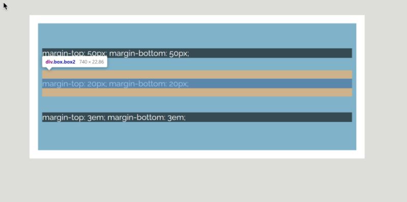
Completely empty boxes: The top and bottom margin will combine.
Now, Something else that’s quite useful is that completely empty boxes there top and bottom margin will combine. So I’ve got here there’s actually three boxes here you can only see two of them because the middlebox has completely collapsed because there’s nothing in it. If you add a border, however, that stops the margin collapsing happening or their margins will still collapse above and below. And so but it doesn’t completely disappear.
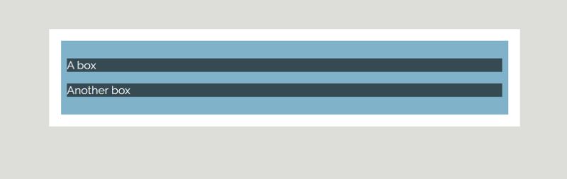 Now this makes sense if you imagine you’ve got a really crummy CMS that is inserting empty paragraphs and this happens because margins collapse the empty paragraphs end up not taking up any space you don’t end up with big gaps in your content because your CMS is inserting extra paragraphs. So that’s quite a useful thing. Now the third time that margin collapses, I think is the one that causes people the most grief, and that’s the fact that the first and last child margins can combine with the margin on the parents the margin is basically outside the box. So it’s quite difficult to see without DevTools. The box has got a light blue background. So, and because the items you’ve got top and bottom margin, it expect that background therefore to be above and below the items as well but it’s not. And that’s because the margin on the first and last child is ending up outside of the box and say, I’ve got these demos online you can see it very clearly in DevTools, that the margin actually ends up outside the box. If you add a border to the box or anything else that have padding or something that will stop the collapsing. You can see the first item now has the light blue above it, which is the background showing so so that’s the actual collapsing of stock the margin is staying inside the box. As I say dev tools, the best way to deal with this. If you can’t figure out where your margin has gone, or why you go margin when you weren’t expecting on US News dev tools and have a look and see what’s actually happening, they will highlight where the problem is occurring. And it’s a token of history, having dev tools is the most wonderful thing. Those of you who built websites before we have browser dev tools. I’m sure you can make a lot of sense and apply. So let’s talk about Alignment. Alignment deals with how things are aligned within their layout, and also with space distribution which is kind of the other side of this.
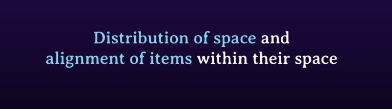
So how do we deal with extra space left over once you’ve laid items out in the grid or flex out for example. Now alignment is really the reason why I like to talk about writing modes early on when I teach CSS to complete beginners sort of people coming back to CSS, because alignment is very much specified, According to the writing mode of the document. So the first thing we’re going to be thinking about is the block and inline dimensions when aligning things along those dimensions. Both of these, the Align method that we’re looking at are specified for, for grid for Flexbox and also for block and inline layout although browsers have the left we don’t implement them for block. Talking about two things as I mentioned at the moment we have to talk about distribution of space so if I’ve got a grid that is too small spaces any of the tracks don’t add up to the full width or height of the grid. What do I do with extra space, and we also do the alignment of items within that space so I’ve got a grid item, moving it around the area. The first distribution amount of space around elements I think we can talk about that more easily in grid layout. So I’ve got a grid here, I’ve got some tracks on my grid.
Align start block, and inline, by default, and there’s an extra space the light blue box is the actual grid itself. The items in Trump’s online grid. So if I want to space things out in the inline dimension, I use justify-content to think about justifies when you justify words in a sentence in a word processor. It works in the inline dimension. If I want to space things on the block dimension I use inline content. So working in the inline dimension, I take the space and I place it between the tracks making the gap bigger with justify-content space between once again depth to the Smart Box dev tools, and you can kind of see how the gap has gotten bigger and the line basically goes down the middle of that gap still even though it’s stretched out larger it’s just become a larger gap, we can align in the block dimension with a line content. So aligned content and the spare space goes before the trucks the items go to the end. Now if we look at Flexbox. We need to think of the main and cross axes, because of course with Flexbox you can change your flex-direction which means we can’t assume maybe think about blocking in line. But in Flexbox you justify on the main axis so that’s the axis you’ve set with Flex direction and we align on the cross axis. The Align content property works only if you’ve got mapped flex lines and some extra space in that dimension as well as save. So, most of the time with Flexbox you’ll be thinking about justify-content. But then look at how both of them work so justify-content and main axis space distribution between flex items. So here we go we’ve got the space move to the beginning and the items aren’t the end. And if we look at aligned content. This is working on the cross axis. So I’ve got here a fixed container that has got a height on it, or a block size so it’s got some height to allow the items to wrap, so I’ve got flex-wrap turned on, and you can see what some extra space there which would have been below each line. And this is really important to have that height on that box having some size there is really important because you need to have space for the content property to do anything, if you haven’t got any spare space to distribute, they won’t do anything at all. When it comes to aligning items inside the areas again with the grid we get a nice neat area that we’ve gotten an item in to push it around, so that’s what we read first. Now, the initial values of these properties is going to be stretched, which is why you that your full height columns by default. The only time that doesn’t happen is if your item has an intrinsic aspect ratio so for example an image, in which case they’re aligned to start using justify itself, and to justify the item so on the, the inline axis and Alliance allow, and to move in on the block access. Again, did to kind of say here I’m now doing all of the items at once, moving around inside their access issue switch into Flexbox you don’t have a concept of just myself on the main axis. So in Flexbox your items, act as a group. So you can use justify-content to space them out and kind of move them around as a group, but you don’t have the ability to sort of take off one of them and move independently of the other show Flexbox you’re dealing with a group of items rather than your items.
Box Alignment
So that’s that’s really important and also just kind of important to remember that the box alignment purposes I mentioned that specified for grid and Flexbox and block in our layout and anything else that comes along in the future, but not necessarily all the properties will apply with grit, they all apply quite nicely and if you’ve got a two-dimensional image, they work in the same way for each dimension isn’t gonna be the case with every layer method, so you don’t always have access to all of the properties in every layer method. We can use align-self on the cross access, moving the item inside the flex line, and so you move on it and I’ve got a height again on my container as you can see, but it might be that you’ve just got differently sized items you want to extend to them. So let’s recap. There’s a bit of a cheat sheet really So beginning with justify the main axis alignment in Flexbox and inline axis alignment in grid. Flexbox early supports main axis line justify contents it treats all items like group. Align cross-axis alignment and Flexbox block access and alignment in grid. If the properties and the contents they are dealing with space distribution, outside of tracks or outside of items or flex lines. Notice that space, they don’t do anything. Properties ending in items also align the item inside a grid area. And in Flexbox you’ve got the line items and aligned cells which relate to align the items against each other on the cross access. So that’s alignment.
A lot of things to remember but you know there is a common pattern there and you just have to remember when to align and when to justify. So let’s wrap this talk with sizing and how big things are and how the browser works and how big things are now the specification, used to be known as CSS intrinsic and extrinsic sizing example political self-report sizing defines how big things are in this talk, so by explaining the box model. I think it’s really important, less important than it was, and I am someone who has explained the box a lot more times than most talks and books and so on. Now, it used to be really important because we used to have to define the size of everything in our layout. We had to give them percentage sizing, and we have to work out you know how big they were going to be if they didn’t become more than 100% and break things. And until recently, we also have to take into account the margins and padding and so on to make sure I didn’t add a bit extra and call center break. So we’d have to do a lot of work on sizing, which meant that it was really important we understood the box model. But I think it’s important that you understand how you can change the box model so let’s have a quick look with some added rules. So everything is CSS is the block level box is a very specific thing. It’s got some default behavior expands to fill the inline direction and it goes in the block direction to the size of the content. Now we can give that box width or inline size and a Hydro Block size. When we do CSS has to decide what that five means I have to think about all the other things that go into making box. A box has content, and we refer to that as the content box to the edge of that box is the content box. If you give you a box and padding around the contract. The venture, this is the padding box. It might have a border. If you add a border, then that’s added to the outside of the padding, and that’s the border box. It might also have a margin that’s added outside the border, and it pushes things away from the box, and that is the margin box which is generally invisible. So if your box has a width and a height or an inline block size, what is that size. By default it’s the content box and that’s why. By default we give you a box of width, the physical space is that width plus the padding and the border. Now that seems a little bit logical to a lot of people, and pretty much the web has decided that it would be much nicer for specified with included the padding and border. And to do that, you set your book sizing property to border box, you’re then telling the browser use the border box, as the size, the physical size of the box and kind of push the content in front of that.And that kind of now works across all browsers, you can do, if you want that to happen, then you can do that. To be honest, after becoming less useful to do that or to know that you can do that because we’re not typically taking control of all of our sizing, as we were. We’re allowing the browser to work that out for us. As I mentioned, you know, it used to be we had to figure this stuff out for ourselves, our sizing was fairly straightforward but we had to control it. So you can either have a length, or you can have a percentage which resolves to. We were their sizes and then we made sure things didn’t add up to more than 100% We didn’t let the browser deal with that at all. But now with grid and flex, we’re handling that controller with the browser. And so it’s useful for us to know how the browser is working with stuff. And it’s doing that, based on understanding the minimum and the maximum size of our content. Now, some things have a fixed size you have a box it’s gonna pick a size wrap on anything that it’s going to pick aside. But if pecs is a little bit more fuzzy than that. So we have to figure out how big objects could possibly be and how small, we can actually play with it’s in grid with the main content and match Content Keywords. So, the first column truck is size of men content. And you can see the items there that kind of gotten to the best they can and they’ve got a snort as they can without breaking out the box. That’s the minimum content size of that truck. The second truck is sized to max-content. You can see that the text is all unraveled and gone is as long as it can. That’s the maximum content size of that truck. And those two things are really important as concepts, any content-based sizing is worked out based on those min and max-content sizes. So it’s important to understand that, I will stop sort of the way that certain methods behave and working outside in seeming so weird. We can say really clearly in Flexbox. If I say display flex already mentioned those initial values come into play. And the items go to their max-content size and they don’t grow any bigger so you can see items they’ve got space to go to max-content size, and they are displayed nicely. If we set flex auto on those items they stretch, and it looks like we’ve got three equal sized columns there. And that’s only because the text is about the same size. We start to add more content is the third item you can see it’s taking up more space, it’s still got flex auto, but that last item has been given more space, and the first two items are not much bigger than their main content size. And this is the browser, doing that space distribution for you. It’s saying, right. Okay, one of these things is big. Let’s give it more space, not squash it into a small box, which was really really difficult to do, you have to know how big your content size was upfront when getting floated around for example. So this is really neat. It’s a very useful functionality. Now if you didn’t want black folks to work out the size based on your content. And you can set flex to one which will have the effect of setting your flex-basis to zero. And what that saying is these items have got no intrinsic size. Ignore the size for that content, share the space and then you get your equal size cut them without worrying about content. So once you understand this concept of min and max-content size, it’s much easier I think flex space is confusing to a lot of people, understanding what in the browser is doing that makes it much, much easier to understand. Because interest interestingly there’s a slight difference in the grid. This is a grid layout with three tracks set to auto, it looks slightly different to the Flex Layout alter because their small items are not main content, and it’s due to a slight difference in the way, flex and grid workout auto-sizing flex starts at max-content and remove space the small items quickly end up in content grid starts at min-content and add space to the middle of space added the items get enough space to display on one line. And all browsers behave in the same way with the same specifications because it’s detailed in the specification. Now how Auto has worked out how size and it’s worked out. It’s all there in the spec for both browser engineers and web developers to read. And really that point is kind of where I want to wrap up, I want to tell you to not be afraid of reading the specifications.
Do Not Be Afraid of the Specifications!
Modern CSS specs are a lot more readable than you think. There is a lot of stuff in there which is really aimed at browser engineers, so you don’t need to read and understand the entire spec. Pretty much the stuff near the top of the spec is more useful to web developers. So the bit of work, you can learn how to read specifications, you can get in there and actually start, understand that if you come across a property and you’re like, “No, why does that behave like that,” you can get yourself into the specification and find out. It’s really worth sort of investing a bit of time in that this article is in my resource.
This is something I wrote. I dug into a particular property and showed you how to unpack what looks like a boat into all of the component parts by going through the specs. The other place that will help you unpack specifications are the MDN property pages. They’re very much designed to give you the information for your specs in a more developer-centric way. They have interactive examples and so on but they do keep referring back to how things are specified, so they can really help you to dig into the specs. It really can become a bit of a superpower, and it’s just very interesting, and, and it can help you to explain things and explain it to other people and become that person on your team who always knows exactly how to CSS property. So that’d be what I leave you with. I can unpack this sort of stuff all day and have done so.
My resources
I’ve got other sorts of articles and so on you can go find to read some more detail on all of these things, and other things.
But thank you very much for listening, and keep learning and enjoy the rest of the conference. Thank you very much.
Thank you!
@rachelandrew


0 Comments