Hui Jing Chen | Frontend Developer, Shopify An Event Apart Online Together – Fall Summit 2021 11:15 am Central Slideshow with Interactive slides: huijing.github.io/slides/94-aea-2021/#/4/0/0 Intro: Hui Jing Chen first dip her toes in the waters of web development, when she built her first HTML website in 2008 for the Malaysia Basketball Association. From there, she discovered the existence of content management systems and migrated the site over to Drupal. In September of 2013, a small web agency took a chance on her and gave her her first job in the web industry. She has since worked on projects across a wide range of industries with clients like Media Corps Singapore, San Francisco International Airport DBS, and Microsoft packaging is currently a front-end developer and Shopify. Please welcome, for the first time on any event apart stage Hui Jing Chen.
It is such a privilege to have the opportunity to speak to all of you at An Event Apart amongst this lineup of amazing speakers. CSS is one of my favorite things in the world, and with a title like our stylish future, you can bet that this talk will be heavy on the styles in Cascading Style Sheets. Anyhow, quick introduction, My name is Hui Jing and I’m simple enough that these images, paint a fairly comprehensive picture of who I am as a person. And I happen to be Chinese. And if you’re unfamiliar with Chinese names or family names come first, followed by our first names, and I’m currently a front-end developer at Shopify. 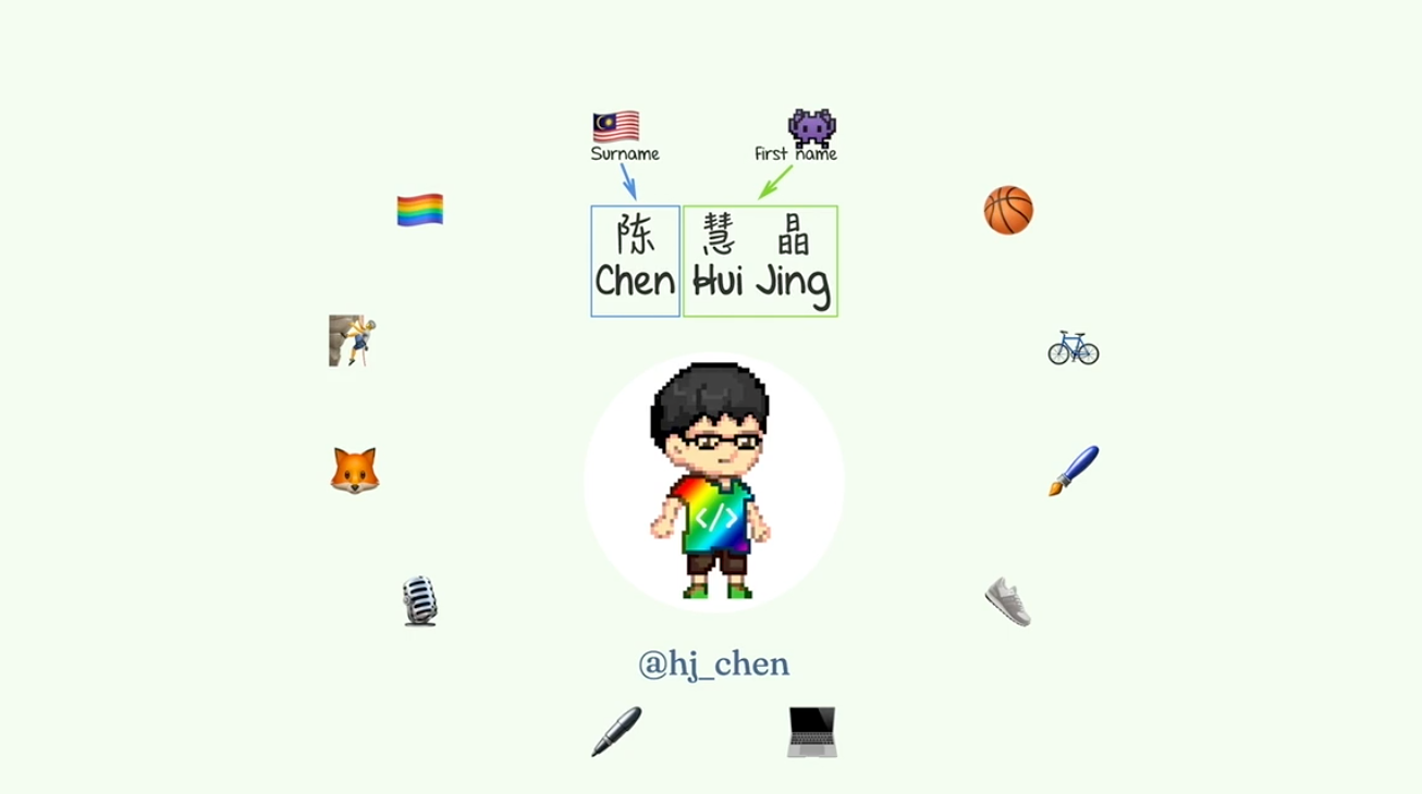 So I first want to remind everyone that CSS has come of age. Now if we take the first WPC recommendation as a birthday milestone that was December of 1996. So CSS is going to be 25 years, soon, and boy has it grown up. 🎉 Well, from a time where CSS was not really meant for doing layouts until today, where CSS is the go-to method for creating websites. We have more than 500 CSS properties. Today, providing us with a much wider vocabulary, with which we can communicate to the browser how we’d like our webpages to look and behave. And there are some things that we can now build with CSS that we could not before. Without the help of JavaScript or some, you know, Semi clunky workarounds, so I’m going to take this time to kind of share with all of you, some of the solutions, and also to sort of paint a picture of the CSS we have now, and what is on the horizon of CSS that is to come. So let’s start off with responsive typography. So, what we’re going to talk about first here is responsive text so for textual content on the web. I would say the key concern is text legibility and readability. There have been a number of techniques developed over the years as newer CSS properties become available.
  Our responsive technique solutions are continually being defined. So let’s just take a look at some, I have three here that I’d like to go through. The first option that we have for responsive typography would be with just various combinations of media queries. I think this is fairly common, I think media queries are not brand new so most people know of this particular technique, it’s fairly granular, it’s basic but in a way, it’s also the most flexible in the sense that you actually have very granular control over the font sizes at whichever viewport, you wish to.
  So this is how it would look, there will be a specific breakpoint and you adjust your text size accordingly. After some time, there were some people who asked if it is a possibility that we let our text, grow and shrink dynamically. This is a digital media responsive and this became possible with CSS. Only when viewport units were introduced for sizing purposes it could be applied to font sizes as well. So this particular technique was introduced by Mike Missoula back in 2016, and it’s making use of the calc function and viewport units for font sizing. So he came up with sort of a formula. He has a very extensive article that explains exactly how he came up with the formula. The TLDR version of it is that you still have to use media queries, but these media queries allow you to limit the font scaling within a range that you control so you can sort out the minimum and maximum font sizes. If you want to see how this works, essentially there’s a maximum and minimum size, at about this size it was really really narrow with the header text does a trick anymore. But between 408 100 pixels, there’s this like growth period for the text, and then after 800, it kind of stops.
 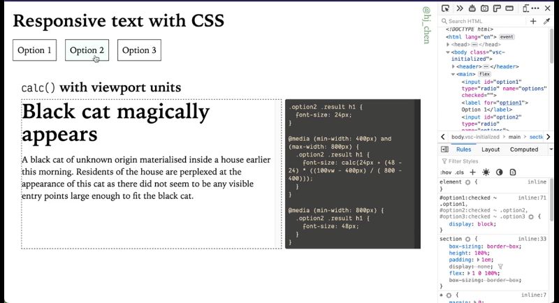 So that’s where the media queries, kick in. This formula itself is plugging in the values used for the breakpoints, as well as your target minimum font size and maximum font size. What has been interesting recently this year, is that we’ve had a slew of CSS math functions that have gained wider support recently. Among them is the clamp function, which allows us to pick a value within a range between a defined minimum and maximum. This is a function that takes in three parameters: the first one being the minimum, the next one being the preferred value, and the last one being the maximum value. A function like this is rather useful if your preferred value is dependent on something you don’t control directly like like viewport units right and this clamp function essentially allows us to do what Mike’s function did in option two, but with a much more simplified syntax.
 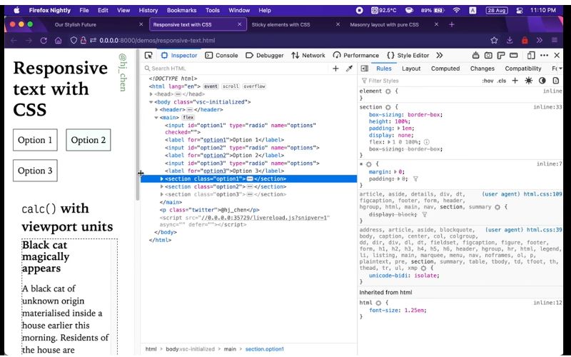 Now, one thing that I find that doesn’t get mentioned enough is when viewport units are used for font sizing, because honestly, using viewport units for font sizing is a technique that is fairly popular. If you Google Responsive Text CSS, that’s going to be the option that comes up in search results right. But using viewport units for font and sizing hazard risk and that risk is accessibility issues. There is a possibility that you could fail them WCAG. The weekends’ success criterion is 1.4 for text resizing because this particular criterion states that the text should be resizable up to 200% without loss of content or functionality. So the problem with viewport units for font sizing actually lies in the way modern browsers implement zooming. These days, browsers use proportional scaling, which is essentially making the CSS pixels, bigger when, when we zoom and when I say zoom, it’s like the keyboard shortcut for it would be like command plus, or plus, depending on your operating system. But you can zoom in and zoom out, and when we do that, this causes us to compute viewport size to decrease. So if there aren’t any breakpoints that trigger layouts for smaller screen sizes it will kind of make the layout still readable, at, at a narrower viewport. But if we’re using viewport units resizing this essentially means that the font size is not going to grow in proportion to what we expected, because when you’ve zoomed, the viewport gets smaller.
 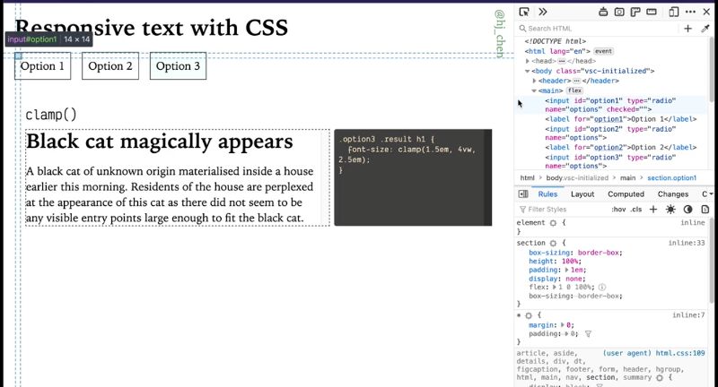 I wouldn’t say never use option two or three because it depends on the font sizes that you’re working with and the size of the user’s viewport when accessing your content. It’s more important to test to make sure that you’re not running into major issues, and just stick to the simpler option of using Media Corps when it’s the safest option. Just putting that out there as far as the clip function if you are interested in using it for many other things right things, other than Responsive Text. The recipe for it is pretty decent looking pretty good, very nice and green and all the modern browser, columns, so something to keep in mind, like, for, you know, flexible values. Let’s put it that way.
 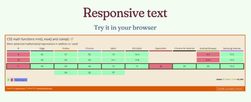 The next thing I want to talk about is this particular UI pattern is called scroll snapping and some folks will have opinions about it or like the scroll.
 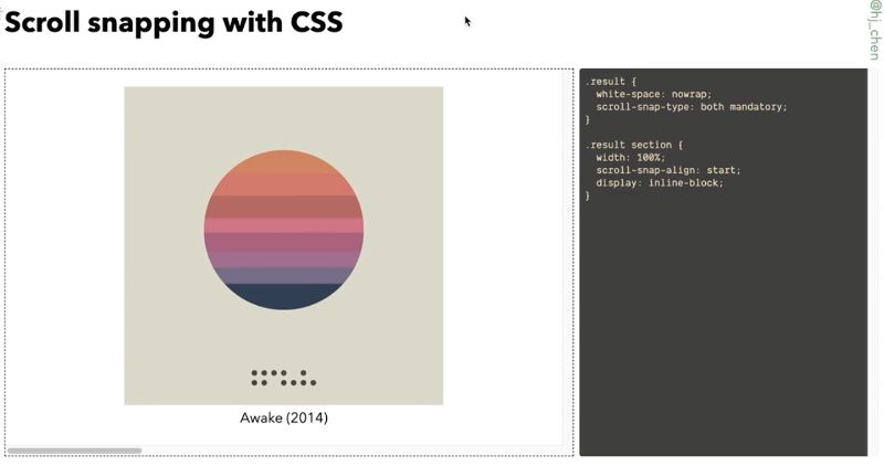 Well, I would say that with scroll snap, we have more options when it comes to this particular style of interaction. So before I go into it, let’s take a look at the support, it’s not bad. Honestly, this CSS has been around for quite a while but the specification I’ve gone through a number of modifications so the properties have changed somewhat from their first integration. So today, the main properties we will be looking at are our scroll snap-type, which is applied on the container, and scroll snap alignment for the child elements within the container. So, easier to show than to talk about going to switch browsers switch things up. So, first of all snap type. The values that you can apply to this property would be mandatory versus proximity. These values determine how strictly the browser would snap to a snap point. So right now I have it set to mandatory and this is the horizontal scroll situation we have here. So I’m using the keyboard. Hopefully, you can hear my clicky mechanical keyboard. It’s like one tap into snaps over. That’s what mandatory does, which is like a strict snap point. So, the browser will always snap for Snap Point, which kind of makes that keyboard navigation thing, very neat. You know one snap per slide. If you can get to the other value which is proximity. would call it a looser style of snapping, because, as you can see it’s like normal keyboard navigation. And then as it nears the edge. It kind of just snaps over.
 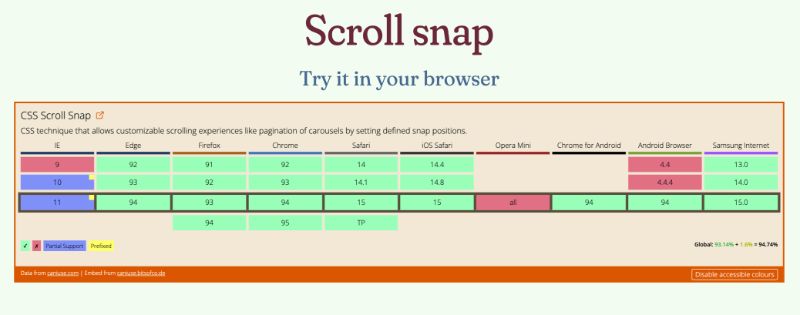 This exact value where the snapping happens is kind of up to the individual user agent, but proximity triggers the snap is at if the user stops scrolling within, I would say a couple of 100 pixels of a snap point. I would guess this kind of semi resolves those school documents because you can still scroll. As for normal you’re not stuck, per se. You can also specify which axis, the snapping shooter curves so it’s either along the block axes or the inline axis. So, here I’m using both, because I’m just lazy, but you can control it if your item should snap only on a single axis and this is probably relevant if you have scrolling on both axist. If I made this horizontal you would see some nice snapping happening. Of course, if I put it to x, that’s not gonna work because that’s not the right. So that’s pretty much how the syntax, and how the behavior works these days. So, I mean, if you do need something like this in your project, it’s a good design that your designer came up with for an interaction. I think this is a great candidate to be considered instead of reaching for a Javascript-based solution first. The next thing I want to cover is sticky elements now okay stale ones are not that new. But this is a pattern that I come encounter fairly often these days like with headers and things like that and in this pattern, even before we had position sticky was being implemented, but I think those previous methods would use JavaScript to calculate the position of where the element needed to be. Then you’ll have a lot of calculations, it all felt kind of expensive.
  You see above that there is good support for position sticky. So, instead of using a more complicated JavaScript solution, we can just use CSS to do it. The thing about position sticky is that I think there’s a lot of confusion over why it’s not working as expected. Like if it’s working, nobody’s gonna say anything but a lot of times if you look at Stack Overflow right like just Google like does it look sticky is not working. I feel that this gap in understanding is worth clearing up because this is a really useful property capacity. A sticky position box is like a hybrid of a relatively positioned box and a fixed position in between these two types of boxes. These boxes just position it. So for it to work element must have an offset value of flight. In this case, I’m using Tuffeau pilot. So we have this demo here it’s a bunch of boxes and boxes. See, so this position sticky on my sticky box. It must have this offset position. I’ve set it to one m so it’s going to stick out about one m, and you can feel free to change this value to position value stream to zero. So, when we define this offset value, the offset will never push the sticky box outside of its containing block, but the sticky box is freely moved within the containing block as the pages scroll. So it’s kind of giving people the perception that it’s been pinned to the relevant pages. As I scroll the sticky element is treated as relative position until it crosses the threshold for the container it scrolls. Because I set it to the top of this rectangle, this area right here it’s referred to as a sticky constraint box. This element is stuck until it hits the opposite edge of the containing block. That bit opposite edge is contained but I believe I pull it out of perspective. Sometimes when you see instances of positions that you like not working. There’s a high chance that your sticky element has already reached the age of its containing. it appears not to be sticky, but actually, it’s just a containing book. I’ve been saying a lot of words is much easier to understand this phenomenon in this demo. So right now, these boxes have a wrapper gift. I’ve given it a class of wrapper. I started off with top but of course, you can change the value on the bottom, and stick to the bottom as well. There’s also left in Brighton, so let’s create a horizontal scrolling situation. Then we’ll have some stickiness happening on the right. But here’s a fun, interesting thing to think about: It doesn’t work, it’s not sticking. And like, the question is why not? This is a good place to explain what I’m trying to say earlier about the container book being scrolled away. Let’s just put a border to make things visualizable or solid. It’s kind of a thin border of two pixels. So the wrapper is actually not long enough to accommodate the sticky element. So when I scroll. It’s not that the sticky box is not sticking, it’s just that the container for the sticky box has already scrolled off the screen. Now, if I changed the width of the wrapper to something longer, there is room for the sticky element to maneuver. Now you’ll see that it’s sticky. Because previously there was really nothing for it to stick to. And before it did stick to anything. The container was already scrolled off-screen. So it just appeared that it wasn’t sticky. I wrote a bit about positioning in my blog before and in there I linked to several articles by different authors, explaining sticky positioning as well. This is because I think everyone understands this slightly differently so perhaps my explanation, didn’t really make sense to you my take on it is to go through as many different explanations as you can until you find the one that clicks with the way your mind visualizes stuff like for me. I sat down and I played with all these different values until I was like, oh, oh I get it now. So this helped you, great. If not, don’t give up, don’t give up, it’s not a lost cause a lot of people have tried to explain this before but if you understand this well, you’re never gonna find yourself in this situation where you’re asking “Oh my God, why is my element nonstick.” Just say, it’s great for troubleshooting. Now we’re gonna move on to something that I would consider future risk because it’s like kind of here, but not very well supported yet but come on, like, eventually, everyone’s gonna support it, and that would be Mason Reed and sue the thing about masonry layout is, it’s fairly new. It’s only supported in Firefox for now, and you get to kind of test it out. You got to go to the config, and like search the flag on, it’s called layout CSS grid template masonry value enable set that to true, and you’re good to go. So let’s talk about masonry right masonry was originally a JavaScript layout library that was created by Sandow back in 2009, I believe, and it’s a layout where items are piled neatly based on the vertical space available. So I’d say lots of colors, things, use it, Pinterest. Pinterest with that too. And given its popularity amongst web designers and developers, this layout method was discussed quite a bit, within the CSS working group meetings, and the editor’s draft of level three. Today specifies how this can be done natively in the browser using CSS.
Masonry Layout
So I already mentioned it’s in grid-level three, so it kind of builds on top of the grid syntax. But before we go into that, let’s talk about what we have with CSS basic, like what options do we have, without the JavaScript masonry layout. Can we, do CSS masonry layout, without CSS masonry? I would say this has somewhat been the keyword here because we have something called CSS royalty colloquia. The theme of the multi-column layout is that the implementation of it is fairly inconsistent. I believe that would change eventually because Rachel Andrew has taken over the responsibility and in my eyes like the original Andrew is on it. It’s gonna happen like the only reason why cabbage today is because of ridgeline. The syntax is called a count. In this demo, I have a column contract for and essentially what it does is that it lays out the content in two columns, hence the name multi-column. But multi-column, the way it’s implemented, seems more suited for inline content. Lines of text newspaper layout magazine layouts in columns. There are some fun things that you can do today with the already implemented syntax. There is something called column, row with syntax right. To do this, you have lines between your columns. If you look at how my boxes are laid out so I’ve numbered them. That’s the order in which they show up in the markup in a horizontal top to bottom layout. When you set it to multi-column, your stuff goes from top to bottom, and then left to right. So I guess one of the limitations would be the fact that if you wanted your important content to show up at the top, it’s probably not going to happen because 1234 is going to be at the bottom. So that’s kind of a limitation. I guess some people, it’s not what you want. Another thing that you would probably want is to be the ability to spend your content across columns. This is also kind of problematic with multicolor today is because the only supported value that we have, is all. It’s kind of weird because it breaks things. And it’s okay, I guess the option that we have today is kind of limiting. So let’s look at what masonry layout can actually do. So like I mentioned before, CSS masonry builds on top of the browser’s print capabilities and so we look at the syntax that I’ve got here, it’s very similar to how we would do subgrid being part of grid-level two. So now, the value of masonry is applied to either the grid template columns or the grid template rows depending on the direction that you want your content to flow. So, for the horizontal direction example that I have here the row heights are defined with grid template rows, while the columns are free to be Mason, together, and like a normal grid you can allow the item to span multiple columns using grid rows so what I was trying to do earlier but in a much nicer way would be something like this. So this starts from row two-span two rows. So this looks much better than when we tried it with multi-column. And, option three is like vertical. So, if you swap it around and then you put masonry on the rows, then this is, this is what you get. So, other than this, we also have masonry-related alignment property. So if you’re familiar with the block London properties, your align content, align-items justify-content justify items, masonry layout has a couple more properties but they function very much the same way. So they use the same values as the other box alignment tactics, so for this vertical direction masonry layout. Let’s try. Let’s give it a height. If the height of the container exceeds the height of the content, then you can play around with this we’re going to use 200 viewport units because you know, why not to know struggling, that messes things up. So, it would, the keywords the property names here would be aligned tracks and justified tracks, aligned tracks from the block direction and justified tracks. The Enlightened direction to center. Sounds like Start Center, and these are the values that we also use in box alignment. So that would be how you align your tracks in amazement, really. So currently, the working group is looking for feedback on the implementation, because it is fairly early days, and there are a lot of aspects to consider before any CSS specification gets to production-ready level. So if you are using Firefox this feature is kind of behind a flag as I explained earlier, let me subtract to remind you how to do that. So, enable it and try it out for yourself. I mean if you have certain things that you would like, and you realize that, you know, kind of mission really isn’t doing it. Use cases are always welcome, because the CSS working group does all its work in discussions, open-source on GitHub, I always highly recommend people go check that out. Lastly, we have something that’s really been in the spotlight recently, and that is container, cruise, so I’m not too sure about the owner of the talks, but if you’ve already watched where in this talk, I believe we would have a pretty solid understanding of the syntax for container ports. If not, I will touch on it by talking through the code example that I have and you can solidify your understanding by listening to Miriam’s explanation before. This is what I call teamwork. Now, the concept behind container Kirbys has been around for a while, I would say, especially as responsive designs became the norm, because the idea of having individual components, displayed differently based on the size of its parent, as opposed to the overall viewport, was very appealing, but hard to do. Now, I’m not a browser engineer, I’m not even close. However, I have enough understanding behind how browsers do layout to know that implementing the logic for container for ease, was not a trivial affair. The idea around containment, or the isolation of the subtree and the rest of the document, have been toting around since, 2017. That was when the first public working draft for the containment module was published for the work on this really picked up at the end of 2020. When Marissa started championing for it. She has since done a lot of the work on the specification and this is a huge reason why we have a version to play with a Chrome Canary right now. Speaking of Chrome Canary contemporaries, all only in Canary and it’s behind a feature flag. So you got to go to Chrome flags, find enable CSS containing previous speaker flag. Turn that on. And then we’re good to go so to Chrome Canary we shall go. So, the specification is currently working progress and has actually changed since the last time I talked about feature or container queries couple months ago I think the preferred the current preferred syntax to establish a creamy container is via the container type property. In my example, I’m using just a container. This is a shorthand. Now, the value of using here is inline size because I’m this particular example, works along the inline axis. And if you look at my code I so contained, is this parent of this pink card, while not contain is the parent of this. It’s called a green image card. I’m using resize, at every time. Part of convey results, just like this. That’s how the results like I had, I had the Resize property, but things are key of it, is the parent container has this container type value and the query itself looks something like this. So, if you’re used to media queries. The style of the same, just a different keyword. So, the style rules for all the elements with them, not contained can then make use of the size of not contained to trigger, trigger stuff, trigger different styles, just like we did for media queries. Now, if you look at this spec as a whole. You should be able to do more than just size but again, early days early days. So, how is this even helpful for folks who haven’t actually really thought about container quarries is the fact that, like, you know, let’s say you have a current component like I do here and you’d like to reuse this across the site. And this clip component might show up in different contexts. Sometimes it might even show up in different contexts. At the same time, it could be like, you want to invoke in the narrow sidebar, as well as a wider main content area. So, in order to have different styles for these essentially the same core component, we would actually have to write extra styles, because we want, we would probably select the parent of the card, and then fell in there. Then, different parent, same card component but it’s in styles so then God knows that. It’s kind of unreal the, I would say, because then the query is solely based on the width of the entire viewport. And it’s kind of hard to, to encapsulate your styles in that manner. So, when we define the container type property or an element on its children can respond according to its behavior okay mentioned earlier. So if I change this to block size is actually not going to work because if you look at my container for width in this case is a lot. And so, like cart component styles, as I scroll down, I just have to worry about how I want the cart calculated, and you don’t have to think about where this cart is going to show up, because I know as long as its parent container fulfills this with requirements that I’ve set. So this component becomes really universal across your site. And I think that’s, that’s what a lot of people are trying to do today, but they cannot. And like I mentioned, where are we right now, and the implementation that we have to play with right now only covers dimensional queries, which is size related, but if you peek into the specification, you will see that we potentially might be getting style quirks, for things like say the color of the element, or any other computer-style value. And, and that’s great like the options have just opened up immensely. And other than the style premise. There’s also a section called State queries, also very exciting because this could potentially allow us to query if, say, a sticky position container stuck, or, or the boxes visible on the screen, or not. And while this to me the, these are all the possibilities, both style and state queries. I believe they’re in the process of being worked out so no implementation for it yet. Because I imagine this probably going to be a ton of things to iron out before broker engineers can even start on the actual implementation but come on, come on, think about it, the possibilities here are breathtaking. So, again, I encourage everyone to really give this a try. You know, think about the use cases you have like this is a very good use case because like I’m not the most creative person on the planet. I know that Miriam has a weird collection of code pendants, where, like, people have contributed kind of read it today, but like, they’ve created code pins for the different use cases for control container queries, why is it so hard to say. Container queries that, you know, you can check out just to you know to get an idea of what we have, but I’m gonna say the same thing as when I was describing Masonry is to give it a try, and if you have any constructive feedback.
Container queries
This feature is only implemented in Chrome Canary, and can be enabled with the “Enable CSS Container Queries” feature flag under chrome://flags, in order to allow testing and providing of feedback.
_______ GitHub is the place to go because that’s a channel where you can actually see the working group discuss things, you can see, like, just normal web developers like you and I, raising raise issues and questions, it’s, it’s really nice to see how this specification shapes. So we’ve covered a lot of things, and as a self-proclaimed CSS lover, and must say that the thing that draws me most to CSS is the fact that there is no one right way to do things. CSS is flexible enough to adapt to a wide variety of situations, for example, you can catch them up. No worries, all is not lost because I’m pretty sure there is a high chance that a certain combination of CSS properties can allow you to work around that problem. And there are really plenty of exciting developments in CSS these days. And what this does is it gives us web developers even more tools with which to style the web. This is an additive. This is an additive thing. It’s not like the old stuff. You don’t ever, ever use old stuff ever again. No. Not true, not true. It just means that we have different combinations of properties in fact, the new properties merely rendered hacks unnecessary, because honestly, way back when. A lot of times the techniques were were clever workarounds. They were working around a problem with the new CSS properties, the workarounds are no longer necessary, but the properties themselves, still valid. And even, even with the JavaScript thing right. This doesn’t mean that you should never ever ever use JavaScript to implement these solutions anymore now that CSS is an option, no, no. The point here is having options. So anyway, I just like to close off to say that it also doesn’t matter if you are not using the latest and greatest right now because it’s the context of which your project operates it right if you don’t need it, don’t use it, you know, don’t use something new for the sake of it, but if you have a project on the horizon that potentially could make use of all these techniques. I really hope that you keep them in the back of your mind. And then, when the time comes and you do need to use it. Try out the CSS ones instead of reaching for a JavaScript-based library first.
There is no one right way to do things. Context is everything.
Further reading and references
These are the links that are relevant to each of the different sections that I talked about today. And once again, thank you so much for your time and attention, and do enjoy the rest of the conference.
- Precise control over responsive typography
- min(), max(), and clamp(): three logical CSS functions to use today
- Responsive Type and Zoom
- Failure of Success Criterion 1.4.4 due to incorrect use of viewport units to resize text
- Practical CSS Scroll Snapping
- Understanding positioning in CSS
- Scrolling box definition in CSSOM View Module
- Native CSS Masonry Layout In CSS Grid
- Container Query Proposal & Explainer


0 Comments