Miriam Suzanne | Co-founder, OddBird
An Event Apart Online Together – Fall Summit 2021
3:45pm Central
Intro: Miriam Suzanne is an author, artist, web developer, and teacher in Denver, Colorado. She’s a co-founder of OddBird web agency, a member of the Sass core team, and a W3C Invited Expert on the CSS Working Group.
After building Susy for responsive CSS layouts in 2009, and then True for Sass unit-testing, Miriam became one of the primary developers of Sass & CSS developer tools, with a focus on layout, architecture, and design systems. She’s also a prolific teacher – offering CSS workshops, and speaking at conferences around the world. She’s a co-author of Sitepoint’s Jump Start Sass, a staff writer for CSS Tricks, and was a founding teacher on the Mozilla Developer youtube channel.
Offline, Miriam is a playwright & author of Riding SideSaddle* (SpringGun Press, 2015), a musician with Teacup Gorilla, and a co-founder of Grapefruit Lab. She won the 2017 True West Award for 10 Myths on the Proper Application of Beauty Products, the stage adaptation of her novel. Please welcome Miriam Suzanne.
_______
I’m here to talk about the future of CSS but in order to understand where we’re going, we have to understand where we are and how we got here.
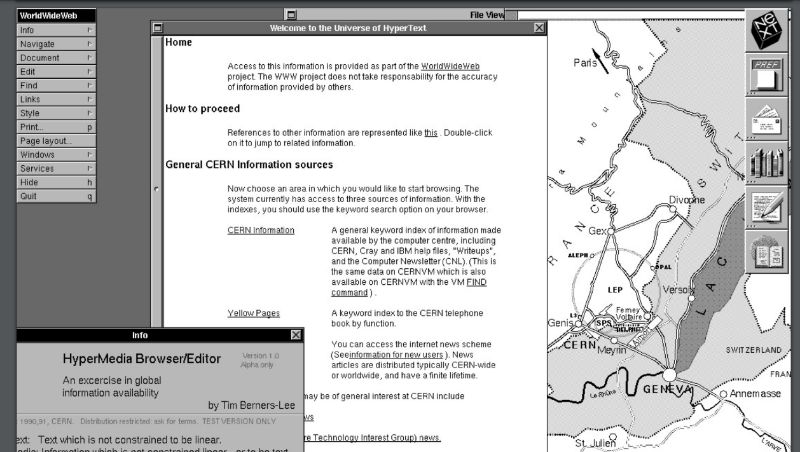
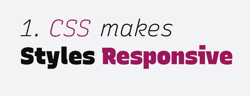 So in my mind CSS exists for two primary reasons, and the first is to make our styles, responsive, and not just to the dimensions of the viewport, though that’s useful, but also to user preferences and device interfaces. When Sir Tim and the team at CERN released the first hypermedia browser, it was designed for the next machine with a fancy graphic interface, but you can’t make a web that’s worldwide by saying it works on my machine and everybody else has an edge case. So, right away they released a second browser designed to work on any terminal with an internet connection. And this becomes the mission statement of the web, web for all, web on everything, and that includes assistive devices and non visual media, always with the end user in control of the outcome. There are just too many variables to consider so we hand some of that control over to the browser, and to the user and to device that they’re on.
So designing for the web is designing for change designing systems that respond and adapt to unknown context, unknown content on an infinite and unknown Canvas across operating systems interfaces and languages. We provide hints and suggestions semantic clues, but only the browser can put it all together, and the Cascade describes that process, by accepting stylesheets from everyone involved, browsers and users, establish global defaults and preferences across the web. And then we fill in the details of our particular site and these are called the primary cascade origins, each one representing a different set of needs and concerns, but these different perspectives can sometimes be in conflict. So, the rules of the cascade and inheritance describe how to merge all three origins and resolve those conflicts. In most cases, the user preferences will override the browser defaults, and then for better or worse, we get to override everyone involved, but when things get really heated when it really matters, the user should have the last word. So the user and browser can insist that some styles are more important than others, creating important origins that cascade in reverse order. Important author styles aren’t that special, that’s us in the middle with our normal and important styles side by side, but users can override us when they need to and the browser finally decided to what’s out of bounds what’s possible on the device. What features are supported, and so on.
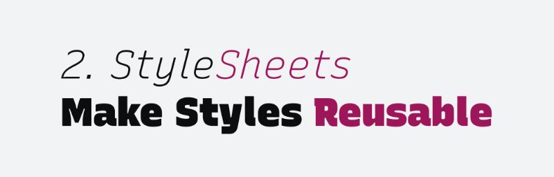
The second goal of CSS is to make our design objects reusable instead of repeating the same styles over and over in our HTML, we can use selectors to apply rules, more broadly, creating patterns based on things like classes and attributes which we can combine to compose reusable objects design systems component libraries. CSS is object-oriented at its core, built around the semantic objects of HTML. And people like Nicole Sullivan and Natalie down helped to develop a systemic approach to all of this describing fluid grids and reusable patterns and their browsers implemented media queries and Ethan Marcotte coined the term “responsive web design.”
Responsive Web Design originally referred to fluid grids flexible images and media queries, everything is in percentages, adapting to the size of the browser at different media query breakpoints. It’s a really powerful approach. And it took over the industry for years, but now. Well, the idea of the responsive web that core vision is just as important as ever at the technology has changed dramatically. The web is still a fairly new medium and we’re rapidly developing new features to make it more responsive and more reusable. Features like Flexbox and grid, which have been around for years, and now also intrinsic sizing aspect ratios, and a whole lot more. We’ve entered a new era of web design and web layout, and we need to update how we work and how we think to really take advantage of those new features.
You might say it’s an evolution not a revolution. It’s happening slowly but it’s an important shift to understand what Jen Simmons calls intrinsic web design, Rather than stripping out the intrinsic size of every image, and building 12 column percentage based grids, we now have the power can make designs, both responsive and reusable at a component level, building patterns and layouts that are based on the content itself, taking that intrinsic information, and building systems out of it.
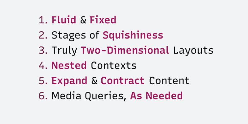
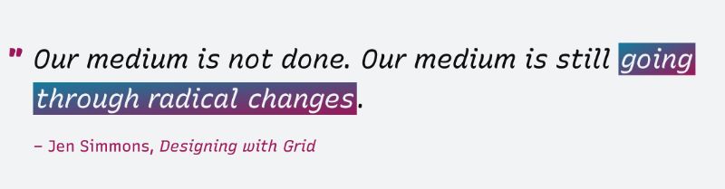
These new tools allow us to create responsive layouts that mix fluid and fixed components, we can go beyond fluid percentages to use flex values grid fractions min max clamp, and other tools to create stages of intrinsic squishiness components, growing and shrinking at different rates. We can truly two dimensional layouts and nested contexts can use different layout mechanisms and content can expand and contract again in various ways. Rather than designing outside in with percentages and media queries, we can spend more time designing from the content out. Intrinsic Web Design. So we’ve come a long way, but we’re still on dot CSS is a living language, still going through radical changes and many of the new features, build on these same ideas.
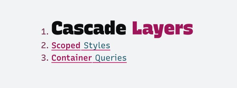
So as a CSS working group, we’re looking at pain points that teams run into when they’re developing responsive components and we’re asking how can we improve CSS to address some of these issues, and I’ve been working on three proposals in particular that I want to look at that I think will be helpful for this. So let’s jump back to the cascade for a minute and selectors specifically. The Cascade is so central to CSS that it doesn’t get a lot of updates. But over the years, it is starting to show some age, like the cascade origin selectors create another potential conflict for the cascade to resolve.
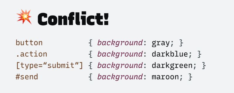
Since we can use multiple different selectors to target the same element, the cascade needs to determine a winner. So it uses a clever heuristic, an educated guess called specificity. We assume that each selector type is meant to represent a different goal or perspective based on how narrowly that selector has been targeted. So the most generic selectors help us paint in broad strokes, establishing low priority defaults, and then classes and attributes allow us to describe higher priority patterns that make up the majority of our styles. And finally one off IDs are both the most narrowly targeted and the highest priority.
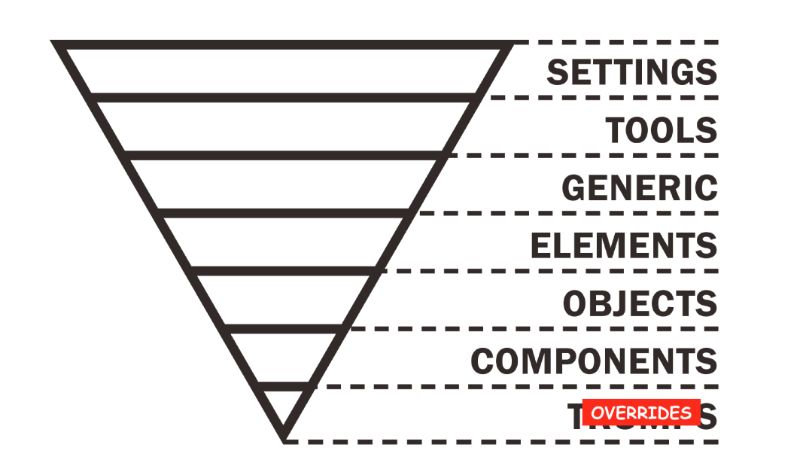 So we can combine these in various ways, but their specificity is always comparative one layer at a time, selectors with an ID will always override selectors without an ID, and so on down the list, and this is meant to be a rough approximation of the layers in our code, moving from global abstractions to narrowly targeted components and overrides, but it’s not perfect heuristics can fail. As our projects become larger and more complex with more distributed teams and third party integrations. There are a lot of situations that don’t quite fit the rule, some low priority defaults are very specific. While some generic attributes really ought to have more weight behind them. And out of all of these specificity layers, there’s only one that we can both customize and reuse the classes and attributes.
So we spend a lot of our time fighting over how many classes and how many attributes are we allowed to use in the selector, with rules and conventions that ensure our cascade specificity matches those carefully crafted layers of intent. And then someone throws importance like a grenade because it gets stuck or one part of the system doesn’t play by the same rules as everyone else. And that brings us to our first feature that I’m working on: Cascade layers.
The idea is that cascade layers will allow us to create our own custom named layers of the cascade that more explicitly represent the different parts of the system, and potentially different teams on our project or even third party code, you can think of these as customizable layers of specificity, just above the ID selector, or you can think of them like our own custom origins, but for things like resets defaults frameworks themes components utilities, anything we want in whatever order we need, we get to define how our styles stack.
And the important flag works as it was designed for Origins, inverting the layers when it becomes necessary for a lower layer to insist on something and punch above its weight. So we can define the layer, give it a name and add styles to it using either a layer function in the import rule, or probably more often by nesting styles, inside the new app layer rule. And we can combine these approaches as we want.
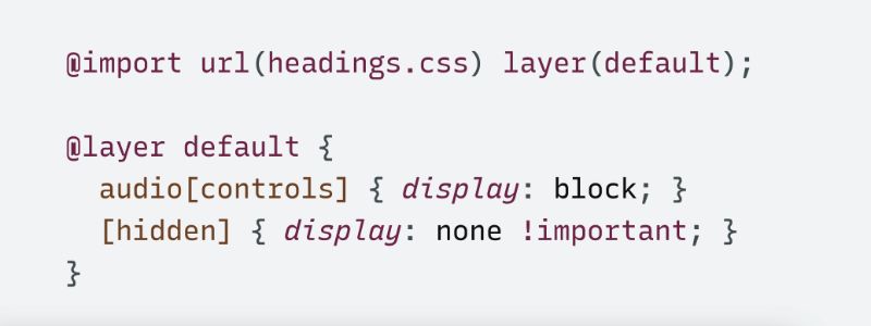
Here we’re creating a default layer with the headings dot css import, and then using an APA rules to add a few more styles to the same default layer. We’ve given the layer name, and we’ve added multiple style sheets to it. Layer stack in the order they were first defined with the first layer at the bottom and the last layer at the top so the highest layer, the one that comes last, will win conflicts, no matter what specificity is used for the selectors inside of it. Specificity only matters, inside of each layer.
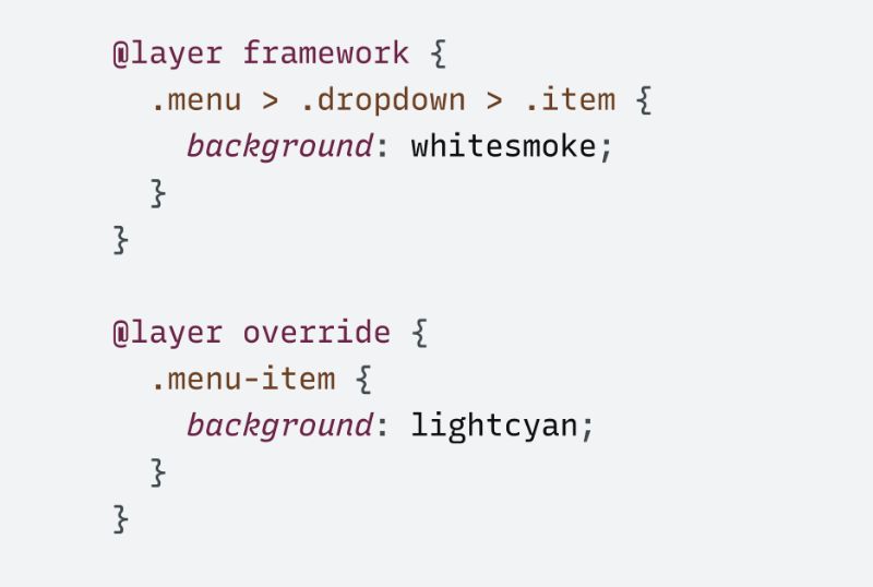
So this single menu item class will win over the combined menu drop down and item classes, because the override layer is defined after the framework layer. This makes it really simple to override tools like Bootstrap, no matter how they write their selectors. So we’re no longer relying on our third party tools to get their specificity exactly the way that we need it. We can decide where they fit into our system, but we don’t need to keep all of our styles in the same order. Once of the layer has been established, we can add to it from anywhere in our code, the priority is based on what the layer name first appears. We even use the layer rule without any styles, just the name to establish our layer order upfront. After that, we load the code in any order and it will just work. Each layer will slot into its appropriate place. That’s especially important if we’re using something like CSS and J S, where our styles might load in any random order. And so there’s a shorthand syntax for that as well to make it even easier using a comma separated list of layer names in a single layer rule.
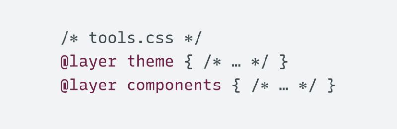
One of the goals here is to make it so that authors get to define exactly where third party tools fit into our style layering, no matter what specificity those tools use internally or whatever layers they create, we can always override them without resorting to specificity hacks. It also gives frameworks and component library authors, a way to expose the layers that they use internally, and provide those layers for us to look into either directly or by wrapping those layers into a container namespace. We can create or access nested or namespace layers using a dot notation to combine the names, or we can actually just nest the layer roles that works the same way, tools, custom is the same as custom inside of tools.
So this gives us a lot more control over our corner of the Cascade, so we’re not totally reliant on selector specificity and code order to determine what takes precedence we have control over the cascade now, so hopefully this allows us to replace all our specificity and important tasks with more clearly defined patterns, and also be a little bit more flexible about the specificities, that we’re able to use in our styles.
Of course, we don’t have to put all of our styles into these layers and for the sake of progressive enhancement we’d likely want to start by adding layers, slowly for new browsers. Unlayered styles will work the same way they always have an belong to an implied base layer, which is before all the others. There’s a chance that we’ll extend this in the future so that you can decide where your default styles go so you could have layers below and above, but that’s not going to be in the first version, we should be able to polyfill this with existing specificity hacks to make it work in old browsers if needed. So we are working on a polyfill and hopefully that will come out as well. And if needed, we could also consider adding an add supports feature test if that seems useful.
The Cascade layer specification is currently a working draft, and I know Chrome and Safari, both seem to be working on implementations, by the time you’re watching this video, they may already be available behind feature flags, and I expect later this year, We might actually see them available in public.

I’m sorry to interrupt you, Miriam. We have breaking news from the future. This is recorded a week after I recorded the initial video. So for anybody watching it’s still your past, but it’s the more recent past. We have breaking news.
So I said that Chrome and Safari, were working on this feature, but now Firefox has jumped out ahead and actually released it behind a flag. So you can play with that by going to about:config in Firefox Nightly, and we can search for cascade-layers. We can see here, I haven’t enabled set to true. If it’s not set to true for you hit that toggle button and set it correctly and then cascade layers will work for you in Firefox Nightly.
CodePen Collection of layer demos link
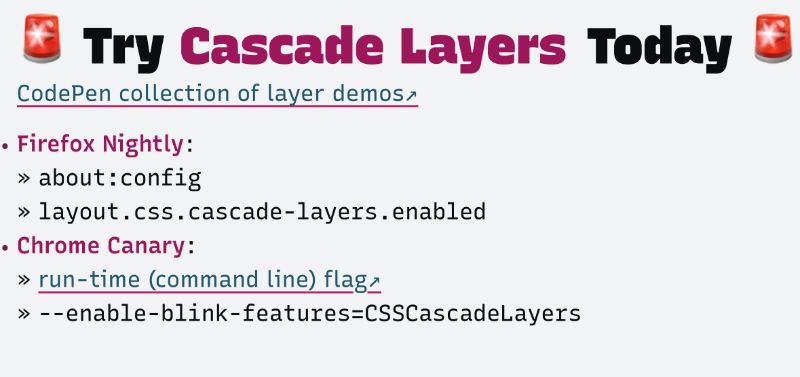
You can also get this working in Chrome Canary, by using a runtime flag that’s not quite as public it’s a little bit more work I have a link here for how to do it. But you run Chrome from the command line, and you can make it work there as well.
Now layers are meant to help with overall site architecture so it’s hard to show exactly how they’ll be used across an entire product that’s hard to show in a single demo, but we can look at some simple tests to see it working, and see small ways that we can use it. So, here we can see, I have high specificity IDs. I have this h1 here, I can target it either by the h1 itself or by the h1 ID. And I have the IDs here setting it to read with an X before.
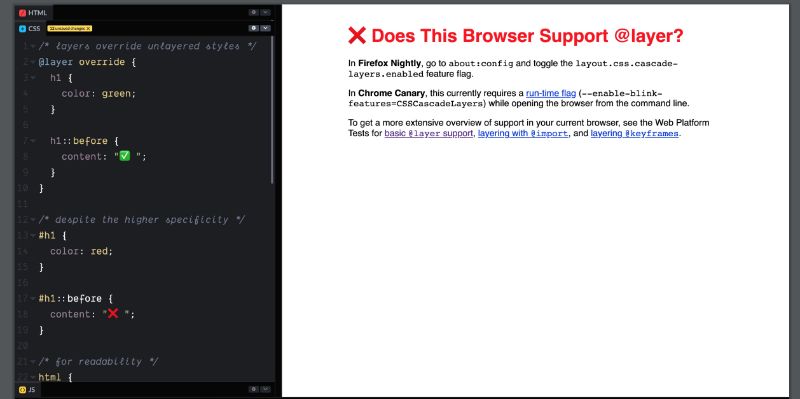
We can see some browsers do not support layers. But if a browser does support layers. This layer will override our defaults, and apply that green color. And that check mark before we could make that a little bit further by adding another layer here and players don’t have to have names, it’s often useful for them to have names. Oh, here’s a reason we might want to, if we’re using a tool where they might load sections of our styles in different orders and we’re not sure what order we can give all our layers names, and then describe ahead of time so I’m going to call this one the defaults layer, and then we can describe the advance layer defaults, and then override. And our Override Styles always win no matter what the specificity is of the selectors inside.
So if you solve it beyond variables talk at the event departs spring summit earlier this year, I was talking about custom properties and they showed this demo with a set of buttons, where everything comes down to the order of our styles, as we rearrange those styles, things change, but if we want a more robust solution that doesn’t rely on source order so much. I showed a way that we can stack custom properties so that the disabled state always overrides the button theme, and we get what we want, but this is something that we can now do with layers as well.
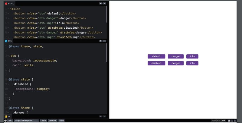
So let’s look at that same demo again and fix it this time with layers, so you see here, we have three buttons “default”, “danger”, and “info,” each one has a different background color, and then we have disabled versions of those same buttons, and they should all turn gray but they’re not. And that’s because it’s dependent on the order of our selectors so if we rearrange this down at the bottom, then it always wins. But what if we don’t want to worry about that order.
What if you had them in separate files, We don’t want to worry too much about what order these tiles are going to load. So instead of we can say, a layer four states. Got our button styles has sort of defaults we can leave that out in the open. We’ll add a layer for themes. We will put these inside. And here, again, the layers are in the wrong order, so we’ve got the same problem that we had before, but we can fix it now with one statement at the top that says rare. First we want teams, and we want states. And that changes the order of those layers, and now the state will always override the theme.
So that’s a small example of layers, but then you can imagine taking that out and using it on a larger scale with the entire architecture of your CSS file, putting components in a layer that will always override global styles or something like that. So now that we have all three major browser engines working on this and two of them have already released prototypes behind a feature flag, the specification isn’t going to change much. The feature is pretty well set and you’re going to get what I’ve showed you. And that could actually happen pretty soon, and it could happen in all of the browsers, if not at the same time, at least not too far apart. So that’s pretty exciting, but I want to take this time also to step back and look how we got there. What was the process from this idea to having a working feature in the browser and I want to show you a little bit of that process.
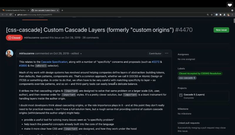
It all starts in the CSS Working Group drafts, GitHub, that’s where most of the action is, and that’s where I posted the initial proposal for this feature, custom cascade layers I initially called it custom origins, and I hadn’t really worked out all the details. I was just sort of suggesting some of the problems that I have a specificity. And the idea that we could give authors, a little bit more control here. It all started with a proposal, I had no idea how this feature should look or work, I just documented the problems with specificity and suggested, hey, what if browsers, had a better way to control this, and that led to a lot of conversation, both in this thread, and on the CSS working group calls which are then transcribed and posted back to the threads. So you can see here the CSS meeting bot has posted discussion, and any resolutions that came out of it. This all started before I joined the working group, so I was relying on this GitHub issues and tracking what conversations were happening through here, and I could tell that there was some interest and excitement and also some concerns about how this would work. And they asked me and a few others to take this back and come back with a more formal proposal, we did that here in a just where people could provide more feedback, and we went back and forth for several rounds, really finessing what the future might look like. Once the group is happy with the direction that we’re going, we started putting it into specification language, and wrote up a first editor’s draft editor’s drafts are sort of like the working branch for specifications, it’s where we make changes and try things. And then, once we like it, and it’s approved by the group that turns into a working draft the first one is called the first public working draft, and from there on those update more slowly, they’re more stable, and we’re going back to the editors draft to make changes that bringing those into the working draft and back and forth and back and forth. If you take a look at working draft you can see that there’s previous versions there’s like, to the editors draft and way down at the bottom there are any remaining issues that need to be addressed, and most of those link back to somewhere in GitHub, where we can actually address the issue.
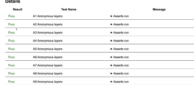
Once the specification is stable enough or a browser decides to start prototyping one of these features, the engineers will also create web platform tests, and I have never really looked into these in much detail before. This is a test suite that’s shared by all of the browsers to make sure that we have compatibility across the entire web platform. So, this web platform test.org tells you more about it and how to get involved, but also you can go to wpt.live or wpt.fyi, that FYI site shows us results of the test in both experimental and stable channels on various browsers, and we can click through to specific test to see more details so we’ll go to CSS, and then we’re dealing with CSS cascade. And specifically, there’s various layer tests here so we can look at layers basic we can see a quick view of what’s supporting and what isn’t. We can also put in and see what’s passing or failing, but this site is showing you the result of public features, and right now, cascade layers are not submitted by default, anywhere. So, what we really want to look at is the wpt.live site, and again we’re going to go to CSS, and then CSS cascade and look for those layer tests. And if we go to layer basic, we can see that the browser that I’m in right now, this is me running web platform tests on my current browser, and you can see that all of them are passing in my browser.
And if we came to the same site on a different browser without the feature flag turned on. Those would all fail. To quote Jen Simmons
One of the best ways that a web developer can truly help make websites work the same in every browser is to help create more tests for WPT. We all want interoperability. Testing is how we get there, and not regress. But we need more tests written to check on more things.
If you’re ever interested in helping web standards helping browser compatibility, making things look the same in every browser. This is the place to get involved, anybody can contribute web platform tests, and we need more of them, to ensure that we have that interoperability across all the browser’s. Okay, that’s what I wanted to show you now we’re going to go back to past past Meriam in 3, 2…
The next feature that I’m working on. It’s also related to selectors and how they target elements in the DOM with scope. We’re trying to address two issues that come up somewhat regularly and often drive people to use tools like them syntax or CSS and J S.
The first goal is to avoid naming conflicts as our projects grow, which we can do by focusing on the second goal, which is expressing membership or ownership in our selectors. So while we have nested selectors that might seem like a way to express membership. In this case, the title inside a post that’s not quite the same thing as a post title. The first one, only describes a nested structure, but the second describes a more clear membership, any component pattern. Not all of the titles inside this post, just the title that belongs to the post. We don’t really have a good way to convey that using our current CSS selectors, unless we invent a new unique name for every kind of title, based on what belongs to either manually using a convention like BIM, or automated with JavaScript compilers. And if we want some Global Title styles we end up using multiple classes and hoping that the more part of it pattern will override the global pattern.
Another way to think about this is to say that some components have lower boundaries, the component itself as a donut with a hole in the middle or slots for content. We should be able to style a tab component or a media object without worrying that we might accidentally style, everything inside of it by mistake, so this might sound similar to Shadow DOM Encapsulation, and there is certainly some crossover between scope, and encapsulation but the Shadow DOM is designed around a highly isolated widgets. Boundaries are defined in the DOM itself, so that each element has a single scope and styles are isolated from getting in or out of that element. Scopes are never allowed to overlap at all, so every scope is unique. While that kind of encapsulation is useful sometimes it’s very different from the lighter touch scope that we get from existing build tools and conventions where scopes reference the DOM, but they’re more fluid. Able to overlap and integrate more smoothly with global design systems, different scopes can have different boundaries and global styles continue to apply globally. So it’s not a one to one relationship between the DOM and the scope.
This provides us with a much lower impact alternative. Scopes are defined in CSS, and can be reused across components or overlap and cascade together. To do this we’re proposing an add scope rule that accepts both a scope route selector, in this case, the media class, and a lower boundary selector, in this case, the content class. Any selectors inside the app will only apply between the route, and the lower boundary. In this case, we’re styling images that are inside media, unless they are also inside media content.
Another way to think about scope is in terms of proximity. These two selectors apply to links inside a light theme or dark theme class and that works great as long as we never nest one inside the other. Since our selectors both have the same specificity and ancestor proximity is not part of the Cascade yet, dark theme will always override the light theme in nested situations. When I put this nested light theme inside of the dark theme. You can see we’re getting the light theme color because it was defined second, in our CSS.
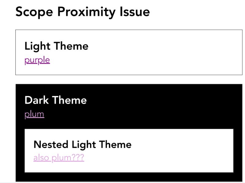
So we can solve that problem using lower boundaries so that themes never bleed into each other, but I think it would make sense for scope proximity to be added to the cascade as part of this feature, so that when specificity is equal, we would default to using the closer scope route, the more proximate scope would win. There’s also been some talk about adding some form of lower boundary or bonus selector, as well as the rule that could be useful in some cases, and I think we’ll probably have it in the spec, but it wouldn’t have the same power to handle proximity, it would only be dealing with upper and lower boundaries of a scope. There’s more to the proposals, you can check it out if you’re interested.
Scope Resources
Full Scope Explainer↗
CSSWG Issue↗
Draft Spec↗
There’s also a draft spec at this point. And hopefully that will be a first public working draft by the time you’re watching this video, which means it’s moving forward in the spec process, but still a little bit theoretical.
And that brings us to the real reason we’re here, which is container queries. This is super exciting, media queries, allow us to respond to the viewport.
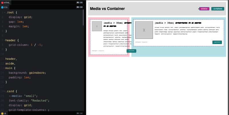
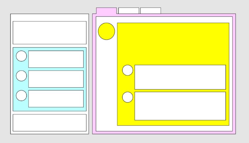
So these two cards as the viewport grows and shrinks. They both change from a vertical to a horizontal layout, but the problem is if we add a sidebar here. Each card has a different context, so having them both change at the same viewport width, doesn’t really make sense. It’s okay that this card in the main content has gone horizontal but the card in the sidebar probably should have stayed vertical. And that’s what container queries allow us to do. We can define the sidebar and the main area as containers, and then we can have each card, respond to the container that it’s in, which is the behavior that we want in order for them both to help them in their respective containers.
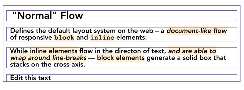 And we want this to work no matter how those containers are nested, but trying to measure a container in CSS, and then make changes based on that measurement poses a little bit of a paradox. So one of the coolest responsive features in CSS is the way that layouts are calculated both based on content, and on context. So if we change the size of the container, we can see that the content is flowing and it’s getting taller. And also, if we adjust this text and add more also makes it taller but only to the extent that the container allows it, so normal flow is a very powerful feature in CSS, and we often take it for granted, but when you try to add container queries to it, you get a little bit of an infinite loop problem, you can measure the container getting smaller, and when it reaches a certain size you can make the content larger, and that makes the container larger and you’re back where you started.
So for a long time browser vendors told us that this would be impossible, but behind the scenes, a lot of people have been working on laying the groundwork to make this possible, and last year two proposals emerged showing different ways we might pull this off. Both are really interesting but David Baron’s approach has the most momentum right now, and I’ve been working on it to flesh out some of the details and start writing that specification.
The first thing that we need to do is to define our containers and that’s any element that we want to measure or query and respond to in order to avoid layout loops, we need to turn off content based sizing on those elements on those container elements, the containers need to be sized without reference to anything inside of them that might change based on the query. So we already have a property to do this and it’s called “Contain” and allows us to contain various types of things, such as containment turns off that content based sizing layout containment is kind of like a clearfix that wraps around floats and margins, and then style containment keeps list counters from leaking out. And we’re going to need all three of these, for our container cruise to work, but size containment is not great in a lot of cases. It’s just not possible to build all our layouts with an explicit width and height, we need one axis to remain fluid so that our content has somewhere to go and we don’t get an accidental overflow. So usually when we’re doing a CSS layout, we want to be more explicit about the width for the inline dimension, based on the available page space, and then allow the height or the block dimension to expand and contract based on the content. So we’re adding an option to make single access containment possible in the contain property contained in line size.
 There’s absolutely dragons lurking here, this is not easy to implement, we’re still sorting out some of the details, but we really do think it’s possible. The current prototype in Chrome sidesteps the issue a little bit. So, the current behavior might not be the final behavior, but it’s a proof of concept, not a finished product. We’re not sure yet if we can also support block size containment, that raises a few more problems because of the way, percentages work and things like that. Again, we’re working on it, it works in the prototype that may or may not make it into the final version.
But don’t worry, you don’t need to memorize or write out all these values, the browser will figure that out for you, instead of specifying all those containments that are required, we just say what kind of container we want or what we want to query on this element, so we can set container type to inline size and browsers can take that information and apply the size style layout containment everything that they need in order to make this work in the background.
This changed recently since the prototype was released, so you might still find older articles that give a different syntax, but this is the syntax that we hope to use moving forward. Also the spec is still in active development so it could change again. And once we have containers we can begin to query them. Container query looks exactly like a media query, but with App Container instead of add media. And then each element will vary the size of its nearest ancestor container by default. Containers can query themselves, and that’s part of ensuring that there’s no infinite loops, but we can nest containers as much as we need to, we can have containers inside of containers, and each container can respond to the one above it. So containers can respond to queries, they just can’t query themselves. If you don’t want to rely on the nearest ancestor container in all cases, you can also give containers names, and only query containers that have a specific name, or only query a specific container type, Again, the syntax could change but this does work in the Chrome prototype, and you can start playing with it behind a feature flag. I’ve also started collecting code pen demos that people are making. So hopefully that will help get you started, and feel free to let me know if you make a demo, and I’ll add it to the list.
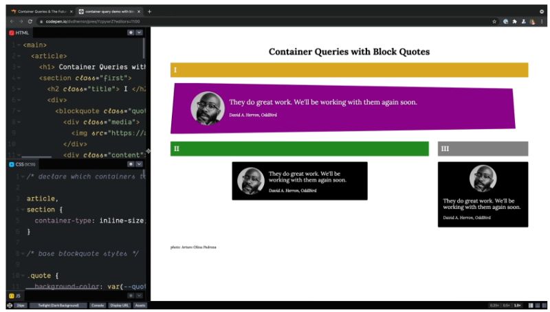
So why don’t I just show you my coworker David Heron made his demo showing the same blockquote in three different containers, and each blockquote has a slightly different style based on the size of his container, and we can see as they all shrink, they become the same at their smallest, and then they slowly grow to that beautiful purple. And you can see in the code, the article and sections are containers, they’re in line size containers. And then if we scroll down, the main layout is happening in media queries, then the quotes themselves are being styled inside the container queries, so that each one responds to its nearest container.
But there are some cases especially in Flexbox and grid where we don’t really want to measure the parent itself, we want to measure the size of the grid track that we’re in, or the flex space that’s available to us. So in those cases, we can add a container, around each individual element in the list. So here I have a number of cards, and you can see that each one has both a div class of card, and then also an article inside of that. And that allows us to see that the outer one is a container, and the inner one is going to respond to that container. So, each card is able to respond to the space that it is currently taking up in the flex box layout, so you can see they all get bigger, but then sometimes one is bigger than the others, and each one is adjusting to the space available. I sometimes call those turtle shell containers, the element is carrying its container with it, wherever it goes. Max B. is using that here in his book store demo where we can drag a book to the cart, or we can drag it to the featured section, we can see each book, changes its style based on the space available to it. And he’s doing this with custom elements and Shadow DOM, and using the host element as the container you can see he’s using the old syntax here. And then measuring the host to style the content inside of it.
Unit Cravis was also playing with this recently and she has a very cool demo here, where she creates a responsive icon, using Container ferries. In a responsive button using Container queries, which is in a responsive card using Container breweries, and she uses the container name syntax to be able to name certain containers so that she can query a container by its name when necessary. I really love this demo, the button changes size, the card changes layout. And you can see the icon also changes, as it shrinks loses those lines.
Of course we can get really creative with container parties, Jay Thompson made these interactive blinds that gets smaller as the container gets bigger, revealing, Peter, who is very happy outside of that window. CSS doesn’t always have to be practical to be awesome. So go out there and make a really exciting web. Stephanie Eccles also joked that my containers don’t hold water. So, to prove her wrong. I put some water in a container, and as you guys probably know water as you resize, you can make sure you have water in whatever size container is available. We’re also working on Container relative units similar to viewport width viewport height qw, qh, qi, qb, qmin, qmax but these would be a percentage of the container size, rather than the viewport size. So we’re calling these query units qw, qh, qi, qb…
Sorry, sorry. Future past past future Miriam here again with a little bit more breaking news.Query units are now supported in a chrome prototype. So we can actually take a look at how those work. You might also be asking why we use q prefix for the units instead of C for container. And that’s a great question. We already have a character called CH, so we couldn’t really use that for container height. Sometimes you’re doing the best you can to work around legacy code that you can’t change, but if you do have other ideas, this isn’t set in stone, and you can go to the issue, and provide some more suggestions.
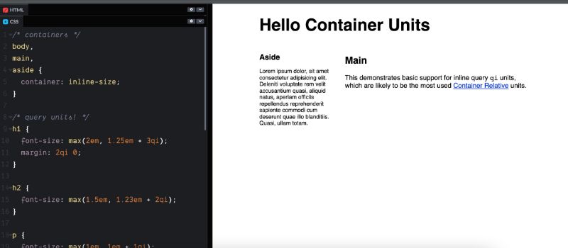
So let’s take a look at how that works here in a demo. Currently we have font size set using VW units. And we do that several places on the h1 the h2 and the paragraphs, and I’m doing that inside of a max function so that they never go below a certain size, but you can see they grow quite a bit as the viewport grows even after that main area stops growing, and no matter what size containers they have. So, here what we’ve done is we’ve set up the body, main and aside all as containers on the inline dimension, and then we can look for everywhere we’ve set VW, and I’m going to change that to query in line. And I can see that each one changes size based on its parents so the h1 is still growing, because the body is growing but the aside an inline stop growing, based on the size of those containers, but that’s not a beautiful demo, I just threw that together in a few minutes to show off the feature. Let’s see what someone with a little bit more typography experience can do is the same thing.
So here’s a demo by Scott Pelham who does a lot of typography work, you can see here, he set the font base font size, with VW’s, we could change that to Qw, and it would work in exactly the same, because for these units, they’re looking for their nearest ancestor container, and if they don’t find one they’re using the viewport. So by default, the qw will be the same as a vw.
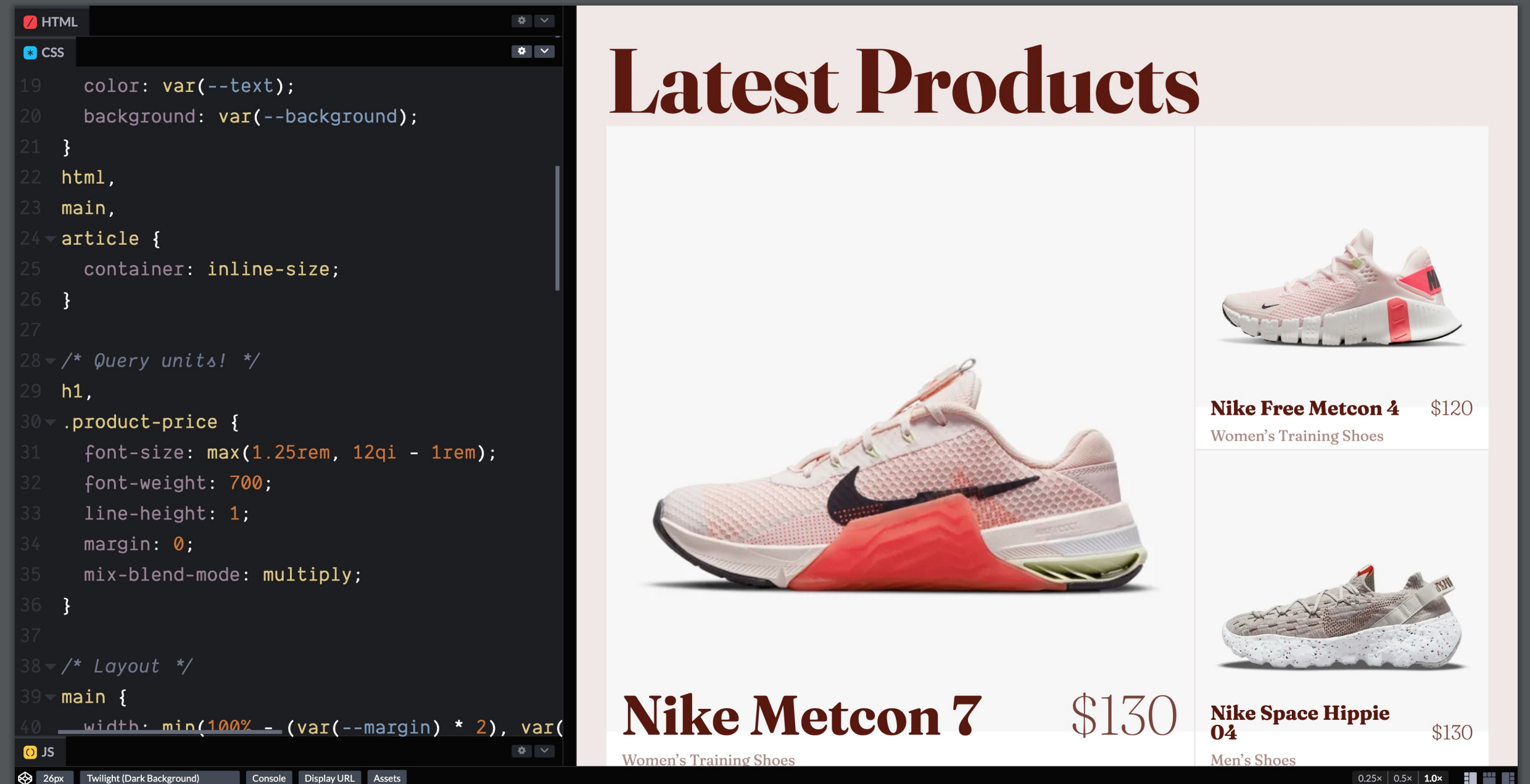
Then down further, he’s using qi to set the font size for these headings and pricing, and we can see that in the demo where we get different sizes for the different products here, based on the size of the container that they have. And if we want to see what that would look like, otherwise we can switch that to vw. Without container units we would have to choose some intermediate size and you can see it feels small on these larger products, and it feels about right on the smaller products. And if we go much larger, it starts to feel too big on these, even though it’s the right size on those. So this is the advantage of using cue units. We can get that fluid adjustment of our font sizes, and also other things spacing, we can use some margin so you can use it on padding, etc. So again, that’s all I wanted to show you, as a quick update. And back to pass, pass Mirium In three, two,
And we’re also working on queries that are about the container size specifically, we might be able to query the actual value of a property on the container and change internal styles based on that property. I think that’s particularly exciting if you’re changing custom property and you want it to affect a number of styles, in this case inverting the colors on the component. And we also might be able to check the state of the container. Is it position sticky and currently in a stuck state. Both of these should be possible but we haven’t worked out all the details yet, so again they might change if we can solve the inline containment issues, this could start rolling up in browsers by the end of the year, and Jonathan Neal is already working on a JavaScript polyfill to make it backwards compatible.
We can also use the app supports rule to create fallbacks natively in CSS. This is a great opportunity for progressive enhancement older browsers don’t understand the container parade, but could fall back to the immediate query or the mobile first layout. I’m recording this in advance so again the details might change, but the prototype is available, and I’ll share a link to all the resources, so you can check out the current state when you see the video.
CQ Proposal Resources
Specification↗
Original Expainer↗
CSSWG project & issues↗
More Artices & Demos »
All of these features are being designed to work together, building on the existing functionality of CSS and the cascade that holds the whole thing together of particularly that overlap between the two main goals of CSS to make styles, responsive and reusable for building components that are inherently responsive and intrinsic not forcing everything to be an exact percentage of a 12 column grid but allowing for different components to manage their own intrinsic sizing and layouts and styles. Sometimes fluid, sometimes fixed, but always responsive to the overall needs of the page, the web isn’t done in CSS isn’t static. We’re still going through these radical changes. And you, as designers and developers working in production, are an important part of that process both in showing us where there are pain points, and also in coming up with solutions in production, that we can then look at and see if they fit into the language itself. So, keep playing, keep filing issues keep giving us feedback and go play with these new tools in prototype before they’re set in stone. We want to see what use cases you have what demos you come up with, and also where there’s room for improvement.
So send me feedback. Send me demos out there. Go out there and make a beautiful responsive intrinsic web. I really excited to see what you build.
You can find Miriam on Twitter as @MiriSuzanne, or learn more about her work at miriam.codes.
OddBird: @TerribleMia


0 Comments