Tom Greenwood | Co-founder, Wholegrain Digital
An Event Apart Online Together – Fall Summit 2021
10:00am Central
Intro: Tom Greenwood is the co-founder and managing director of holding digital A B Corps certified digital agency in London, specializing in high-performance, low carbon WordPress design and development for purpose. Organizations. He’s the author of sustainable web design from a book apart, which makes the case for considering the environmental impacts of digital products and using sustainability as a lens to help us create a web that is better for both people and the planet. Tom is also a co-founder of the organizational development consultancy Trico, exploring the interconnections of personal and organizational growth. Please welcome first-time An Event Apart Speaker Tom Greenwood.
_______
Hi, I’m Tim Greenwood and am very happy to be with you here today at an event the part of the author of the book Sustainable Web Design from A Book Apart, and today I’m here to talk to you about the topic of Zero Waste Web Design.
We’re all familiar with the concept of waste, it’s a part of our everyday lives. The Oxford Dictionary defines it as simply extending something carelessly extravagantly or to no purpose, and waste is something that we very much take for granted, but hasn’t always been this way. There’s actually no waste at all, in nature, nothing is ever wasted. All resources have a value or resources have a use and they go on to be used again and again.
 So the idea of waste is very much a modern invention. It really came to become a core part of our society in the 20th century, particularly with the invention of cheap plastics that could be manufactured so cheaply that we can literally use them once and throw them away.
And what we have now is a situation where, actually, unlike our human nature which is to wants to conserve our own resources, we want to save effort we want to save ourselves energy that’s just a natural instinct. We now have access to sources of energy sources of materials, external to ourselves that actually make it easier for us to waste other resources in order to save our own resources. And so, so waste became a common power society the 20th century and also the advent of plastics fueled this rise in consumerism made things cheap made things accessible made things disposable by the 80s. We were very much a consumer society I shopped there for I am was very much a fitting motto for the 1980s.

This really started to concern, some people particularly the mountains of waste that were piling up in landfill sites across the globe. One of these people was a guy called Daniel Knapp, who was so concerned that he decided to try to solve the problem himself he came up with an idea called Total recycling in which nothing should ever go to landfill or incineration. He coined the term Zero Waste. Together with his wife Mary Lou they founded a salvaging operation, and a market in Berkeley, California called Urban or a huge center full of all sorts of things that were going to be thrown away, that actually you could have a second life be reused or upcycled or repurposed for real-world experiments to demonstrate how all types of waste could be diverted from landfill and reuse in the community.
Daniel wasn’t satisfied with simply making an impact in Berkeley. He saw that the idea of total recycling should be standard across the world. This waste problem was not unique to California, or America, it was a global problem. So he traveled the world, explaining his idea of total recycling zero waste, and it got a lot of attention particularly from politicians 1995 The Australian capital city of Canberra was so inspired by the concept of total recycling that they passed the low waste act, stating that there would be nothing wasted in the city by the year 2010 For everything I’ve read, I’m pretty sure that they didn’t manage to achieve that goal. But nevertheless, Daniel Knapp had a good go at trying to get people to move in that direction.
Governments seem to be struggling to grapple with this issue and corporations, despite some positively sounded marketing messages, didn’t seem to be helping much either.
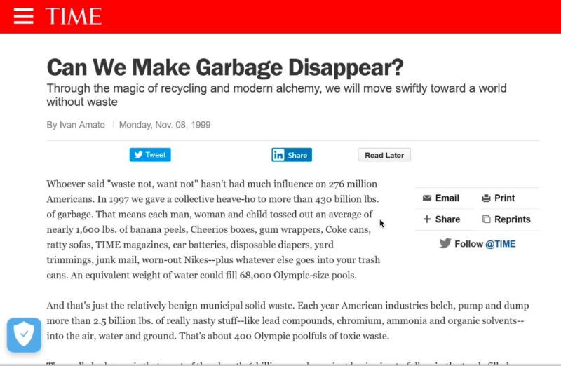
By the end of the 20th century. This issue had reached mainstream awareness. Time Magazine wrote an article can we make garbage disappeared. And it started with this rather blunt statement. Whoever said Waste not, want not hasn’t had much influence on 276, million Americans.
And a lady called Bea Johnson is widely credited with kicking off what became the zero waste lifestyle movement with her blogs Zero Waste Home. The Zero Waste Lifestyle movement was a group of people around the world who are trying to find ways to despite the system that they were now living in that was just inherently wasteful, they will find ways of trying to live without creating a print. And this actually is spawned the whole new sector of shops, specifically trying to help people live this kind of lifestyle. And it’s epitomized by this idea that you’d be able to fit your own waste into a mason jar.
Lauren Singer who has a blog called Trash is for tosses claims that she can fit five years of her own trash inside a single basin job. If that’s true, it’s pretty impressive. I think most of us would probably struggle to fit a single day’s waste inside one mason jar.
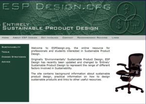 But why am I talking about this at a web design conference, why am I talking about this at an event apart. Well, if we take a step back in my own journey when I was at university, I studied industrial product design and I was really excited about the prospect of having a career, designing things that would touch people’s lives things that they could hold in their hands that would be meaningful to them that would provide real functionality of benefit to them, but I was also really concerned about the environmental impact that these products might have. So for my final year project, researched everything I could find out about ways of designing and manufacturing products, more environmentally friendly ways and I created my first website espdesign.org as a place to put a lot of the information that I’d found to share it with other designers and hopefully inspire people to design more environmentally friendly products, and I started my career in this direction.
But after a few years. I started to feel disillusioned, despite my best efforts, I was feeling like, actually, I was only making an incremental improvement just scratching the surface that actually the reality was that even so, the products I was designing are made of materials dug out of the ground, shipped across the world and consumed energy in their usage and then at some point they were thrown away.
I was demotivated, and I needed to find a better way. Digital seems to be a new frontier a new exciting opportunity to get rid of all this environmental impact. Digital was virtual that didn’t really exist, it wasn’t physical toll was made of vapors in the cloud. And so I started a digital agency with my wife Vinita, with the hope that we could design things that didn’t have any physical environmental impact, use design to make people’s lives better to help positive organizations achieve good things in the world, without all of those issues associated with physical products.
And so, we live happily ever after.
A few years later…
It was only a few years later when we started looking into the process of certifying as a B Corp. We started to question that assumption that we’d made about digital the virtue of having no physical impact. The B Corp assessment, which is a rigorous assessment of all of the social and environmental aspects of business also has questions about how you’ve measured and reduced the environmental impact of the products that you manufacture as a digital agency. We didn’t have any data on this, we didn’t manufacture any physical products and we were advised that actually, we should just skip this section, relevant to us.
It seemed a reasonable assumption the assumption bothered me. So, in the coming months and years, we started researching.
What was the environmental impact of digital did have one at all? We hoped that there was none. But we needed to validate our assumptions, we can no longer just let it be. What we found was surprising. We found that what we call the Internet, consumes a huge amount of energy, it’s a very physical system it’s the biggest machine that humans have ever created spanning the entire globe, data centers, alone, let alone the telecoms networks and the use of devices, just data centers consumed around 20 terawatt-hours per year of electricity. To put that in context, roughly the same amount of electricity is used every year by speed, or by Australia, these are large economies, data centers were equivalent to these whole countries.
And when we actually look at the whole of the internet we include the telecoms networks we include the end-user devices, and we put that into the context of greenhouse gas emissions. What we find is even more surprising. The Internet produces roughly the same amount of greenhouse gas emissions as Germany. Germany is the seventh most polluting country in the world. And I think, perhaps more surprisingly, produces roughly the same amount of emissions as global aviation. The most polluting industry is flying, one of the worst things for the environment. How can the internet is virtual, it doesn’t really exist, have the same carbon emissions as global aviation, but it does.
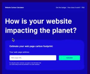 So, we realized that we had to start doing something about it so we needed to learn how it relates to our own work on our own projects. So we developed a methodology for scaling this impact down, estimating what the impact might be for an individual website or an individual web page, and we put a version of this online for people to us. Really, an educational tool websitecarbon.com If you put this tool out there it’s starting to gather data through lots of tests. Patterns starting to emerge
 regarding
sites.Through its energy and emissions impact to be what besides ACP they look quite old fashioned in fact, they were old fashioned, in many cases they were actually very old websites.
The websites that had the biggest impact tended to be new, exciting, and modern in their design, or that seems like a logical thing. The incidents getting more rich and as an experience for us to enjoy we can do more and more online. And so it’s not for all but actually, perhaps the old basic both sides would be less polluting, look at it another way. This is so logical. We look at almost any other industry we see that actually, products get more efficient over time, cars made 10 or 20 years ago, less fuel-efficient equivalent sized cars manufactured today. The same is true of televisions and computers, washing machines, we hear a lot about the Internet of digital technology being really at the cutting edge of innovation with efficiency, improving at a faster rate than almost any other industry. Surely websites must have accelerated inefficiency at a faster pace of washing machines. The Internet has been getting faster.
This is a graph of internet speeds from 2007 to 2017 Internet speeds multiplied, five times.
This graph. I think gives us a clue as to why those old websites might be more efficient than the new ones because although internet speeds have increased, increased massively this is, this is effectively a graph of efficiency of networks that we’re using average load times over the last decade or so have remained roughly static. So internet speeds are going through the roof,
staying the same. What’s going on, well, this graph raised it to the archive, I think, really gives us insight. So while internet speeds might multiply five times over a decade.
The average page size of a web page is nearly 400% bigger on desktop, 12 100%, bigger on mobile. It seemed that while other industries were accelerating efficiency and while the internet itself as a machine was accelerating and efficiency websites were going the other way, websites were becoming more and more bloated, consuming all of this benefit all of this. All of these gains in efficiency were just being locked up by additional bloat in our web pages.
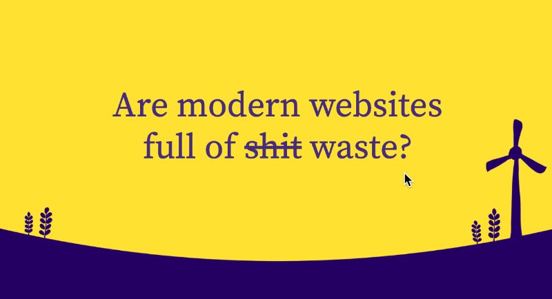
So this raises the question, modern websites are full of shit? I mean our modern websites, full of waste, and if they are wouldn’t be going to do anything about it.
Should we go back to the 90s? I’m sure there are some of you here, myself included, who like a bit of nostalgia, but I’m not sure that going back to the 90s is really what we want for the web of today and tomorrow. But perhaps we don’t have to go back into the 90s.
Stephen Lahey, a journalist at National Geographic wrote an article about people trying to live Zero Waste lifestyles. What he’s found surprised him, he said that the people he interviewed were not as he suspected, “wannabe hippies,” but more effective people embracing a modern minimalist lifestyle, and they told him this lifestyle saves them money, save time and most intriguingly it enriched their lives. Could the same be true of zero waste where the design, can we embrace principles of modern minimalism? Could it save us money, save people time, and could enrich the web?
I think it could, and I think there are a number of benefits that can come from embracing this mindset of zero waste. If it weren’t designed, I think we could achieve better performance improved accessibility and inclusivity, reduced hosting costs easier maintenance, improve user experience improved search engine rankings and conversion rates, and reduced energy and carbon emissions. In this effort, everything we ever wanted. I mean, probably not quite, everything we wanted but it’s a pretty good list, we could achieve a lot of these things, surely, that would be good for everyone.
So how do we do it? Well, the first thing that we need to do is to start asking ourselves some really fundamental questions, first of which is just, do we need this, do we need this web service at all, do we need this website, do we need this page. And if yes, then ask the same question about every element that we put on that page, do we need that image do we need this content, asking these fundamental questions can help us identify waste. Could we do the same with less? Are there more efficient ways of achieving the same outcome of what could we lose, without anyone feeling like they’ve been compromised? what could we lose perhaps without anybody even noticing?
Well, what can we lose, and actually make people feel like they’ve gained something? I think one of the best places to start looking for waste is the images that we use in our designs.
Images
Nielsen Norman really interesting study a few years back using eye-tracking technology to see where people’s gained sets of web pages. They’ve made some really interesting discoveries about the use of images of websites, or the found was that although a picture tells 1000 words, it only tells 1000 words, if it actually is relevant to the thing you’re trying to communicate. If it doesn’t, that is literally a waste of space. This example here on the page is the Yale School of Management.
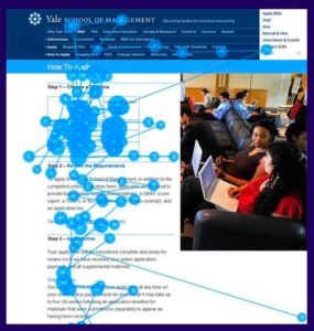
And they did this eye tracking study on this particular page of their websites and what they found was that people didn’t look at the image of the students at all. The blue dots on the screen represent where people’s gaze lingered, and their gaze lingered on the text of the article on the navigation of the website, and of the diagram of the top of the article, which was relevant to the information being communicated by the article itself, not a single person’s gaze rested on the picture of the students. It’s just filler. It’s just a waste of data, and it’s a waste of space, it means nothing. This is really common in websites that we just put images there because there’s a space of it’s filling all because we think that no one will be interested in this page. If we don’t have an image, just text alone is too boring people won’t be interested. But actually, the people only want images when they’re relevant like the diagram at the top is relevant. The image on the right is not and Nielsen Norman has concluded by saying that actually but what designers, see more obsessed with showing off, that they are getting to the point that “visual bloat” continues to annoy users, even with high-speed internet connections and sub-second download times users still prefer websites that focus on the information that they want.
So images are a great place to start looking for waste and questioning whether we need them at all. But let’s say we do, what can we do to actually identify and minimize waste within them. Well, just the sizing of images can have a really big impact. If we put an image full screen. For example, 1280 by 800 pixels. This image of a horse who lives in the forest just down the road from me, the image is 1.2 megabytes saved as a JPEG at 80% quality. I put some text on top of it but says visit the New Forest.

This is a big file. And this slide doesn’t necessarily communicate an awful lot, the text is a little bit difficult to read on top of the image, the impact of the image is a little bit lost because of the text overlaying the top of it. What if we made the image, half the size in terms of pixel dimensions that bring the actual file size down to only 360 kilobytes. Now, we can put the text next to the image, it’s much easier to read. We could even put a little bit of text underneath, try to make you see a reason why you should visit the New Forest, it’s the magical national park at the south of England, where wild ponies, donkeys, and deer roam free. Please do come and visit. I’d love to meet you here.
But we can reduce the size of this image, even further. Just blurring the edges of the image, and keeping the horse in focus, we’ve reduced the image size down to 192 kilobytes because when it comes to images detail is data. And data is energy. So, blurring out big parts of images that don’t actually convey useful information, or using shallow depth of field in art direction or cutting out the main object of an image and putting it on a more graphic simplified background can really help us reduce the actual size of our image files, but we can also strip out another type of information that perhaps could be argued as waste. We can strip out the color, the New Forest is apparently, despite being called new, it’s apparently 1000 years old. It’s a pretty old place, so perhaps a black and white image would be even more fitting thought that they had black and white images 1000 years ago, but nevertheless, gives us more of an oldie worldly feel it’s black and white image is only 129 kilobytes roughly 10% the size of that original image. We’ve made a huge saving.
Alternative formats
And this is still a JPEG image. What if we looked at alternative file formats mp3 files around 30% Smaller than JPEG images, basically, they’re stripping out 30% of waste to a JPEG and AVIF is, which is a newer format that produces files that are around half the size of JPEG files. And there’s growing browser support for these, where p now has around 96% of global browser adoption, so it’s really widely supported not using WebP in many cases would be a wasteful thing to do in the future. The same will be true of AVIF if it already has around 67% global browser support, and growing fast. So, this is something to watch in the near future, but we could still strip, even more waste of our images even if we’ve sized it right, reduce the most efficient file format for the browsers that we’re loading, we can strip out even more waste using a tool such as short pixel a tiny png to compress our images with no visual loss of image quality. This example here from the Short Pixel
website shows a before and after comparison where the image looks exactly the same before and after compression, but actually, file sizes reduced by 77% that means that 77% of the data inside that image file was waste, wasn’t needed. It didn’t actually do anything useful. Perhaps we could get rid of images, altogether.
Oxfam Policy and Practice went with a type of graphic design language as a way of actually helping communicate the information they were trying to convey in a way that was really data efficient. This is a website that’s going to be viewed by people all over the world, not just people in offices in western cities but in all parts of the world including developing countries. So it was really important that the information could be accessible to all. And although this, this website does have some images. They used really as accents in places where it’s really necessary but it leads to the Typographic Style, which is effective and efficient.
Rights for Children is a website for children in the UK who live in institutional care it teaches them about their legal rights. This website needed to be fun and engaging to make children actually want to engage with this quite a heavy topic of legal rights, but at the same time, it needed to be very data efficient because these are the least privileged children in our society and they have very limited access to data. So this website doesn’t use any photographs at all. Instead, it uses CSS styles color SVG shapes, and some SVG cartoons to create visual interest have fun in the most data-efficient way possible. This website is cleaner than 84% of websites tested in our carbon calculator SVG images can be a really, really efficient alternative to photographs, but they’re not inherently efficient. They can be wasteful too and we can actually optimize these by hand easily just by opening an SVG file in Illustrator. We can find the waste right there. We can find unnecessary points on the vector parts. We can find unnecessary layers in the Illustrator file. We can flatten paths. We can significantly reduce file sizes in the process.
This icon from Eat Well Networks website started off at 132 kilobytes, simply with a few minutes of hand optimization came down to three kilobytes, that’s 97%. Saving 97% of the data inside that file was waste. And we can do the same with PNG images. There are 16 million color channels and a 24 bit PNG file. And you don’t necessarily need them all.
Image Alpha is a great tool that can help us actually convert these to more efficient, eight-bit PNG files and only include color channels that we need an image of a pineapple on a transparent background.
Just a fun example to show how we can actually reduce the file size by reducing the number of color channels. By switching it down. Image alpha from 256 colors to 16 Safe at 80% of the file size. And this is a really good thing to do, particularly for logo files that are often PNG’s, often the logo files only have a few block colors actually stripping it down to overuse the color channels that required these there’s no visual loss of information, but we stripped a lot of waste out of the file itself.
Color
What about color, I talked about black and white images having an impact. What about color in general? Does that have an impact on efficiency? Is there waste in color? Well, indeed there is. Modern LED screens, unlike previous screen technologies, light on every individual pixel individually. They’re like millions of tiny LED light bulbs on your screen. And what this means is that when we have a fully white screen, all of the light bulbs are switched on at maximum brightness. We have a full black screen it means all of the light bulbs are switched off using almost, almost no energy. So actually using white as our default background color is really really wasteful. Yes, there may well be occasions where white is the right background color to choose but actually, we should think more carefully about the colors that we choose in our web designs. We have to work with brand guidelines of course but knowing the different colors have different color impact allows us to make informed decisions in our designs. One of the interesting factors here it’s not just that white is more energy-intensive than black. But the blue is more energy-intensive than red and green pixels. This is quite an intriguing fact that can allow us to shift the color palette of our designs, we did this actually on our own website where we moved away from white and do design changed our entire brand style. Google’s done some research to show that actually dark mode. Its apps use considerably less energy and therefore uses less battery on mobile devices because of the reduction in screen energy. And so when we’re using really bright colors. It’s not just a waste of energy in a general sense it’s a waste of people’s battery life, which really impacts the user experience when out and about and trying to get things done on their device.
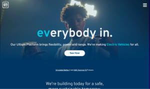
There’s one thing that really blows everything else out of the water when it comes to waste on the web. And that’s autoplay video. Autoplay video is like the oil spills of the web, they’re just so inherently dirty and wasteful. This is a screenshot from the General Motors website that is trying to promote the new Altium platform for electric vehicles with some slightly bizarre video of pop stars dancing around in the dark. It’s really not necessary. It’s incredibly wasteful. About as wasteful as an electic Hummer.
Brian Chen wrote an interesting article about the scourge of autoplay video for The New York Times and in it he said that autoplay videos
demand your attention while burning through your data plan of sucking up your batteries,
They really inconsiderate of the user, particularly users on low incomes, limited data. There are alternatives, not just to autoplay video but to video in general, if you do feel we need some sort of motion on a web page to communicate information we could for example use interactive animations. This animation created using the
open-source library Lottie from Airbnb demonstrates how heat pump works. And this was originally going to be a video that would have consumed a lot more data, but actually by doing it as a Lottie animation, what we were able to achieve was to put it on the page with real text, that could be read by search engines with real text that could be read by people using assistive technologies, and allow the user to control the timeline people can skip through this at their own pace if they want to just skip through it in 20 seconds, they can do so they don’t need to sit through a three-minute video, wasting their time.
Google provides some really interesting advice on how we should think about the use of animation in general, you know web designs in its
Material Design Guidelines because three principles for how to decide to use animation in a design they say that it either should either be informative, meaning that the animation itself communicates useful information to the user. It should be focused, ie, the animation draws the users’ attention to the thing that they should be focusing on and helps shield them from other distractions on the page. Or the animation should be expressive and actually help build an emotional connection between the user and the service that they’re interacting with.
And we can actually get an idea for how much energy, his animations are actually using your designs using the Energy Impact Tool in Safari browser dev tools. Energy Impact tool gives us a nice rating of low, medium, and high CPU usage when a page is loaded as well as a pie chart showing us where this is being used, we can dig into this data in more detail. In this case, we see that the energy impact on the right is high. On the left-hand side of the pie chart with a purple section of just over half of the pie chart is JavaScript usage. So, getting this information allows us to actually start digging into like what are the things in our code in other sites that are actually consuming CPU capacity, consuming energy that are wasting resources, and actually start investigating how we could improve efficiency.
System Fonts
And that was one thing on the web that is truly zero waste, and that system fonts are free, they’re free not just financially, but they’re free in terms of data they’re free of energy. They don’t have to be stored in data centers, they don’t have to be transferred over the networks that are already on people’s devices, and I know designers tend to cringe and roll their eyes every time I mentioned system fonts. System fonts are actually really worth considering. I’d urge you to look at
hotels.com, a highly successful online business that seems to only use system fonts, and I would bet that the reason they’re doing this is because they want to give their users, a good experience that users may well be using a mobile device while traveling, perhaps in a foreign country whether using roading data it’s very expensive, perhaps the slow connection and want to give the users a good experience and so actually eliminating waste being super-efficient is good for everybody.
But maybe we do want to use it for premium fun, more interesting, unique font to communicate our brand. We could look at something like the inter-typeface family one of my favorites and see how we could eliminate waste here. If we take just a single weight of this font into bold is a TTF file 2000 characters over 500 kilobytes for one font-weight, but we can do a thing called subsetting if you just Google Font subsetting tool you’ll find a number of tools where you can upload a font file and subset the fonts to only include characters that are used in the languages you’re using on your website. We do this within bold, we set it to just English, we actually reduced it down to 98 characters. That’s a reduction of over 2000 characters, and now the fight is only 39 kilobytes. There are another 2100 characters that were literally waste for languages that we would never even going to use. Then we can reduce waste even further by just converting it into the most efficient file format which is off to. And when we convert this into off tear format, we actually get the file down to 10, kilobytes, really, really huge reduction.
CSS
We can also find ways in our CSS, we take the example of the
Zero Waste USA website. It’s a nice, simple website it seems to only have about five colors it’s got a white background black text gray accent colors, some green buttons, it’s dark gray used here and then we run it through CSS stats.com we find there are 555, total color decorations for a website that seems to only have five colors.
This isn’t having a dig at Zero Waste USA, in fact, this is actually pretty normal for a lot of websites particularly websites that have been around for a long time,
cssstats.com does a beautiful job of helping us visualize waste in our CSS, finding out where we’ve repeated the same thing over and over and over again, with lots of people this awareness we can actually start to think about how could we reduce this, how can we clean up our CSS, perhaps by introducing a design system where we have modular reusable styles that are easy to maintain, and that can be rolled out time and time again, without having to reinvent the wheel.
Tracking Scripts
Another area of waste are tracking scripts, tracking scripts are a pet peeve of mine. Every time I seem to go to a website these days I’ve faced all these ghastly cookie banners that basically says, We don’t care about your privacy, but we’re pretending that we do, so read this legal document that you don’t understand, or just click Accept, get it to go away so that we can harvest your data tracking scripts are wasteful, not just in terms of people’s time, but also wasteful in terms of data you have to send the tracking script over the network to the user, then it uses energy on their device harvesting data that they don’t want to be harvested, that sends it back over the network to a data center where it gets stored for eternity in an ever-growing cloud.
We look at some common tracking scripts we can see waste. Just it’s simple tracking scripts. Google Analytics is 17 kilobytes and it uses cookies. If we add Google Tag Manager, it goes up to 75 kilobytes and that’s before Google Tag managers injected and the other scripts Metomo 40 kilobytes, then this is an intriguing thing Minimal GA, only one and a half kilobytes. It’s basically Google Analytics, does most of what people would want from Google Analytics, but only in one and a half kilobytes. That indicates that actually for a lot of users 15 and a half kilobytes of the normal tacking script is just waste. But it gets even better. Fathom, a tracking script has only 1.2 kilobytes and it doesn’t use cookies which means you don’t need the ghastly tracking script, and Plausible, even better. Less than a kilobyte and no cookies. There are really efficient options out there that are privacy-focused and efficient if we choose to use them, and more advanced tracking scripts are worth looking at.
Advertising
NPO, which is the Dutch national broadcaster took GDPR regulations, seriously, unlike most people they said, well actually, we’re going to follow it, not just to the letter of the law, but to the spirit of the law, and we’re not going to harvest people’s data that they don’t want to be harvested but that meant that they had to get rid of their personalized ads. Many people told them this is going to be devastating. Commercially, because personalized ads are the key to online advertising revenue, are they.
Well, it turns out that they work, they took a big risk and they got rid of personalized ads and they replaced them with contextualized just based on the content on the page. What we found after launch, was that that advertising revenues didn’t just didn’t not go down, they increased significantly. So with less tracking less privacy invasion. They actually increase their revenues significantly.
Libaries
We should also look at the libraries that we use the libraries are a really common source of waste. jQuery is a library that most people probably wouldn’t say it was bloated. And in some ways, that’s probably true. It’s only 30 kilobytes Gzipped, and it provides a lot of useful functionality, so use that if you use 78% of all websites. That’s pretty impressive. But hang on a minute. 78% of all websites are using something that’s only 30 kilobytes. This
Sustainable Web Manifesto is only 27 kilobytes for the whole homepage, we’ve got a whole web page for less than the size of jQuery. The Sustainable Web Manifesto the home page includes a contact form. This contact form was originally going to be implemented using Gravity Forms for WordPress, which uses jQuery. Using Gravity Forms would have more than doubled the size of the page. So instead, it was just implemented as a simple form, without the need for jQuery. I think we need to really challenge the use of the word ONLY and shift our own baseline for how much data we consider to be not very much.
Programming Languages
We should also look at programming languages. There’s a huge amount of difference in the efficiency of different programming languages to perform the same tasks the most efficient a C, Rust, C++ the least efficient a Perl, Python, Ruby, JavaScript is seven times more energy-efficient than PHP 16 times more energy-efficient than Ruby. That means effectively. If you do something in PHP that could have been done in JavaScript, wasting seven times the amount of energy. Little wonder then that Cloudflare workers which is in itself a highly efficient hosting technology that’s scalable and only uses the resources that you need only allow you to use JS, Rust, C, and C++ four of the most efficient programming languages. There are some other interesting innovations happening in the hosting space that we can look at that also help us eliminate waste static web technology is one area where instead of hitting a CMS every time to generate a page we could actually just serve static HTML files, like we did in the 90s and the hosting service
Strattic takes us even one step further, they say, Well, let’s not just serve static files, let’s actually switch off the CMS using babies only using a tiny amount of energy but it’s a waste. Why does the CMS need to be switched on in the background on standby 24 hours a day 365 days a year. It’s like leaving the TV on standby, we know that it’s only using a tiny amount of energy but it’s on all the time. Most of us probably don’t bother switching it off at the wall, but we kind of know that we should. Strattic does that fit your WordPress content management system switches it off at the wall of when you want to edit some content, and puts it back up again.
I want to wrap up by really just emphasizing this issue that waste is an accessibility issue, and it is an inclusivity issue and this is one of the reasons why we should really take this seriously. Gerry McGovern, the author of the book Worldwide Waste has said that large web pages are taxes on the poor, and he’s right. Liechtenstein is one of the richest countries in the world and it has the fastest internet of the world 394 times faster than the internet in South Sudan. To download a five-gigabyte movie and Liechtenstein takes about two minutes to do so in South Sudan takes over 19 hours.
Those of us that work in digital, while we might not live and work in leftish died we tend to live and work in places that are wealthy, that have fast internet connections, and we can often land up designing for ourselves rather than thinking about the people in the least privileged parts of the world. And even within our own countries, those who have slower, more expensive connections. Did also think about the devices that they use, the average device in the world right now is not an iPhone 10 or Samsung Galaxy it is a Motorola Moto E6 It’s a really, really slow phone that costs about $150. And it might look okay, but it is painfully slow. This is the average phone in the world right now. That means there’s a significant proportion of the world’s population, who have access to the internet or using devices that are even slower than this.
We need to be designing web services so that they function well on the slowest connections, and have the least powerful devices, and eliminating waste can help us make that possible.
Alex Russell, who is an engineer at Google now works with the Microsoft Edge team has been studying this for several years and he says that actually currently for modern pages, half a megabyte, is a decent hard budget, half a megabyte is a quarter of the size, the average web page today, but it’s 20 times the size of the Sustainable Web Manifesto homepage. Is it unreasonable to think that we could do most of the things we need to do within half a megabyte, eliminating waste can help everybody, of those privileged users, as well as the least privileged users.
So I hope this presentation has helped you to see that, we use the concept of Zero Waste as a lens through which to see the detail in our design, and our development in the conception of our project, we can actually make things better for everybody.
But how can you get buy-in from your boss or your client for you to actually be allowed to sue zero waste in your web projects, why should they care. Well, you can tell them that they’ll get better web performance, improved accessibility, and inclusivity. They might get reduced hosting costs.
They might get easier maintenance of their products, improved user experience better search rankings better conversion rates, and reduced energy and carbon emissions. If they’re still not convinced after all the staff, perhaps you should ask them this question from the homepage of the Urban Ore website.
If you’re not for zero waste much waste are you for?
Thank you.


0 Comments